|
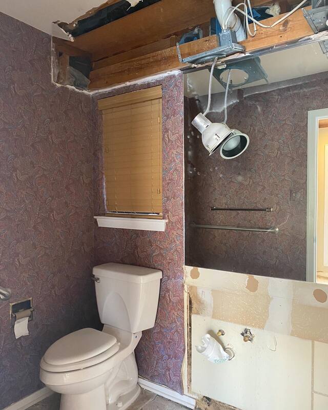
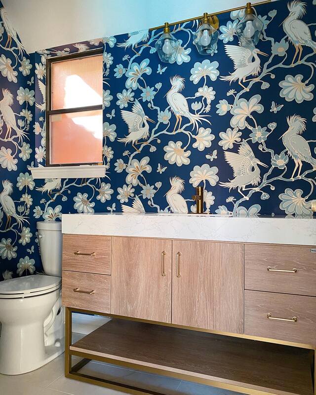
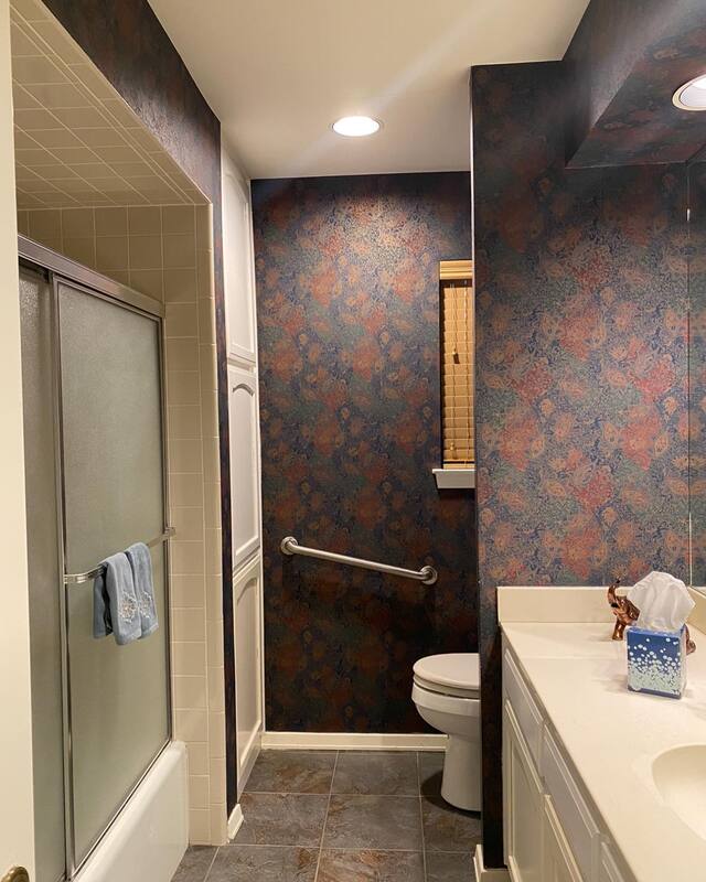
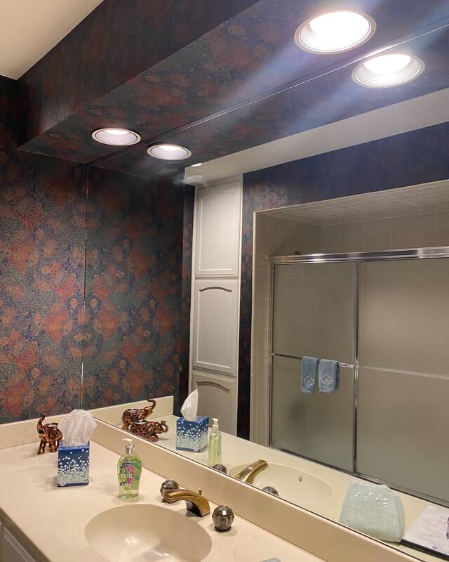
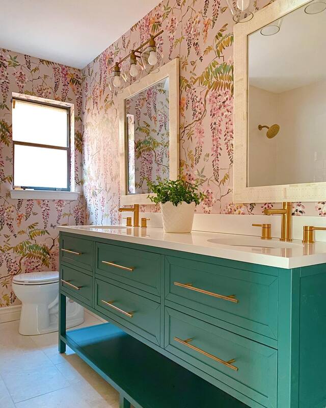
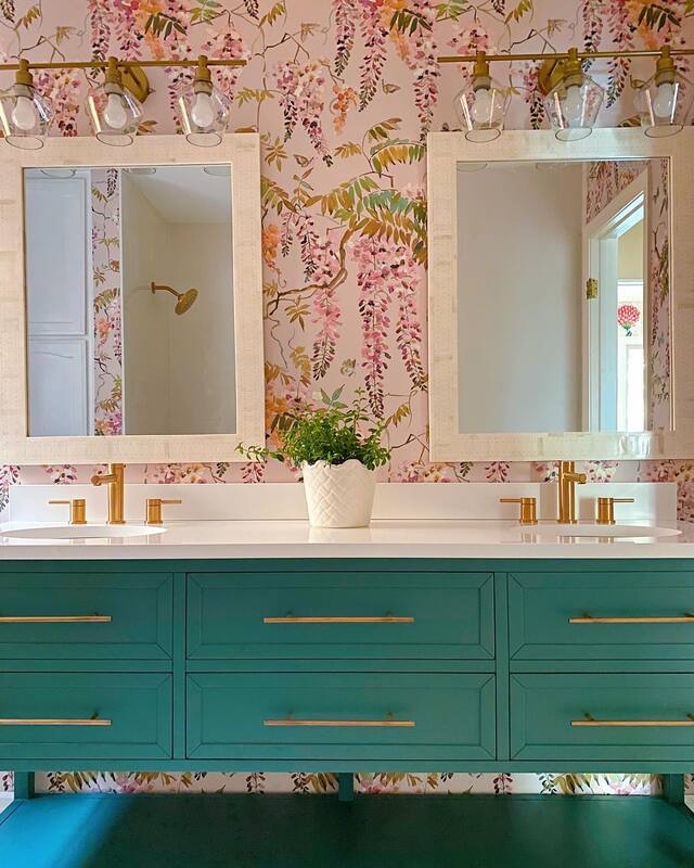
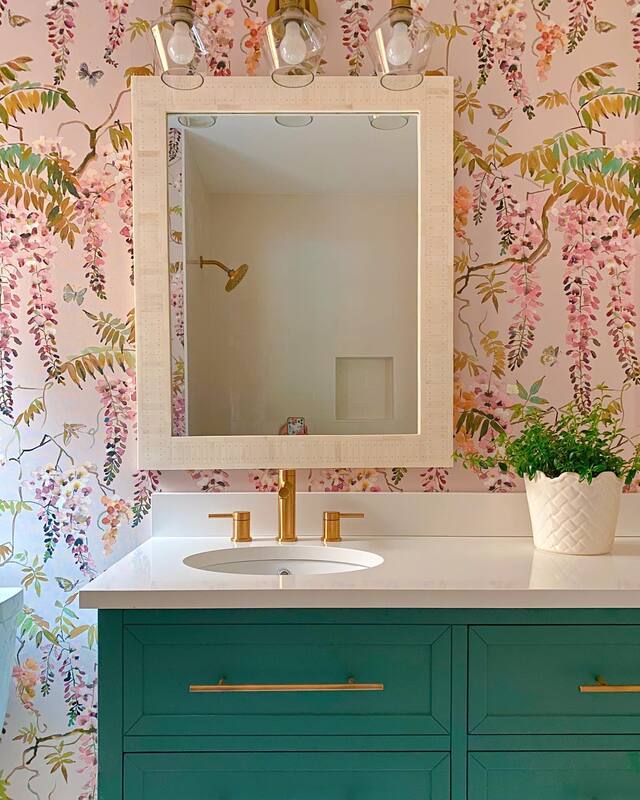
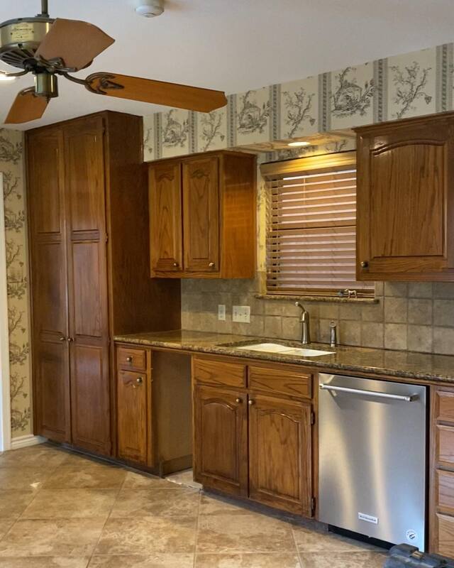
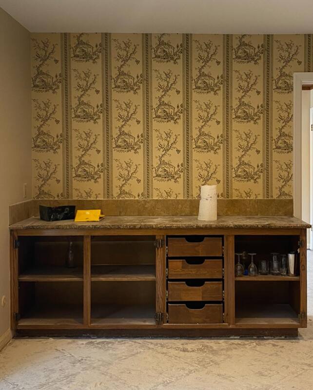
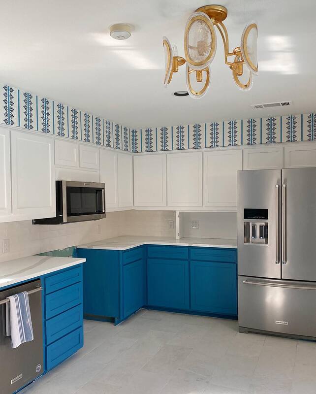
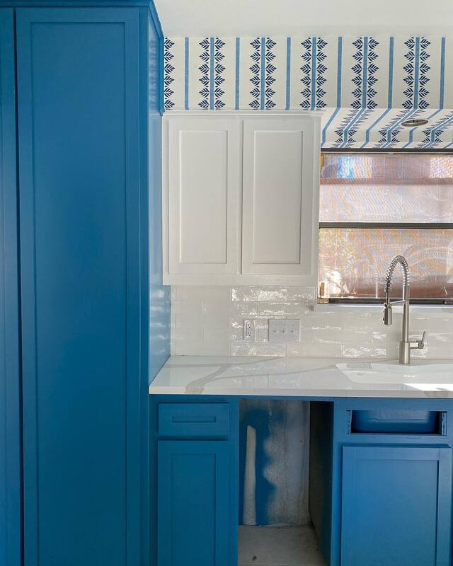
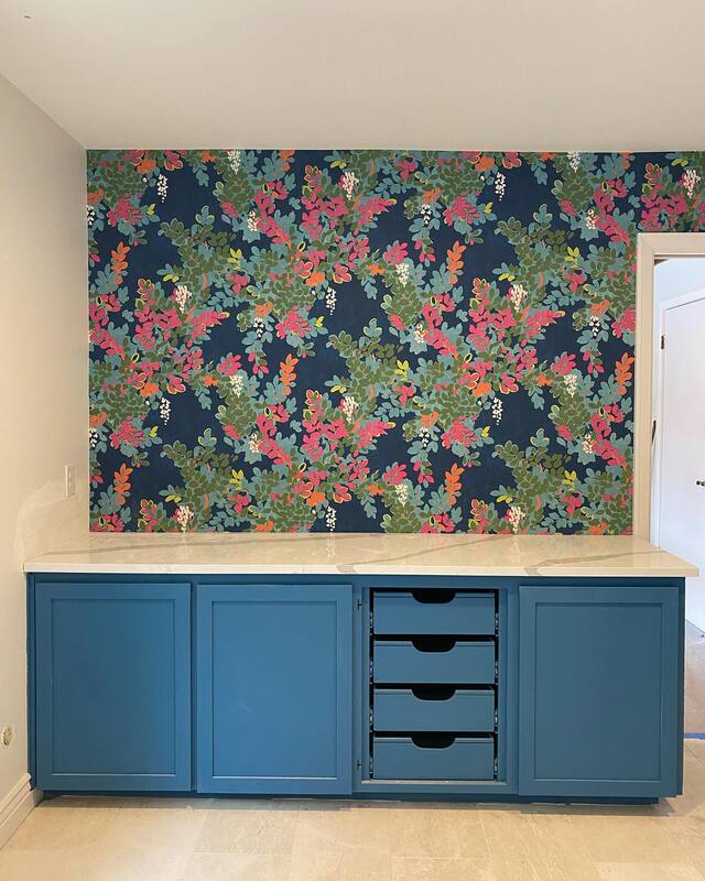
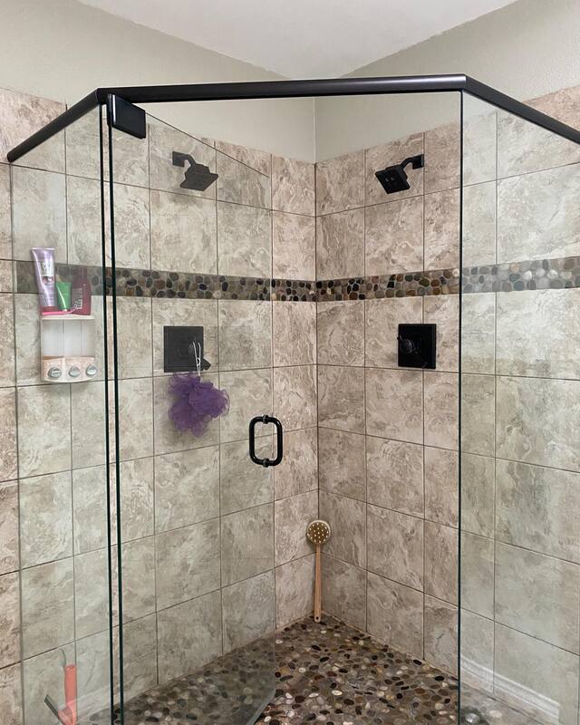
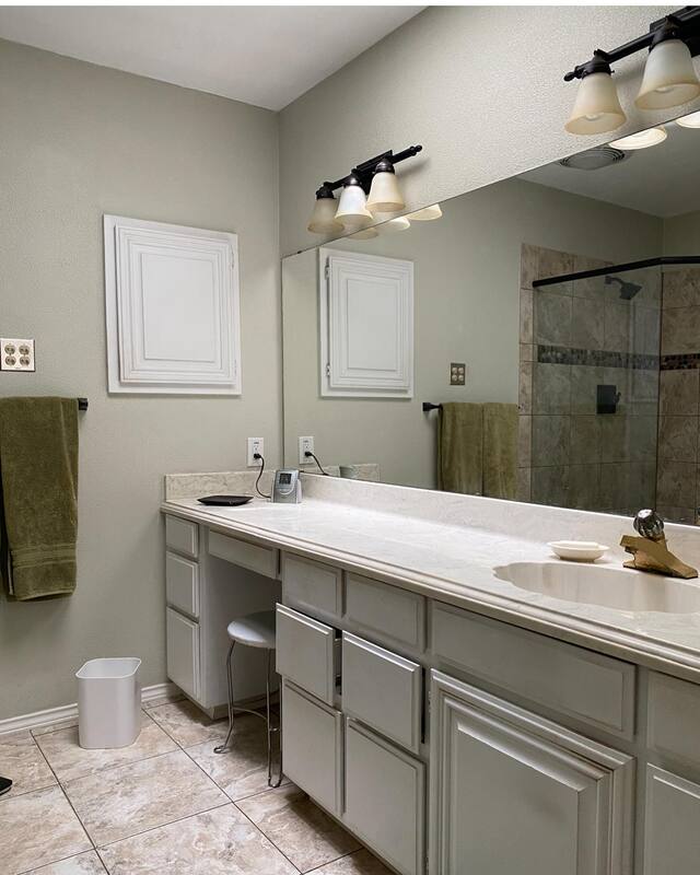
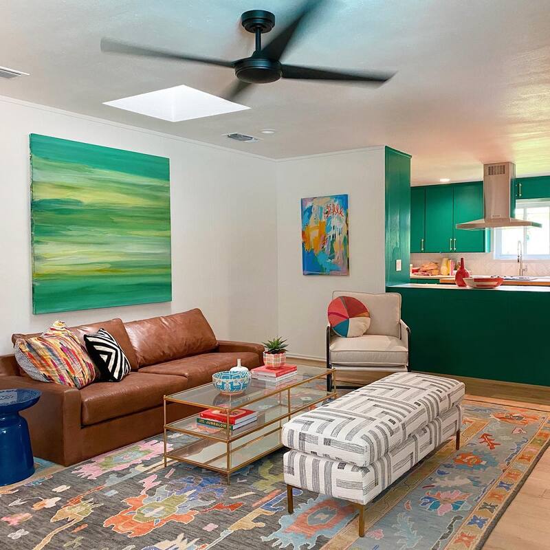
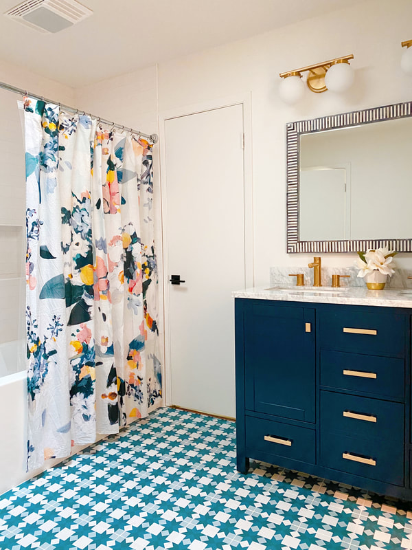
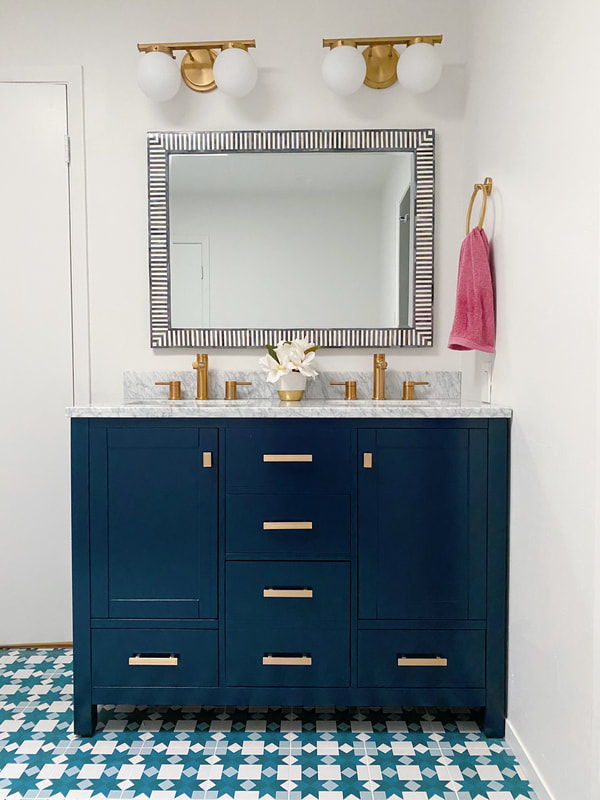
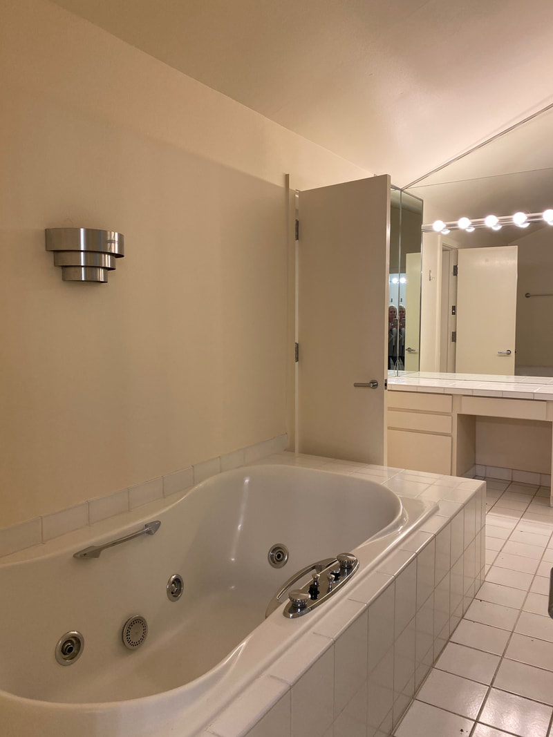
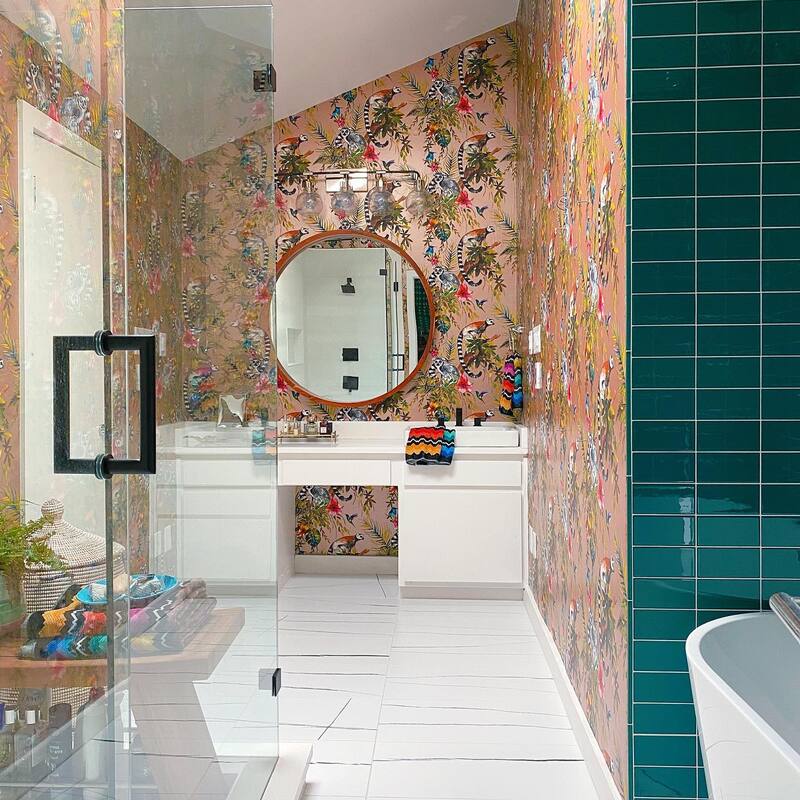
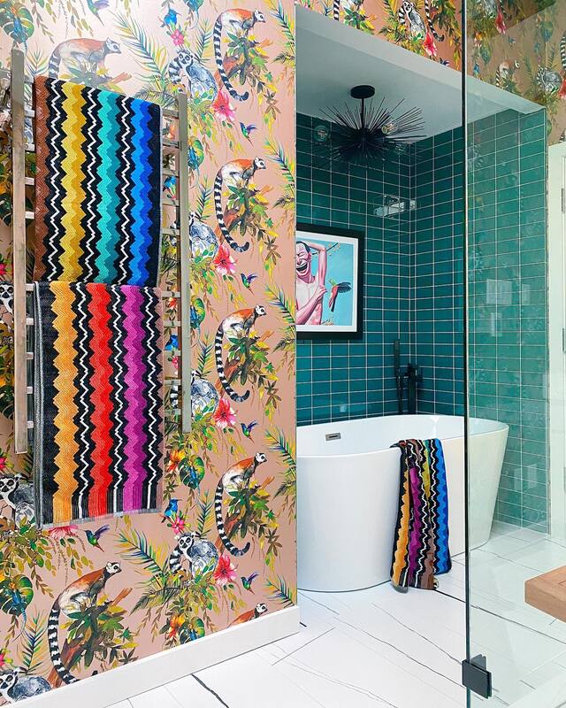
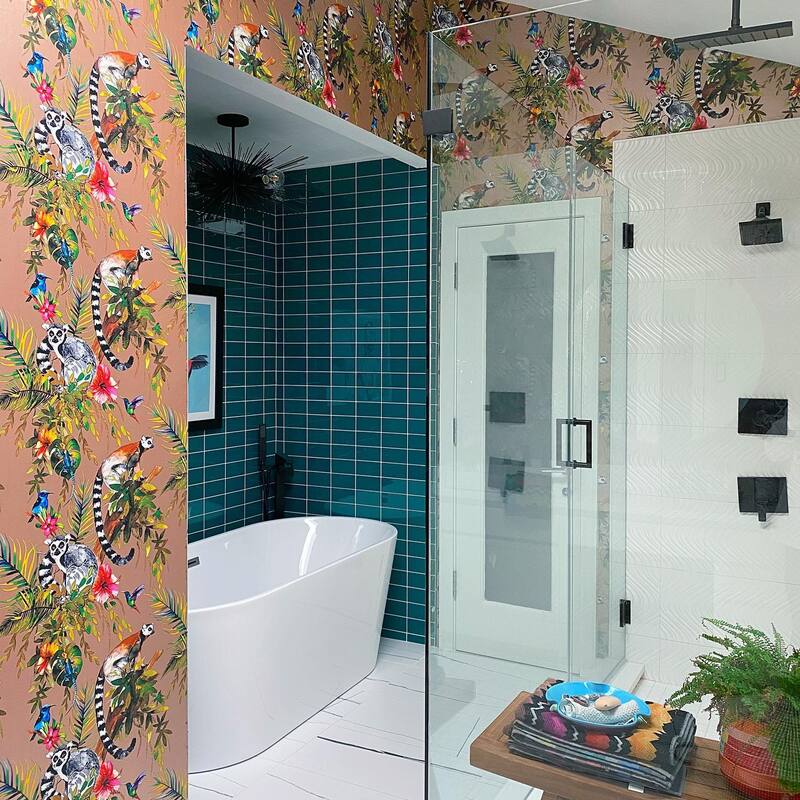
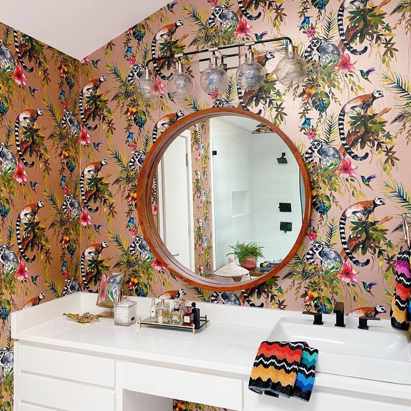
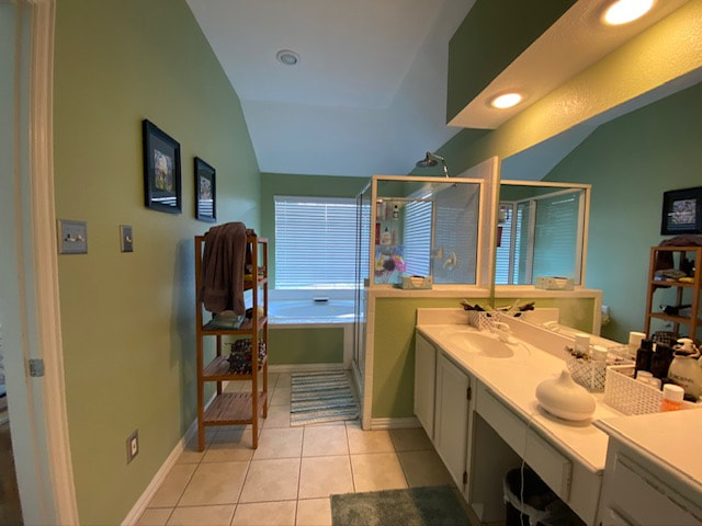
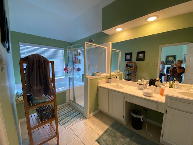
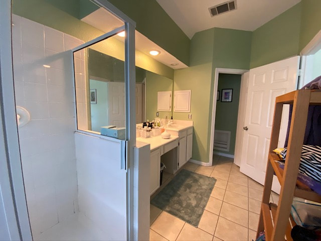
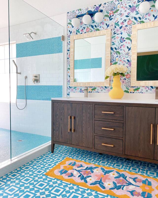
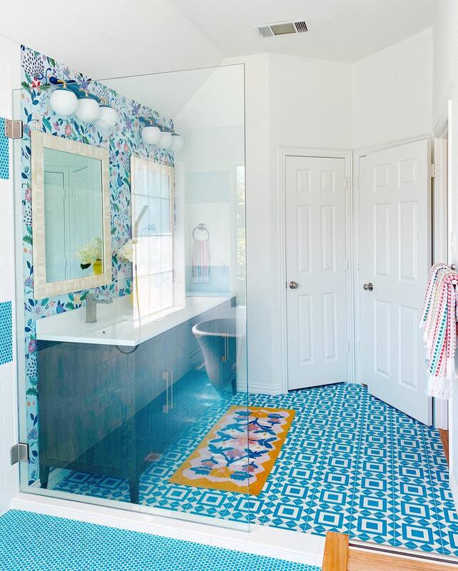
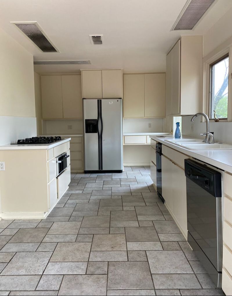
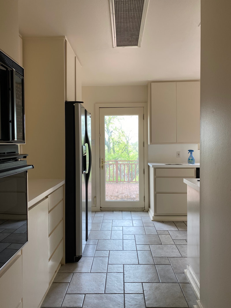
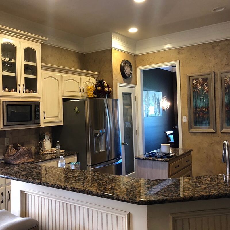
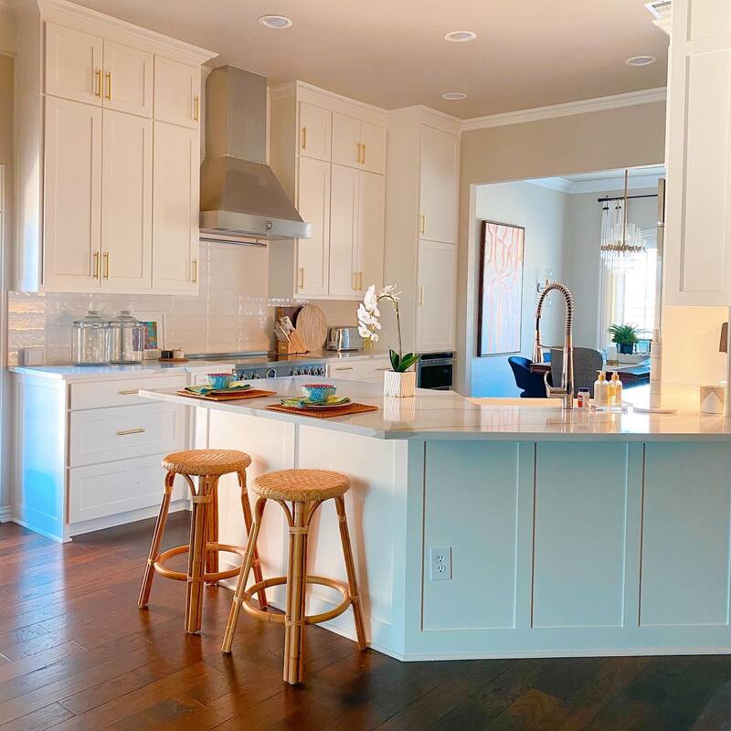
The sweet mother of one of our clients reached out to us back in the spring of 2021 about helping her update 2 bathrooms and her kitchen. She had a contractor lined up, someone who had done projects for her in the past, but hired us to do the design work. Her love of wallpaper and color made us giddy with excitement and Shauna couldn't wait to get started on the designs. The client was thrilled and signed off on everything with few changes and told us that the contractor would be able to start in a month or so and to go ahead and get everything ordered. That was in May. June: "Mrs. Smith? How's it going? Are they ready to start?" "No, he said he's still backed up. Maybe next month." July: "Mrs. Smith, just checking in on your project!" "He said not yet. So frustrating!" And on this went for several more months until finally Mrs. Smith said, "I'm tired of waiting, do you know people who can do the work?" "Hallelujah! Of course we do! We'll rally the troops." The project itself was not extensive other than the fact that it was 2 bathrooms and a kitchen. No footprint changes, just cosmetic refreshes; tearing out old vanities, updated lighting, new cabinet door fronts, paint and of course, wallpaper. We set up a makeshift kitchen for Mrs. Smith in her office with microwave, toaster oven, coffee machine, etc. since the kitchen was covered in plastic for painting. That didn't stop her, however from raiding the freezer every afternoon for her 5:00 martini. I think she must be related to the Queen. Five weeks later, Mrs. Smith was enjoying her afternoon martini in the comfort of her brand new kitchen and showing off her beautiful new bathrooms. There's some finishing touches to do here and there, but we couldn't be more proud of our crew who rallied at the last minute and over the holidays to make this project happen. Now for the fun part, before and after: Bathroom 1, "the dog's bathroom" (see? the Queen) We are still digging for pre-demo before images, but you can see that the can lights were installed up in the soffit above the sink. We tore that out and installed vanity lights over the mirror. The single vanity cabinet was replaced by a freestanding one. More photos to come here. Vanity: Wayfair Wallpaper: York Wallcoverings Lighting: Wayfair Bathroom 2: Guest Bath There was some plumbing work to be done in this bathroom as we added another sink. Why these houses had such long vanities with only one sink is beyond me! We also tore down the wall between vanity and toilet, and the soffit where lights were. Such an amazing open, bright transformation! Vanity: Signature Hardware Floor tile: Tile Shop Shower tile: Tile Shop Lighting: Wayfair Wallpaper: James Dunlop Textiles Mirrors: Serena & Lily Faucets: Wayfair Kitchen Still a few finishing touches like hardware, etc needed but oh my! what a change. The cabinet frame was kept in tact and we just replaced the doors with a more modern shaker style. New quartz countertops and tile backsplash, tile floor (same as in bathrooms) and gorgeous, colorful wallpaper. Lastly, we replaced the ceiling fan with a chic flush mount light fixture. Martini, anyone? Cabinet paint: Turkish Tile and Snowbound by Sherwin Williams
Tile floor: Tile Shop Backsplash: Tile Shop Soffit wallpaper: Thibaut Cabinet wall wallpaper: Thibaut Flush Mount Light: Hudson Valley Lighting Stay tuned for more updates and photos of this project. Including a dining room refresh! Love these or any of the other wallpapers you see on our posts? A lot of them are available to the trade only, so please reach out if we can help you buy the wallpaper of your dreams! This post contains affiliate links and we may be compensated for purchases made via these links.
2 Comments
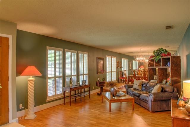
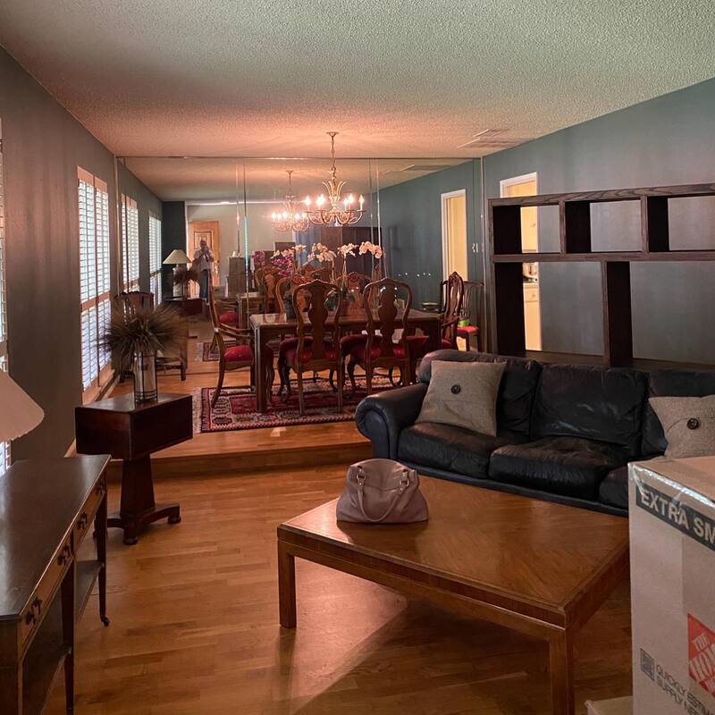
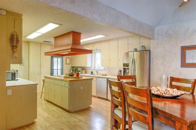
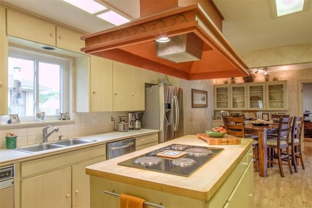
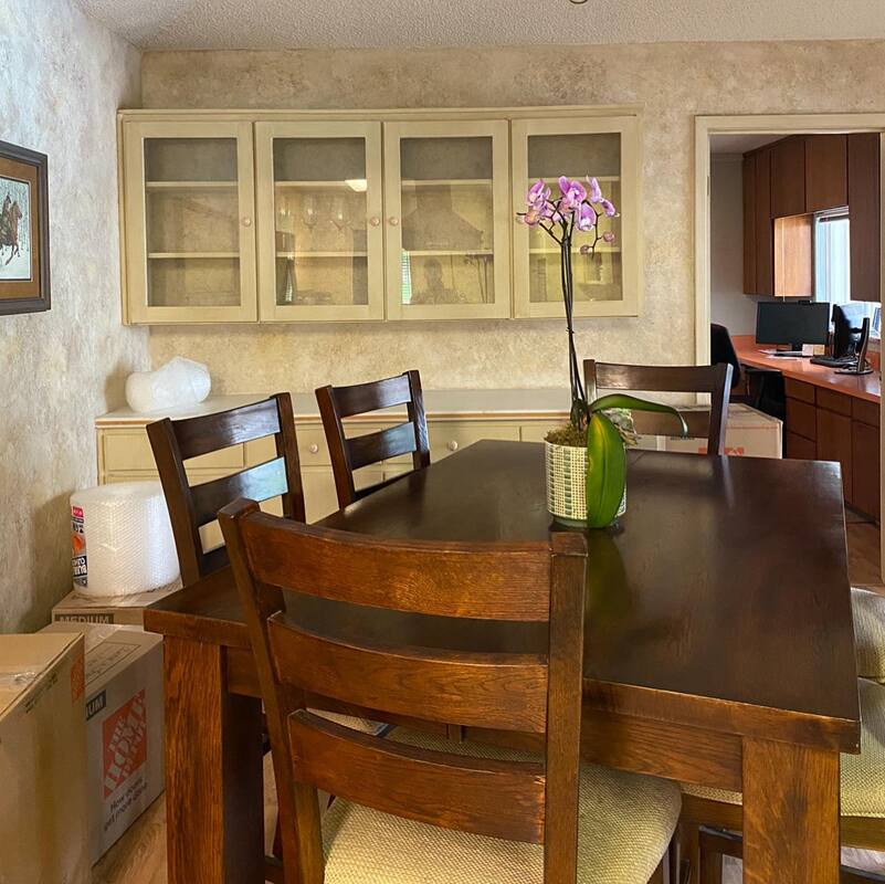
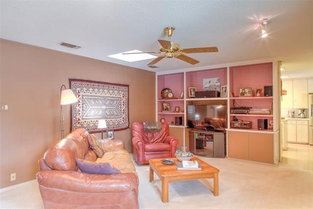
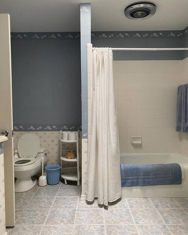
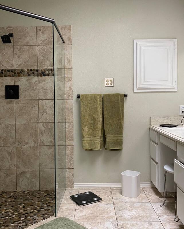
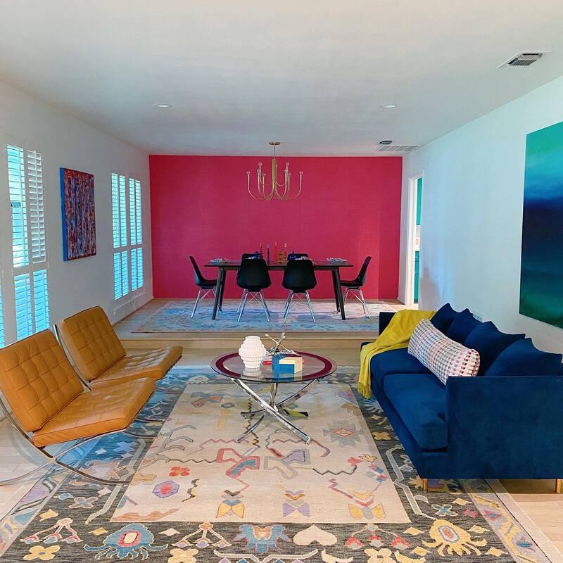
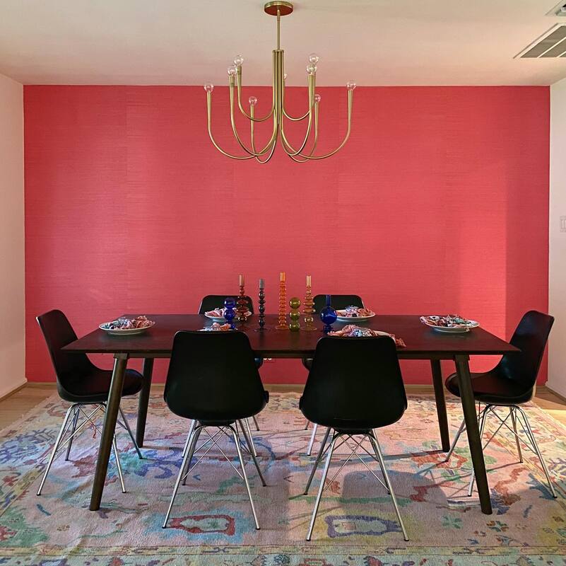
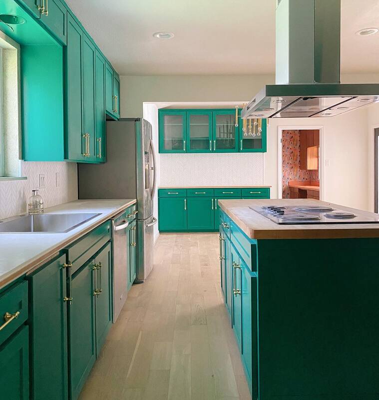
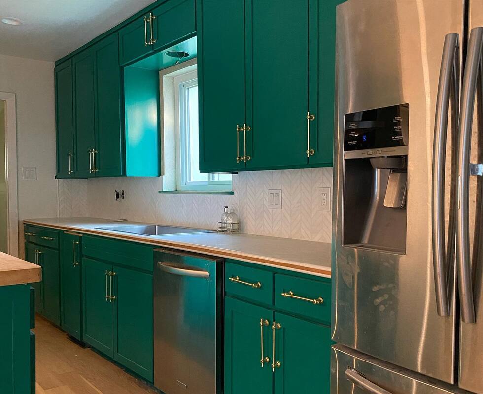
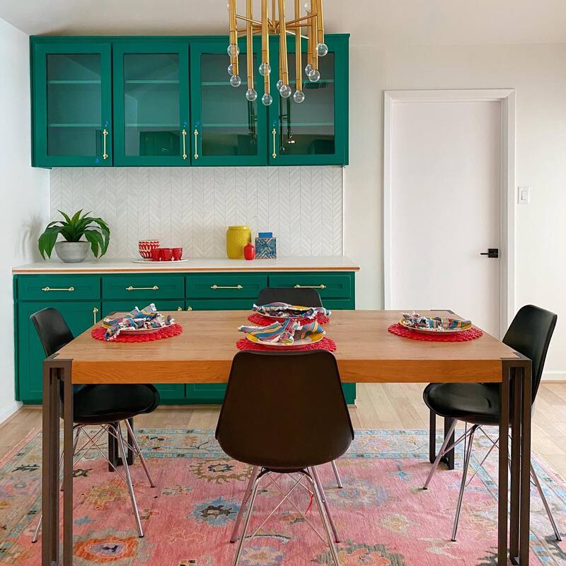
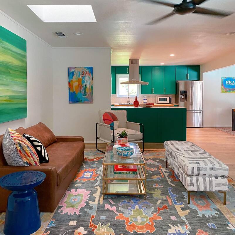
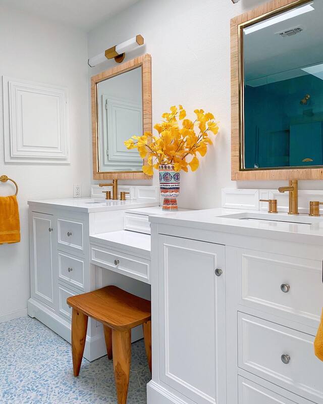
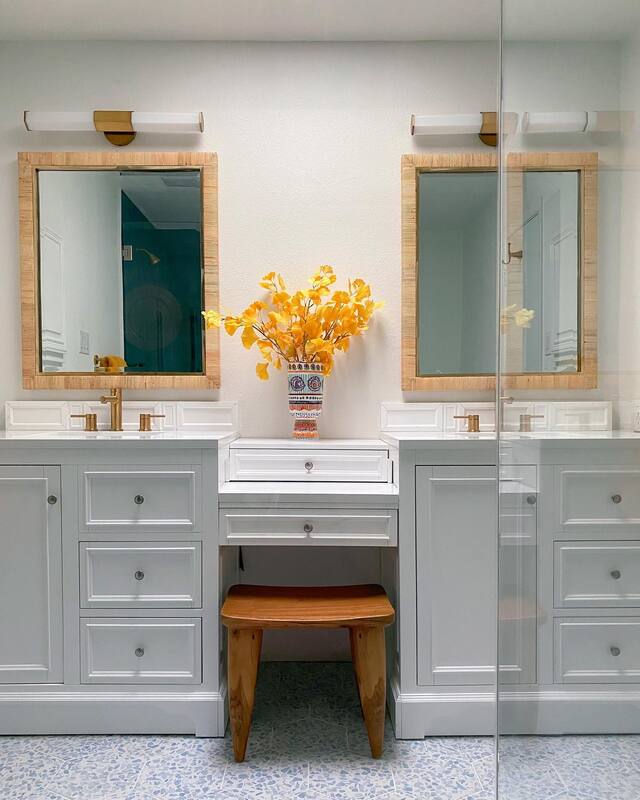
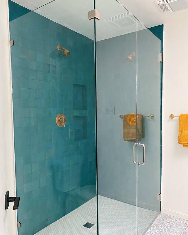
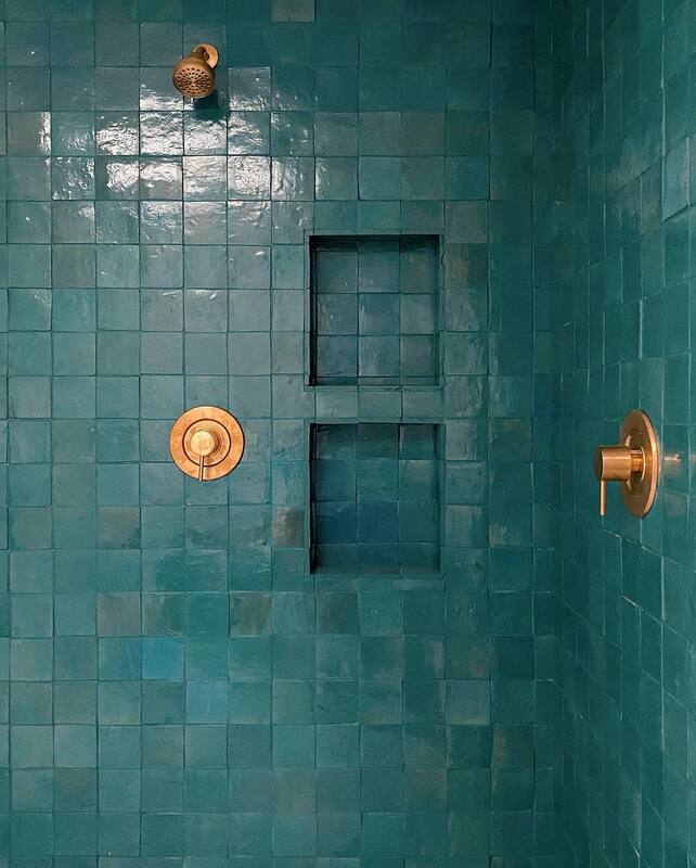
About nine months ago, we received an email asking if we could consult on a new home build in San Antonio. After some communication back and forth, the potential client, let's call her Lisa, said they had changed plans and were not going to move at this time and were staying in Fort Worth. Fast forward 6 months and Lisa reached out to us again to say they had bought a new house in Fort Worth and wanted to hire us to renovate their 1960s ranch. It was not necessarily going to be their forever home, but there were several things that had to be addressed before the family of 4 could move in.. Dropped and popcorn textured ceilings, 9 different types of floor covering, bad paint, mirrored walls, dated bathrooms and a kitchen all needed to be renovated and updated. In addition, new can lighting to be installed throughout the house all within a tight timeline of 8 weeks. As you probably know, Shauna is always up for a challenge so we called in our team to get bids going and started demo within the next week. Here's where we started: Living/Dining RoomKitchen and Family RoomJack & Jill BathroomMain BathroomWhat you don't see in the images are the original terrazzo floors in the entryway and down the hallway. We knew we wanted to preserve those, so they were covered up before any demo work began. Then our crew dug in to scraping the ceiling, removing the mirrored wall, tearing up carpet in family room, wood floors in living and family room, and tile in kitchen. Four different types of flooring there, now all one consistent unstained white oak wood floor. We also painted everything our favorite white, Sherwin Williams Snowbound. In addition, the two bathrooms were demoed and on their way to becoming their beautiful new selves. The clients had a move-in date rapidly approaching so we had to get at least one bathroom functioning before their deadline. Kudos to our team for stepping it up in that last week to get us there. Now for the kicker. As Shauna was doing a walk through with the client, Lisa broke the news to Shauna that her husband had accepted a job in San Antonio and they were NOT in fact going to move in. So, the "Operation: Move in" quickly turned in to "Operation: Sell" and the team got everything on the punch list completed to list the house for sale. Here's where we ended up. Ignore the furnishings, these were rented to stage the house. Except for the rugs, those are for sale! Living/Dining RoomWe debated about moving forward with the hot pink grasscloth wallpaper after we knew the house was going to be sold, but it had already been purchased and, what the hell. Someone will love it. Wallpaper: Thibaut (similar here) Chandelier: West Elm Kitchen and Family RoomWe never knew we'd love a green kitchen as much as we do. We kept the original cabinets, adding a shaker style trim to the door and new hardware, then painted this gorgeous green color. The countertops are original solid surface with a wood inlay on the edge so we definitely wanted to keep those. Backsplash was updated to a chevron patterned marble. You'll also notice that we raised the cabinets in the eating area to go all the way to the ceiling to make room for coffee machines and the like on the counter. In order to open things up, we removed the upper cabinets between the kitchen and living room. No one likes being stuck in the kitchen away from the party. Cabinet paint: Starboard by Sherwin Williams Tile backsplash: Tile Shop Cabinet hardware: Rejuvenation Chandelier: Wayfair Jack & Jill BathroomSince the bathroom was to be shared between the couples' daughter and son, we wanted something durable but still fun. We replaced the original tub with a deeper one, raised the height of the shower head, and had just enough room to install a double vanity. The floor looks like cement tile, but is actually porcelain, a much more durable and economical alternative. Tile floor: Wayfair Bathtub: Wayfair Vanity: Wayfair Faucets: Moen from Build Mirror: Serena & Lily Lighting: Wayfair Shower curtain: Anthropologie Main BathroomOur client wanted to keep the stool cutout section of the vanity so we found this great piece that fit perfectly in the existing space. The space plan of the bathroom did not need to be changed so everything we did was cosmetic. This gorgeous Zellige tile was our jumping off point for the shower and we paired it with a large terrazzo style hex tile on the floor. The brass fixtures and hardware add a modern pop.
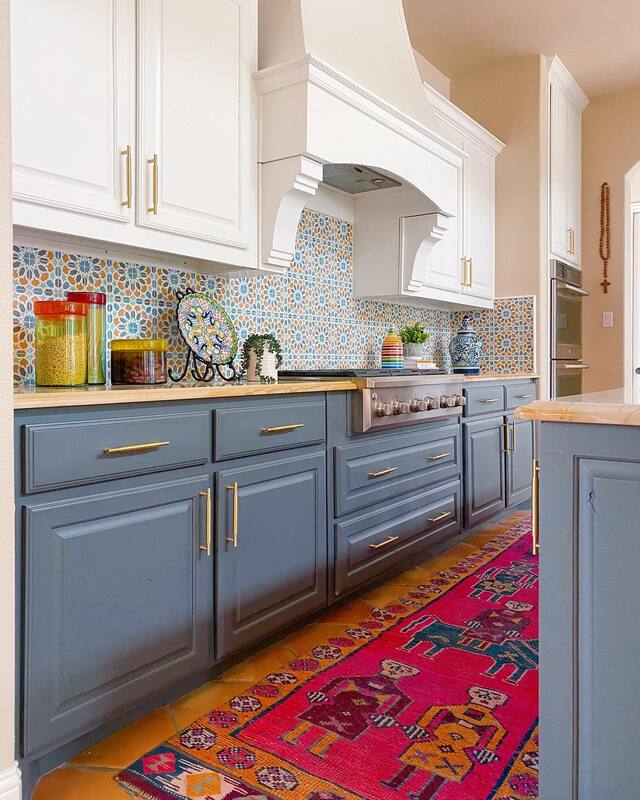
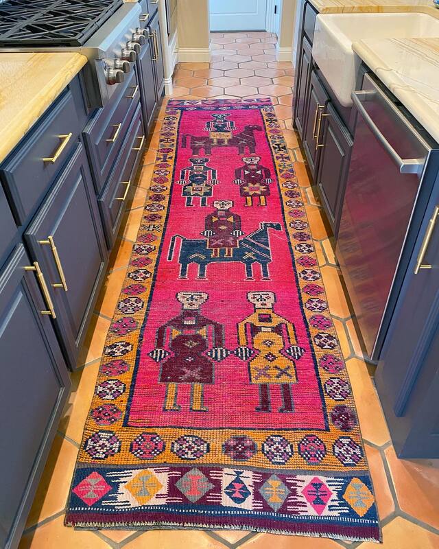
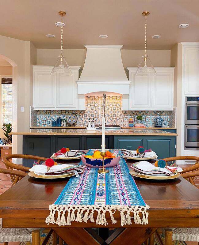
Shower tile: Zia Tile Floor tile: Tile Bar Shower fixtures: Moen from Build Vanity: Signature Hardware Sink fixtures: Moen from Build Mirrors: Serena & Lily Lighting: Shades of Light Vanity Stool: Pottery Barn So, after a mad dash on our punch list, the house was finally listed on the market. Last we heard, after the first weekend they had 6 showings and a full price offer. I feel like this is an episode of "Love it or List it" without the annoying British woman. Here's hoping Lisa hires us to come to San Antonio to design her new home. Some images courtesy of Realtor.com. This post contains affiliate links and we may be compensated for purchases made via these links. One of our most popular main bedroom and bathroom projects, and one of our earliest were for a client that, to be honest, is one of our favorites because she says "yes" to every wacky idea we come up with. You may recognize this room from the way back machine. (Resources below) And this bathroom... (details on the bathroom here) So, when the client reached out about updating her kitchen, we didn't hesitate to say yes. As we mentioned, the home was custom built in a Spanish style with soaring ceilings, wood beams and gorgeous Saltillo floors. We knew right away that we wanted to amp up the hacienda vibe but also infuse some modern elements. Paint, as we preach over and over again, is a gamechanger. Never underestimate what a difference a coat of paint can make. Kitchen Before Kitchen After I mean, paint! We went with white on the uppers and a dark gray on the bottom to allow the tile backsplash to shine. Both colors also play so well with the warm granite countertops. New hardware in brass pops off the cabinets instead of getting lost in the previous sea of brown. And let's talk about this tile. Handmade cement tile from Zia Tile that gives us all the Spanish Mediterranean feels and adds that much needed infusion of color we can't live without. The addition of a vintage runner makes it such a fun place to be, you might even have volunteers to do the dishes!
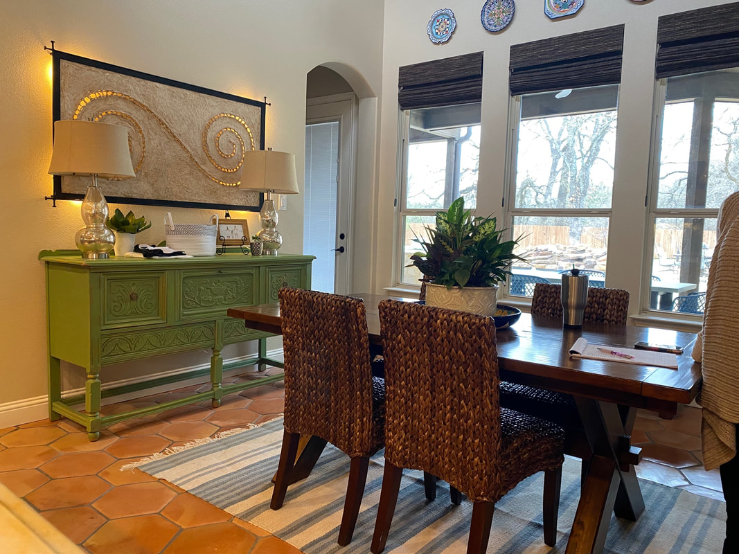
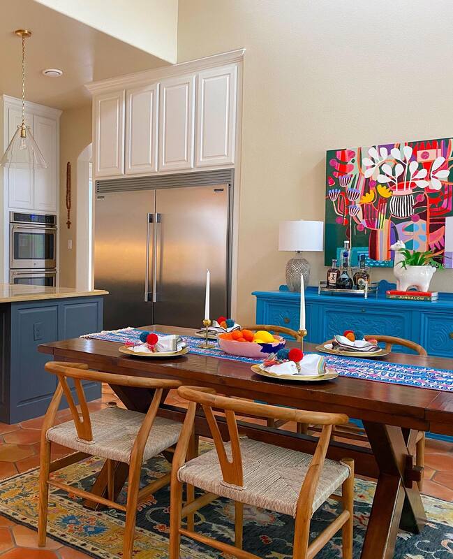
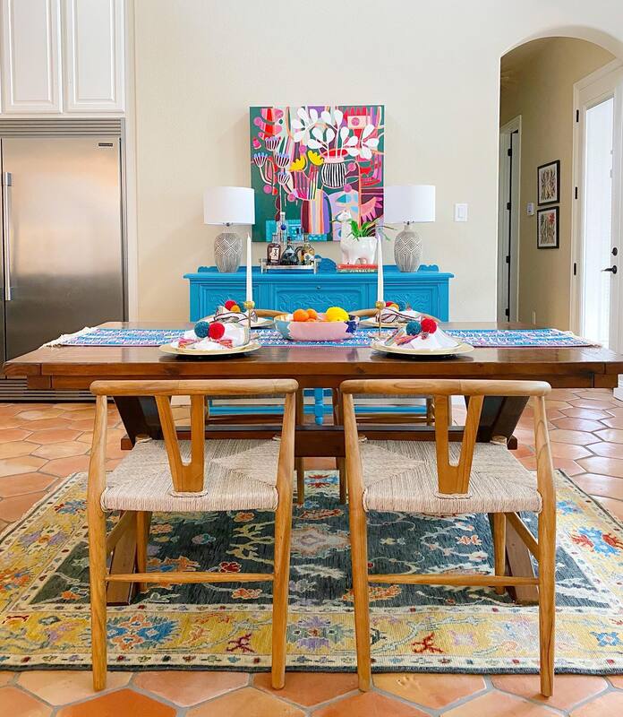
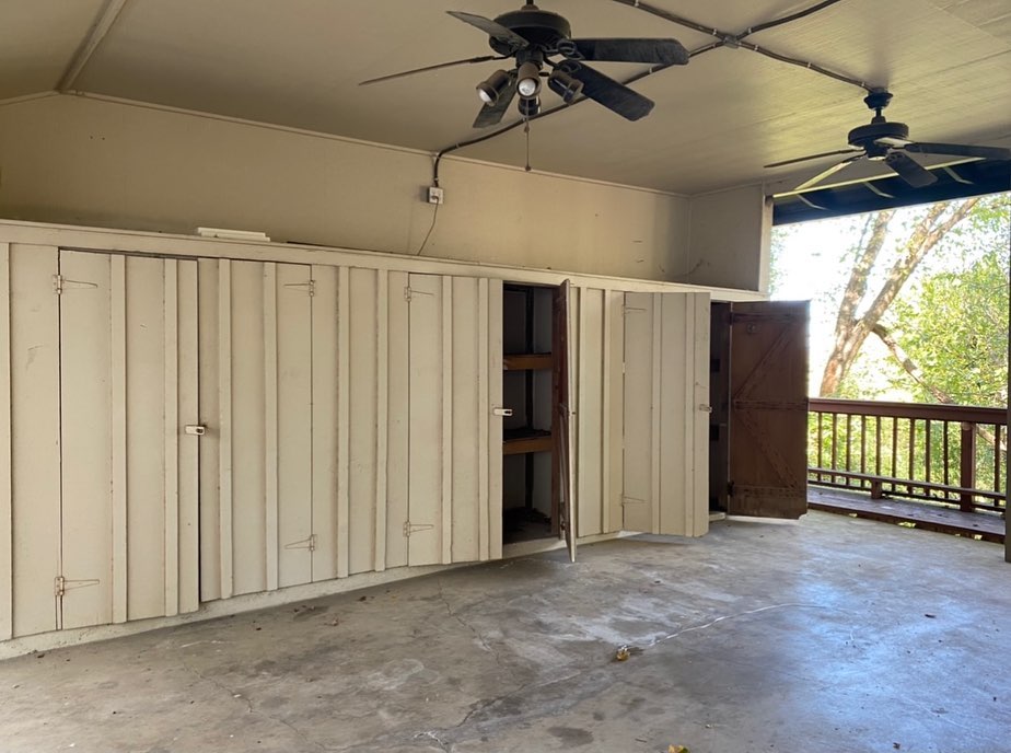
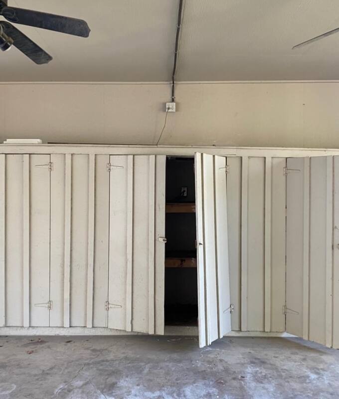
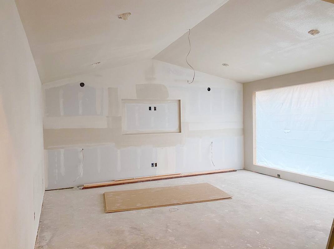
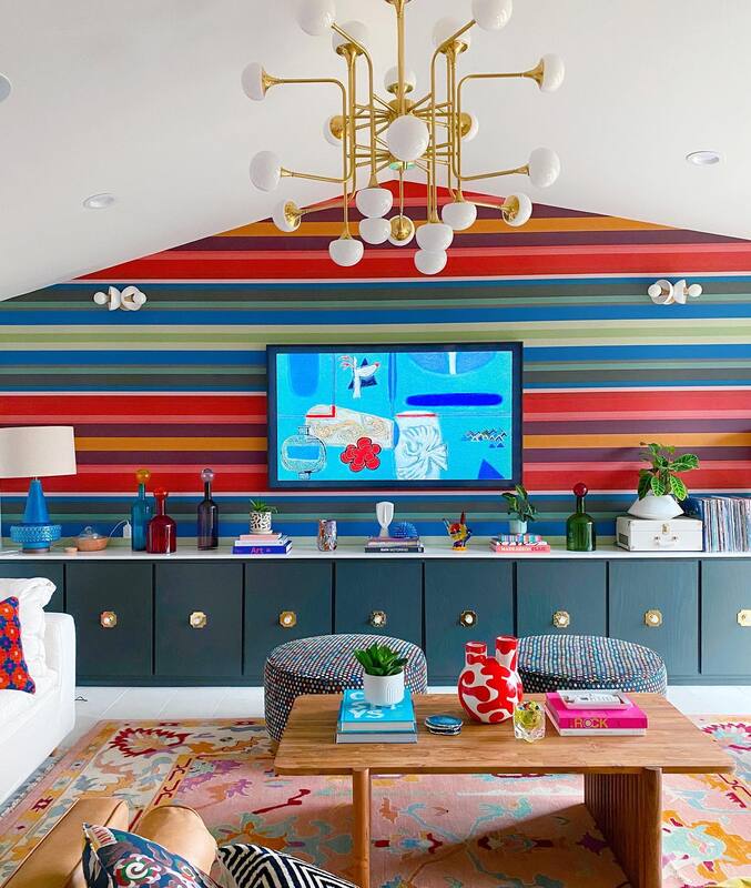
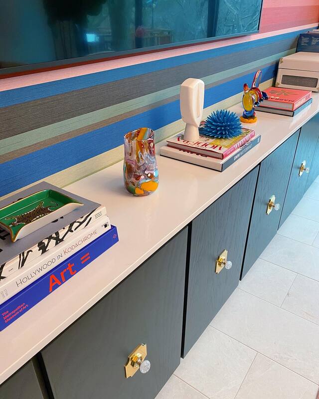
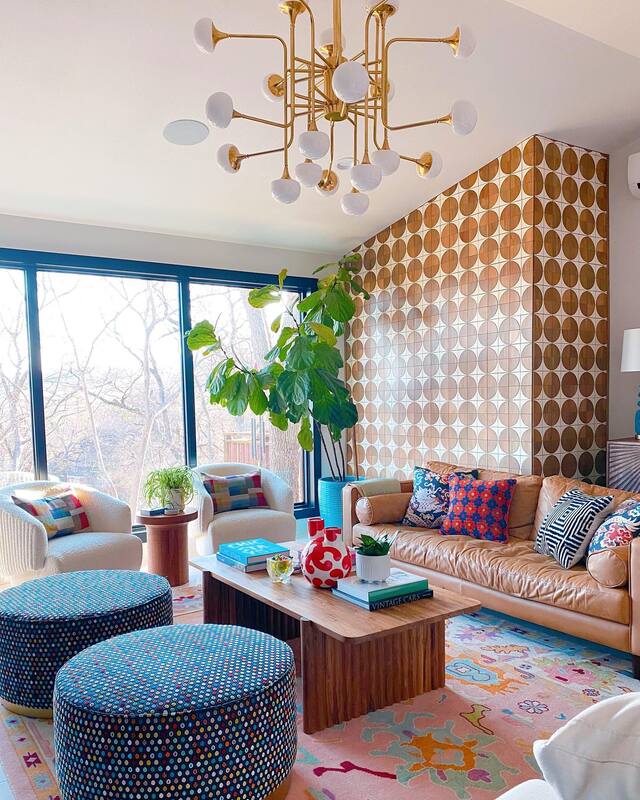
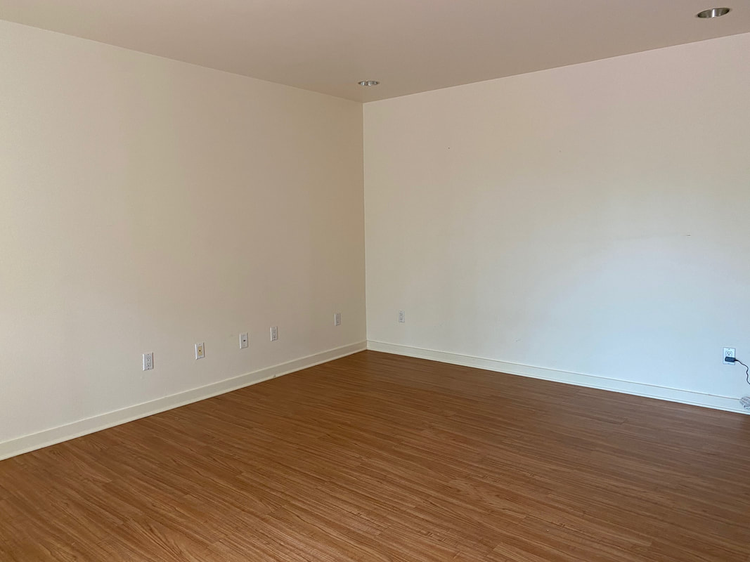
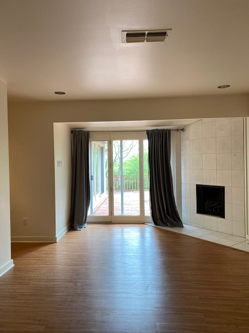
Kitchen Resources Cabinet uppers: Whitetail from Sherwin Williams Cabinet lowers: Peppercorn from Sherwin Williams Hardware: Signature Hardware Backsplash Tile: Zia TIle, similar here Pendants: Visual Comfort Rug: Vintage from Chairish, similar here In the dining area, the first order of business was to paint the sideboard a bright blue to play off of the tile backsplash. Add a pair of lamps, a plant and this amazing artwork from Marianne Rodriguez to create a dramatic focal piece that draws you right on in. The existing dining room table was updated with new wishbone dining chairs and a gorgeous Oushak rug. Remember that your wood tones don't have to match! In fact, it's way more interesting when they don't. Resources: Dining table: Pottery Barn Dining chairs: Wayfair Rug: Oriental Rug Galaxy Sideboard paint: Briny by Sherwin Williams Lamps: Anthropologie Art: Marianne Rodiguez So, the lesson for the day is, "When in doubt, paint." And the second lesson is, "Say yes to everything Shauna suggests." Trust us. This post contains affiliate links and we may be compensated for purchases made via these links. As we continue through Shauna's home and all the ongoing renovations, (seems there's always SOMETHING in progress!) we are focusing this post on the new addition. To refresh your memory, Shauna and her husband Jeff bought the mid-century home in Fort Worth back in May 2020. The house was transformed in 6 short weeks including entry way, family room, kitchen, bedroom and bathroom. After living in the house for a while and realizing the potential of the empty old carport, the decision was made to open up a wall and create a new living space. The old living room became a dining room, but you'll have to wait to read about that project. Carport space before: Living Room Addition After Anytime you can add more storage to a home is a good day. These built-in cabinets were done by our favorite carpenter, Colby Armstrong, and jazzed up with hardware from Modern Matter by Addison Weeks. A clean white quartz countertop provides the ideal surface for art, books and other décor.
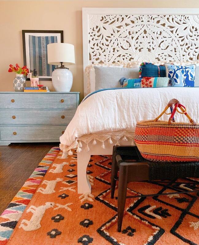
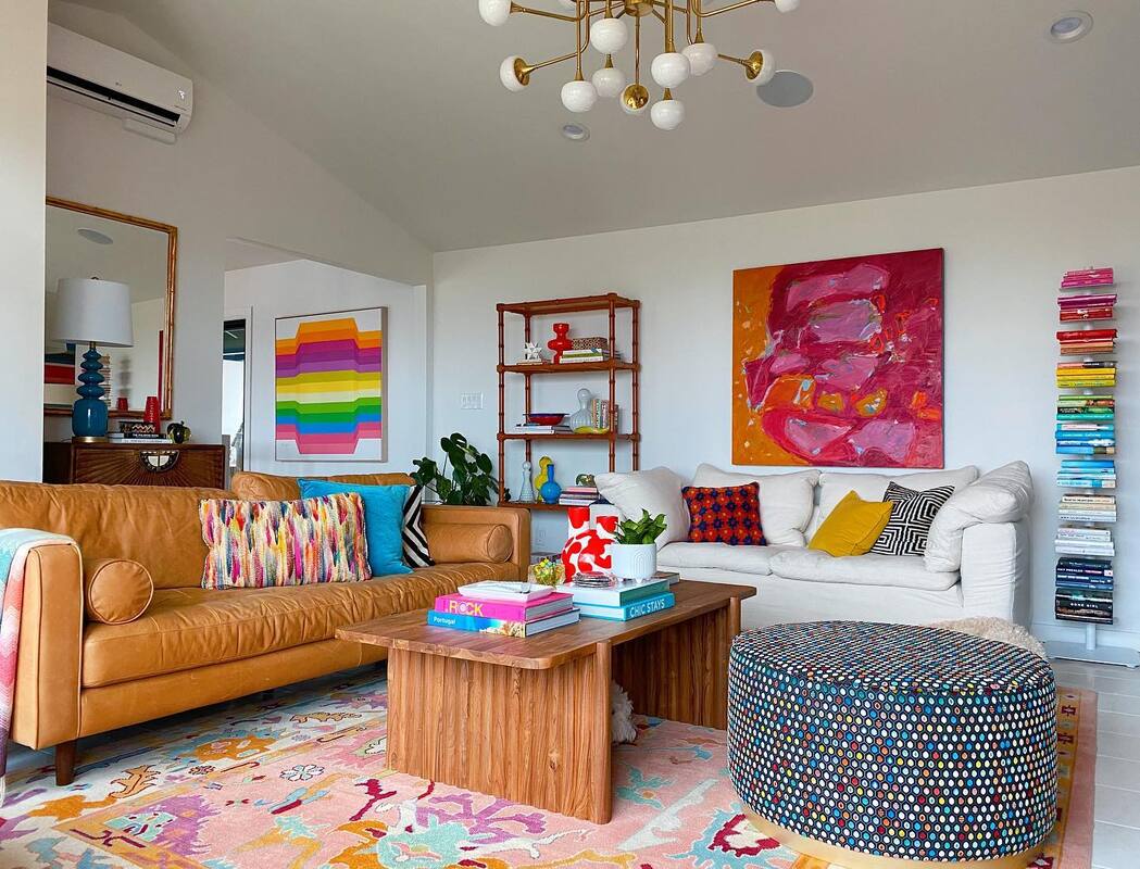
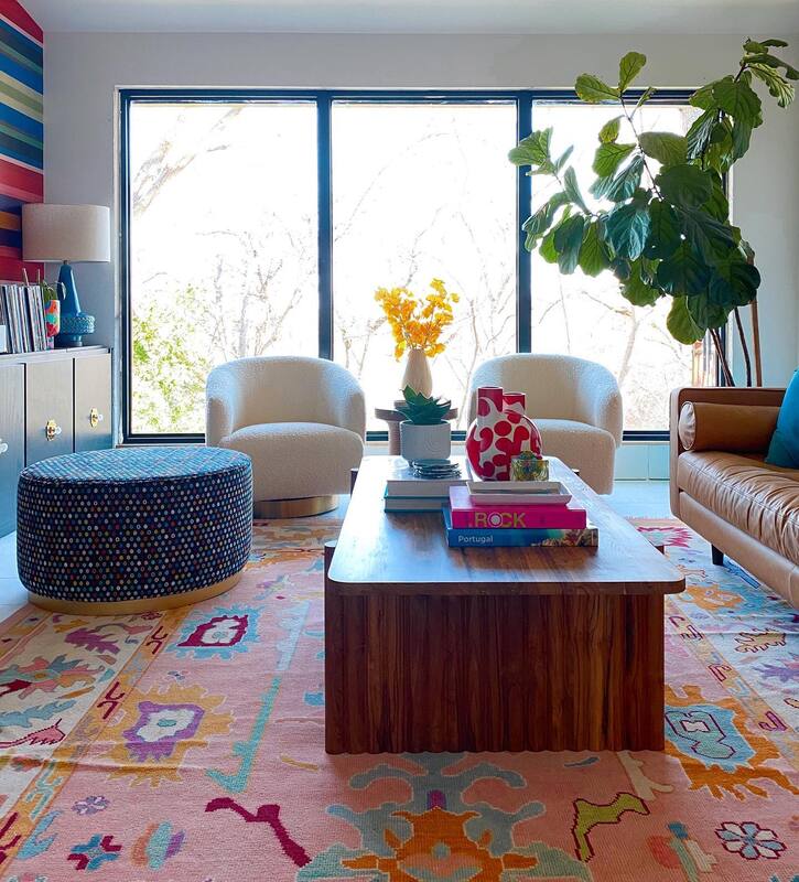
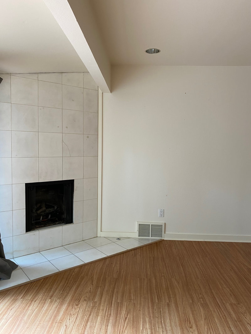
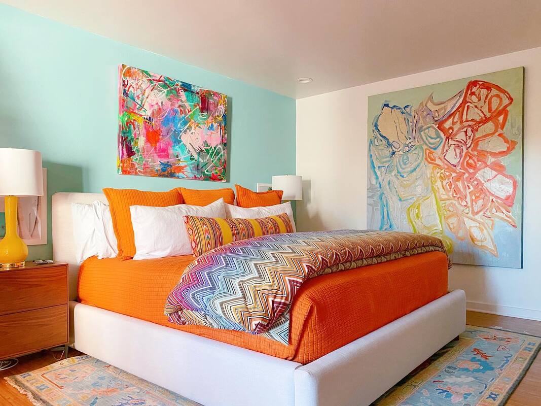
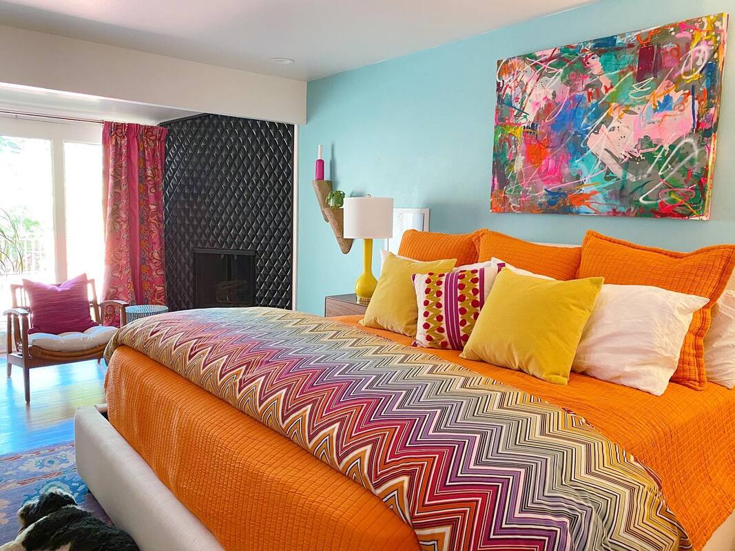
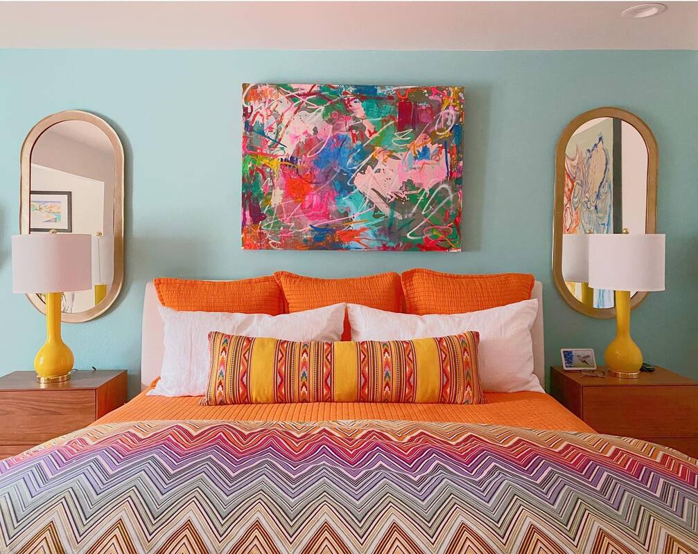
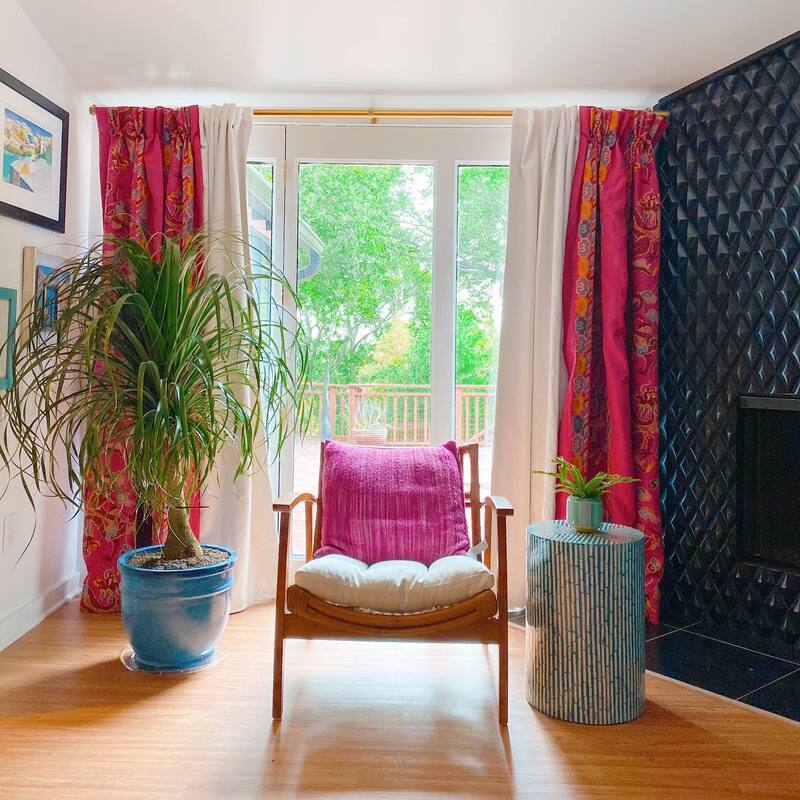
The custom Oushak rug was designed by Shauna specifically for this space and plays perfectly with the vintage inspired striped wallpaper. Side note; our wallpaper installer was not happy when he was told the stripes needed to go horizontal instead of vertical. One of our favorite design techniques is to buy inexpensive upholstered furniture from places like Wayfair or Overstock and have them reupholstered in something fabulous. Everyone deserves a custom piece of furniture in their home! We are hard core followers of the reviews so be sure to check those out before you buy. These ottomans were bought from Wayfair and upholstered in this amazing cut velvet fabric from Osborne and Little. Lastly, this magic thing on the wall is a Samsung Frame TV. Framed out like a real piece of art, it comes with an assortment of art that can be displayed on the screen while not in use. You even have the option to upload your own images. Way cool, way fancy, and super casual and relaxed all at the same time. Resources: Leather sofa: Article (similar here) White sofa: Restoration Hardware (similar here) Swivel chairs: Scout Design Studio (similar here) Chandelier: Hudson Valley Lighting Coffee table: CB2 Snake side tables: Overstock Ottomans: Wayfair (fabric from Osborne and Little) Blue lamps: West Elm (no longer available, similar here) Wallpaper: Wallpaper from the 70's Marble tile floor: The Tile Shop Wood wall tile: Indoteak Design Abstract art: Beth Gandy Book tower: Design Within Reach Rug: Oriental Rug Galaxy (custom, similar here) Etagere: Wayfair Chest: Anthropologie Brass mirror: Pottery Barn Teal lamp on chest: Wayfair Round wood side table: CB2 Wall sconces: Dutton Brown TV: Samsung Frame Read more about Part 1, Part 2 and Part 3 in our previous posts. This post contains affiliate links and we may be compensated for purchases made via these links. So, it's been a minute since we've shared Part 1 and Part 2 of Shauna's MCM house renovation. So many minutes in fact that rooms we shared with you in Part 1 and Part 2 have already changed, so you might want to go back and review for all the details. Today though, we are bringing you the main bedroom and en suite bathroom. Main Bedroom Before We like to call this a perfect blank slate. Great floors, white walls, simple recessed lighting, the ideal canvas to create magic. AND bonus, a fireplace in the bedroom! Construction wise, that was the only thing that was updated in this room, the tile on the fireplace. Now it's a cool 3-D black tile with black marble hearth. The other finishing touch was a pale aqua paint on one wall and it's move in ready! Main Bedroom After Resources: Bed: West Elm Bedding: Orange Coverlet from Annie Selke, Duvet Cover from Missoni Home Bedside tables: West Elm (sold out, similar here) Lamps: Wayfair Mirrors: CB2 Art over bed: Amy Young Large art: Beth Gandy Fireplace tile: Tile Shop (discontinued, similar here) Armchair: CB2 Inlay end table: Home Goods (similar here) Curtains: Custom made with Schumacher fabric Bathroom Before You probably won't be shocked to know that this bathroom has already gone through a second evolution since Shauna moved in. Thanks to COVID and almost a month of quarantine, she had a LOT of time on her hands. That, and a fab wallpaper that was meant for the new living room that was just begging to find a new home. Bathroom After There are two vanity areas, so definite "His" and "Hers" spaces made it easy for Shauna to be a little more playful on her side. Which is everything you see here. We try not to force Jeff to endure our styling his side of the bathroom. If you listen carefully, you can hear the birds in the trees.
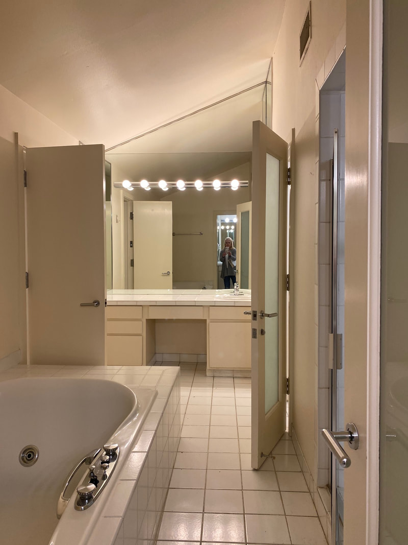
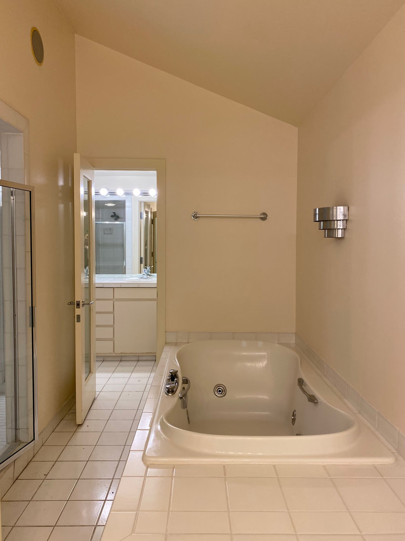
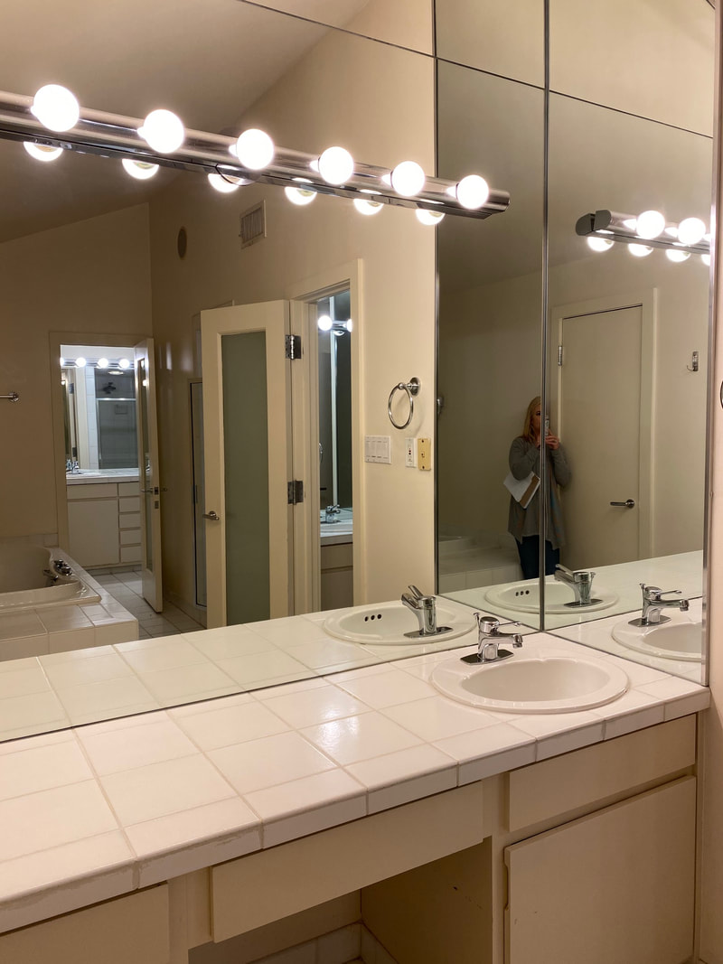
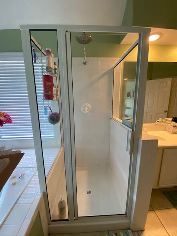
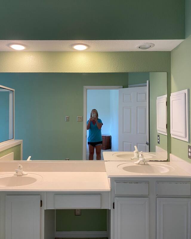
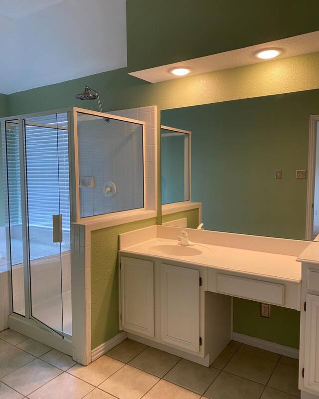
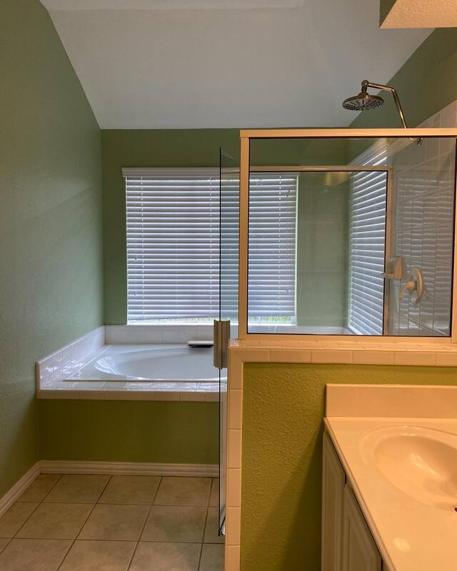
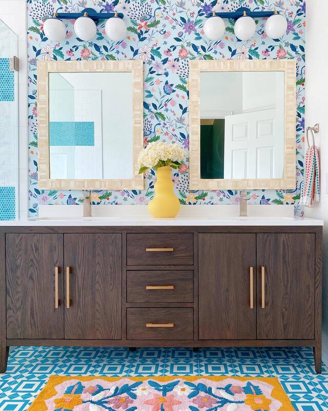
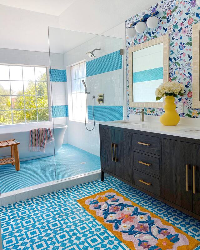
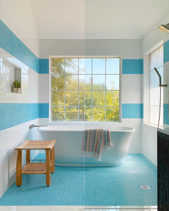
Resources: Flooring: Tile Shop Wall tile: Tile Shop Wallpaper: Wallpapers To Go Mirror: CB2 Vanity light: Wayfair Light over tub: Dutton Brown Towels: Missoni Home Be sure to check out Part 1 and Part 2 of the reno adventure and stay tuned for the exciting reveal of the new living space. This post contains affiliate links and we may be compensated for purchases made. We always cross our fingers that a renovation turns out as amazing in person as our initial vision and storyboard. AND that our client loves it as much as we do. Well, this latest bathroom project was a super duper success and I think all of us were blown away by the end result. The original footprint of the bathroom was a great size to begin with, so we were able to work with the original plumbing layout and had plenty of space to work with to create an elegant, fresh, happy room. Bathroom Before We love idea of a wet room, where the tub and shower are together behind a wall of glass, and this layout provided us the perfect opportunity to create one. The existing vanity needed to be updated for more storage as well as to remove features she didn't use (chair nook and multi-level sinks). We also removed the dated soffit containing the vanity light for an immediate refresh. Bathroom After Now, we assume that when people hire us to renovate bathrooms that they know that what we are going to propose is color and pattern. While we can and have done serene and elegant; bright, bold and happy is totally our jam.
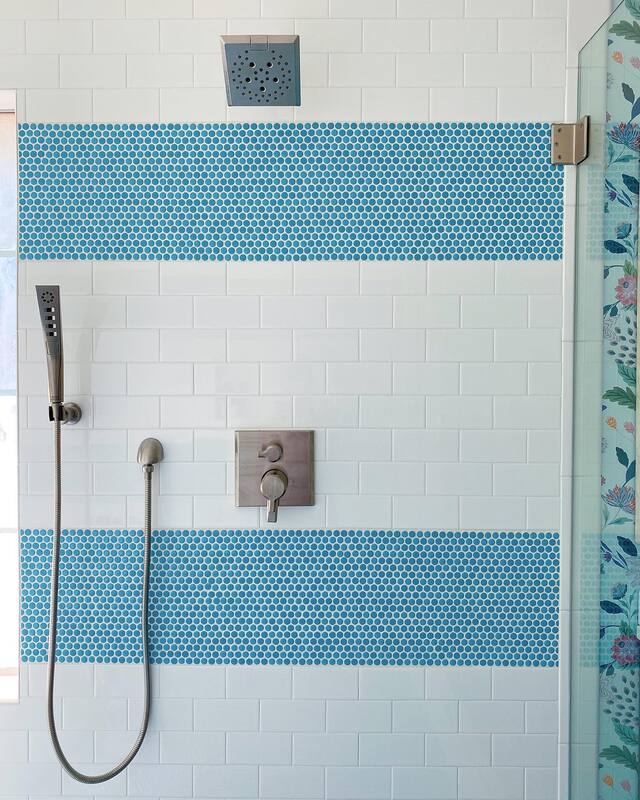
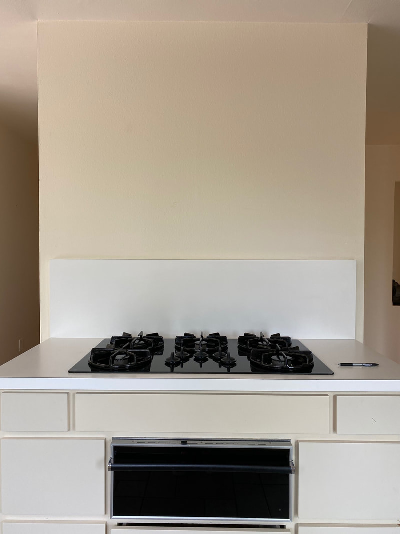
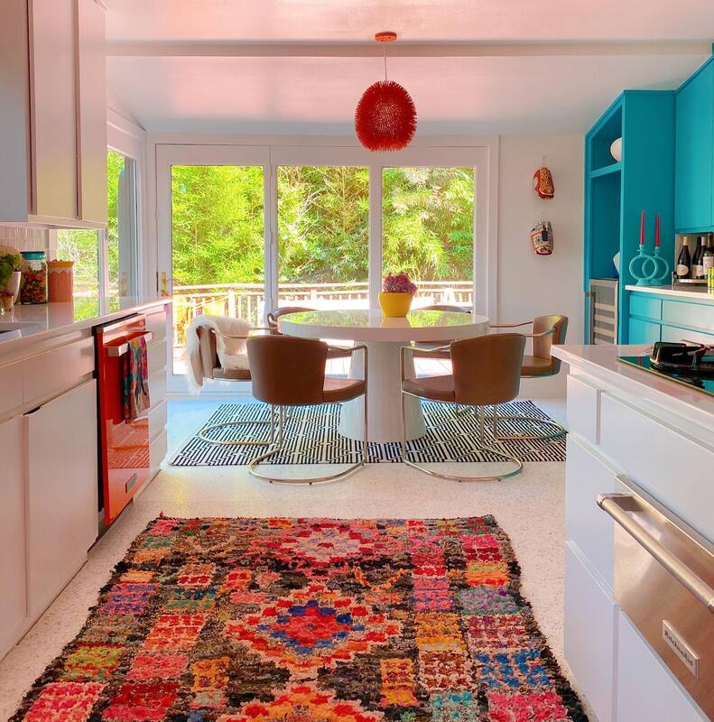
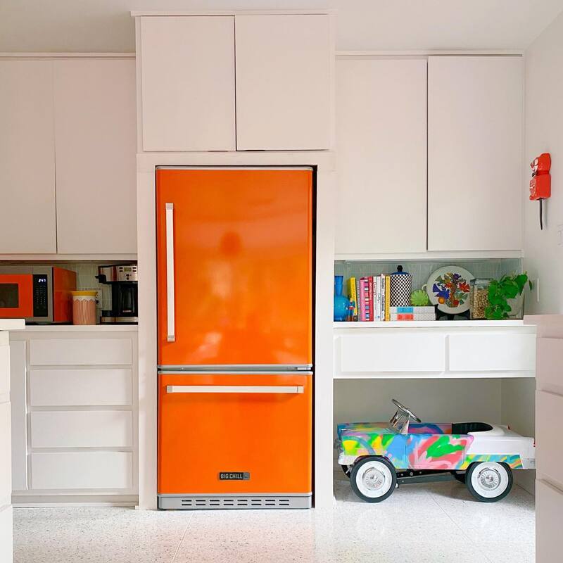
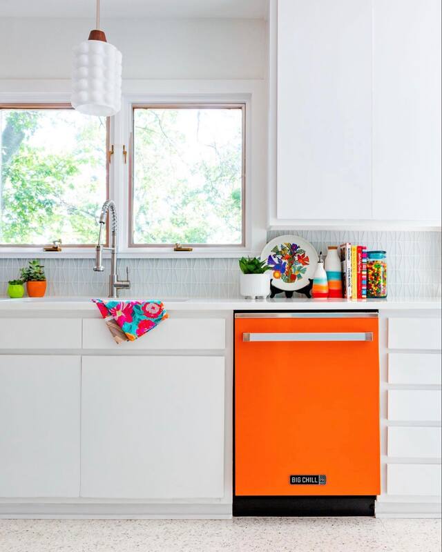
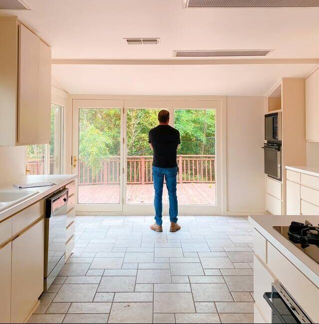
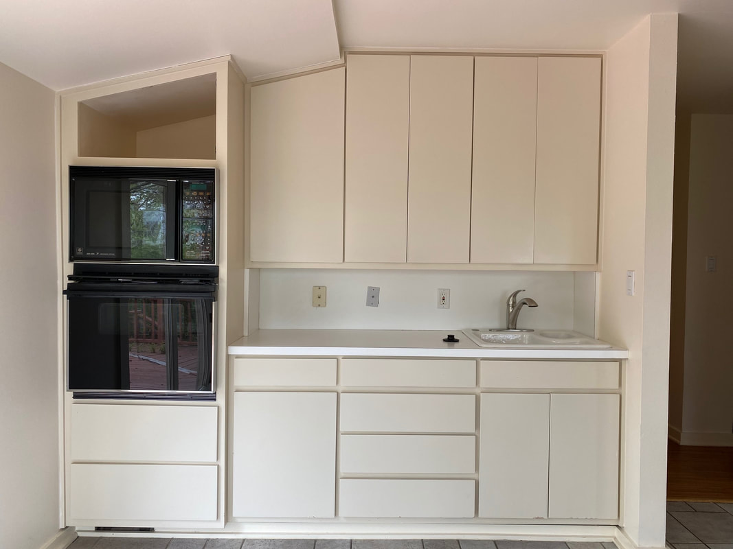
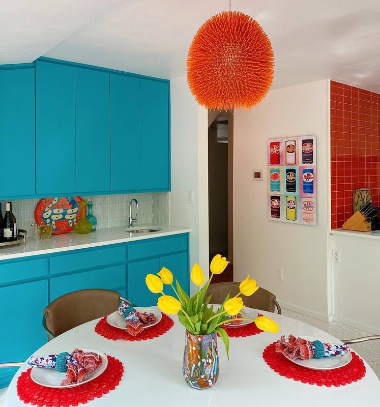
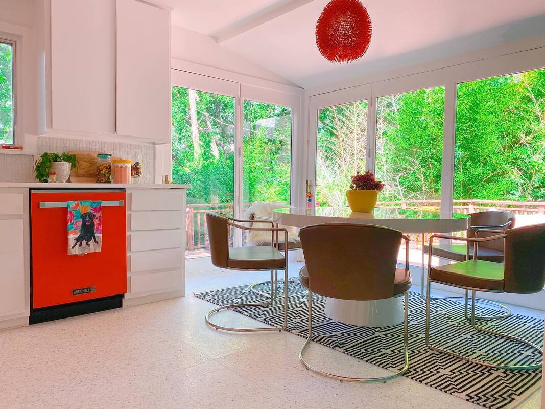
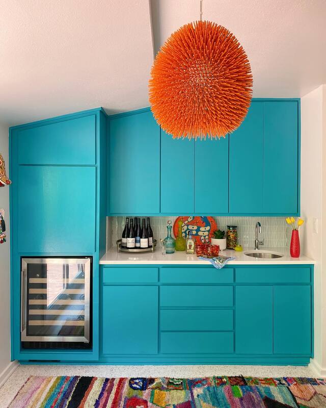
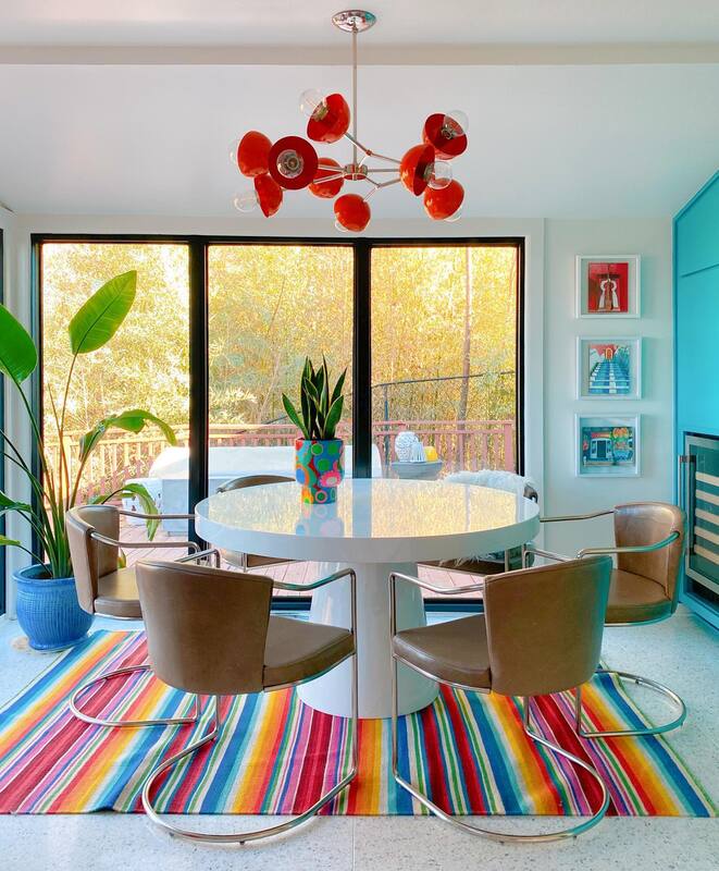
It might seem out of place to put a dark wood cabinet in this bathroom, but with so much blue and white, it needed a darker color to anchor the room. We also brought in natural elements in the bone inlay mirrors and teak stool in the shower, and like to include these elements in every design. Kind of like a visual sorbet to cleanse the palette! Because the wet room space was so big, we chose an economical white subway tile and aqua mosaic tile to match the floor. Mosaic tile is perfect for the shower floor as the grout lines provide a non-slip surface. By replacing the built in tub with a vessel tub, we gained a ton of room for the shower. Seriously, you could have a party in here. Lastly, the wallpaper from Anthropologie gives the space that feminine touch to balance all the geometric designs and dark wood vanity. I guess we passed the test because we are already hard at work on a plan for the client's guest bath. She's already told us though that it can't be as fabulous as this one. We'll try to contain ourselves. Resources: Vanity: Restoration Hardware Floor tile: Zia Tile Shower tile: Subway and mosaic both from Wayfair Bathtub: All Modern Shower fixtures: Wayfair Wallpaper: Anthropologie Mirrors: Serena & Lily Vanity light: Dutton Brown Teak shower stool: Frontgate Towels: Target Rug: Urban Outfitters Vase: Home Goods, similar here. So, are you ready to get started on YOUR bathroom reno? Contact us for more info! This post contains affiliate links and we are compensated for purchases made via these links. If you follow our Instagram, you have seen photos of Shauna's home renovation, but it's been a while since we've given you a peek in to the before photos and all the juicy details. Plus, well, there were some itty bitty finishing things that needed to happen in the kitchen, like doors and trim and paint, before we were ready to say "ta-dah!". That and there were no floors for a good 4 weeks. So, here is everything you ever wanted to know about Shauna's kitchen and dining area. Kitchen before So, bones are pretty good, right? Layout works, just needs some paint, new floor and to "Shauna" it up a little. Kitchen After The biggest expense was to add the Terrazzo tile floor. Made in the USA by Terrazzio, it had a lead time of about 6 weeks but it was totally worth the wait. Original laminate countertops were switched out for white quartz from Vicostone and where there was no backsplash, a snowy white glass one was added. The all white palette allowed for some super fun color pops in the Big Chill appliances and the orange glass subway tile behind the cooktop. Terrazzo floor: Terrazzio Sterling White Countertops: Vicostone White tile backsplash: Tile Shop Orange tile backsplash: Wayfair Appliances: Big Chill Faucet: Lulani Lighting: Wayfair Rug: purchased in Morocco, similar here Dining Space Before I mean, we work here every day and these windows are fabulous. Shauna felt the second set of wall ovens here were unneccesary (there are double ovens to the left of the fridge). So it became the perfect place for a wine refrigerator and additional storage for her vast amounts of vintage barware. Painting the cabinets this bright turquoise not only separates the space visually but brings Shauna's signature colors to play in the room. Dining Area After Note that the dining chairs are not fully sitting on the rug. We get this question all the time and yes, that is OK. A bigger rug would not have fit in this space so we just had to make it work! Cabinet paint: Biscay by Sherwin Williams Table: All Modern Chairs: CB2 Rug: Aelfie Lighting: All Modern Dr Pepper art: Sort of Cool Art As you know, we can never leave well enough alone, so this space has evolved with new lighting and a new rug. Just keeps getting better and better!
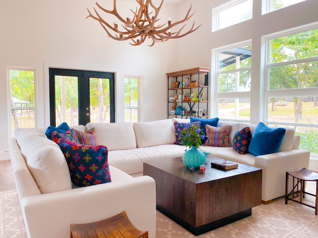
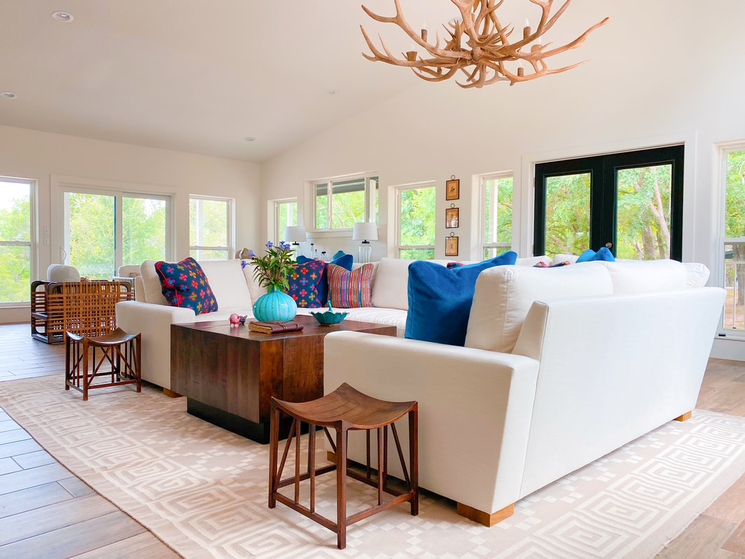
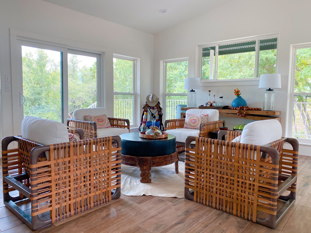
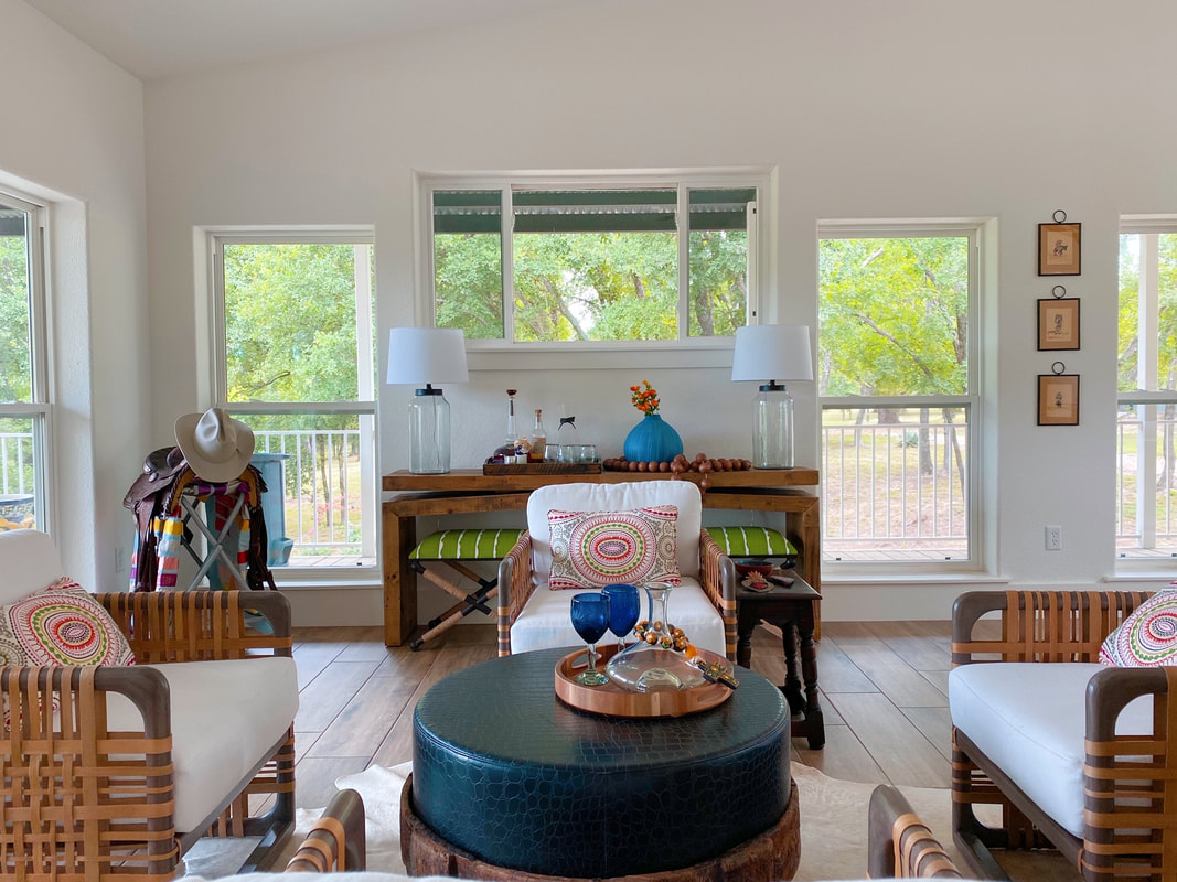
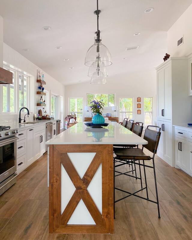
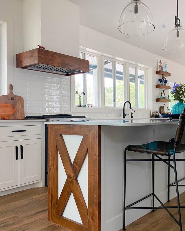
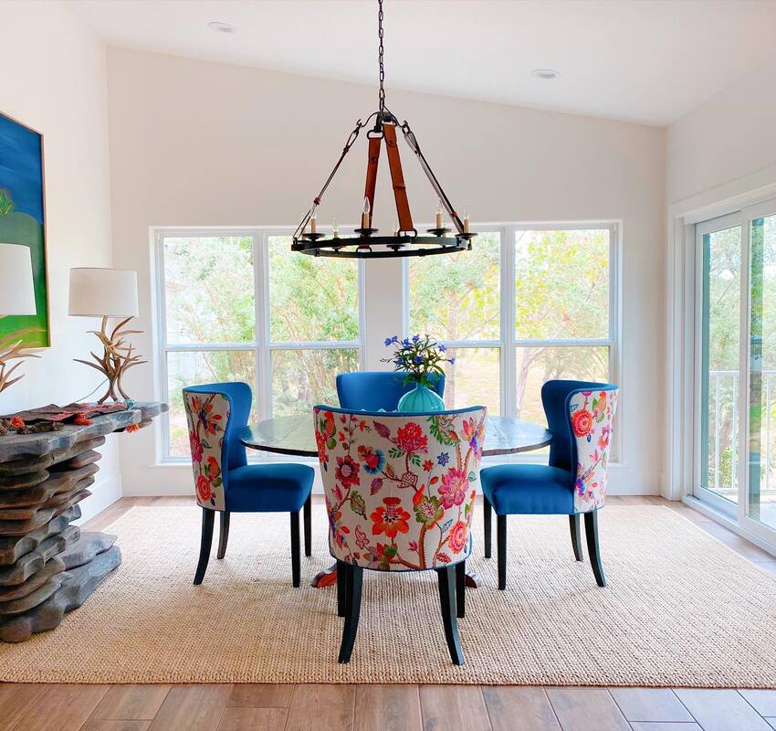
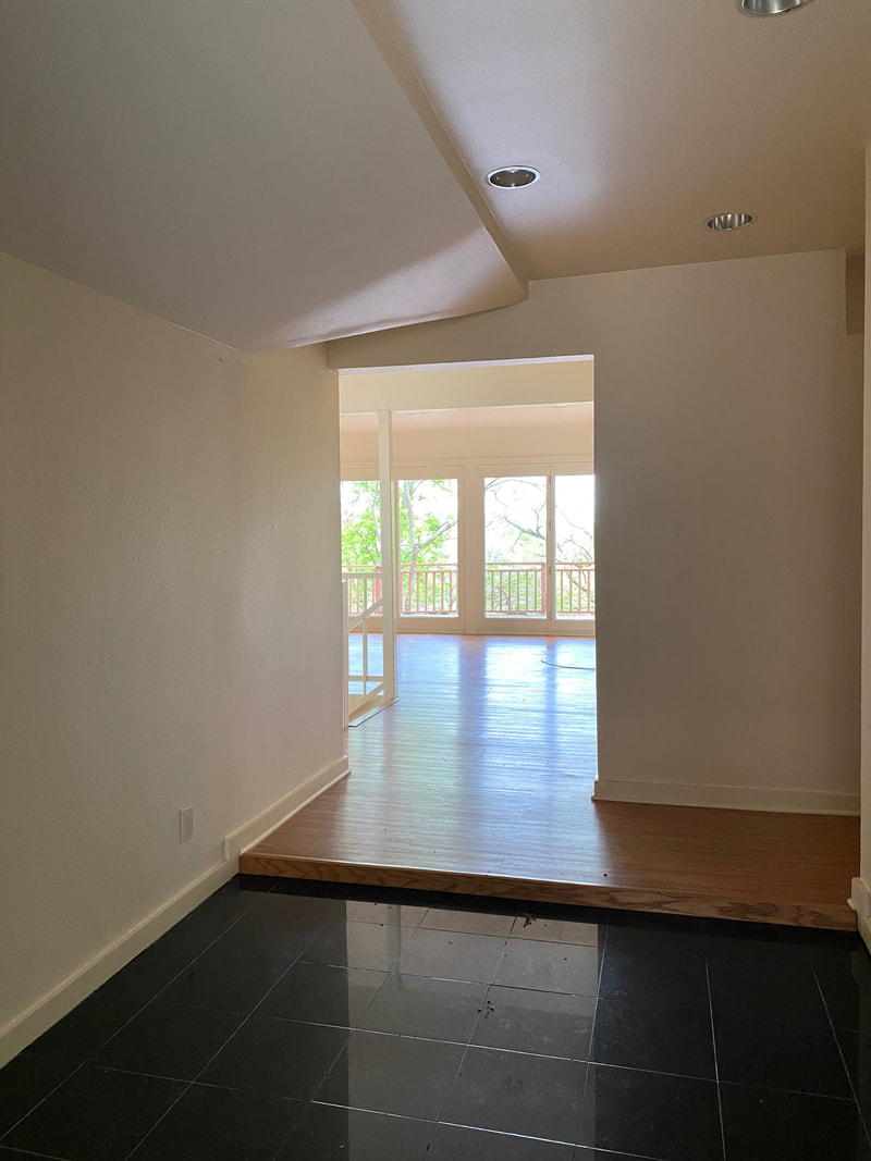
Light fixture: Dutton Brown Rug: Annie Selke Check out Part 1 of the reno here to see the entry way and living room and stay tuned for more amazing transformation stories. This post contains affiliate links and we may be compensated for purchases made via these links. When you think of a ranch in the Texas Hill Country, visions of rich leather, heavy wood, animal skulls and western art probably pop in to your mind. When one of Shauna's good friends came to her to update their family ranch, we knew that finding the perfect balance between the western ranch aesthetic and a fresh, modern look would be a challenge we were anxious to dive in to. The first space we tackled was the family room. A wide, open space that originally held a seating area and a dining table. We had other plans for a dining room (more about that later), so there was an opportunity to create a second seating area for afternoon cocktails, card games or just good ol' conversation. BEFORE: AFTER: I mean....wow! Right? We switched out the heavy leather furniture for a light, bright sectional from Restoration Hardware. Their Perennials performance fabric means you CAN have white linen at the ranch and not worry about mud or red wine or marinara sauce stains. We also added this great cocktail table, also from Restoration Hardware (similar here), but kept the homeowners rug and that amazing antler chandelier to maintain the ranch vibe. Custom pillows in cobalt blue mohair, and simple, colorful patterns and stripes provide a rich contrast to the white sofa and are still comfortable enough for an afternoon nap. In the new cocktail area, woven rattan chairs also from Restoration Hardware surround an antique Indian chakki table that has been topped with embossed leather to create a cocktail ottoman. The rustic console table from Four Hands fits neatly between the windows with two newly upholstered stools tucked underneath for easy additional seating. Of course, it's not a ranch without a cowhide here and there, so this seemed like the perfect spot. The homeowner is an avid collector of art and objects so we were not lacking for amazing pieces to style out shelves, tables and walls. For the kitchen, we wanted to continue the open, bright feel and also give the homeowner a place to showcase her collections. We chose white cabinets and countertops and oversized white subway tile but the wood accents in floating shelves, cabinet detail and the range vent create that warm, rustic feel. And remember the dining room that we eliminated? Well what used to be a fairly unused sunporch is now a bright and colorful dining room. BEFORE: AFTER: Seriously, y'all. This has to be one of my favorite before & afters. It's still obviously a ranch but modern and bright and colorful (but not too much) and homey. These chairs were ones the homeowner already had so we just reupholstered them in a yummy blue velvet and floral print from Schumacher. The stacked wood console table by Noir again keeps that wood/nature theme going. Simple jute rug from Dash & Albert is easy to maintain and allows the colorful chairs to pop. Chandelier from Suzanne Kasler has leather buckle detail.
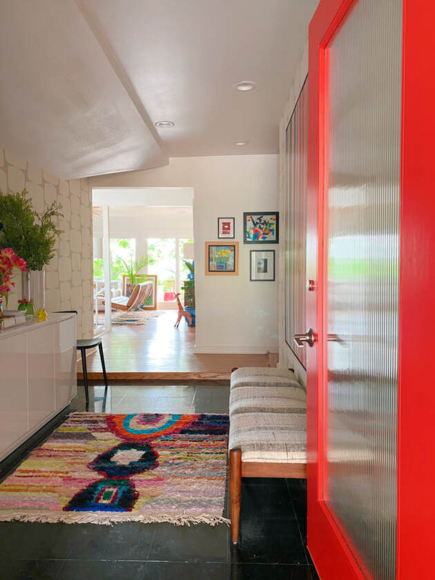
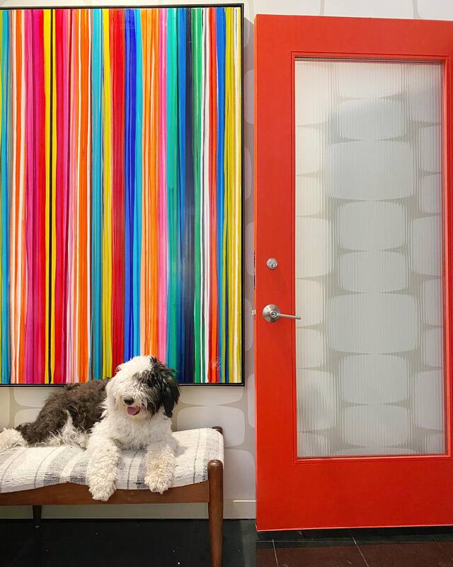
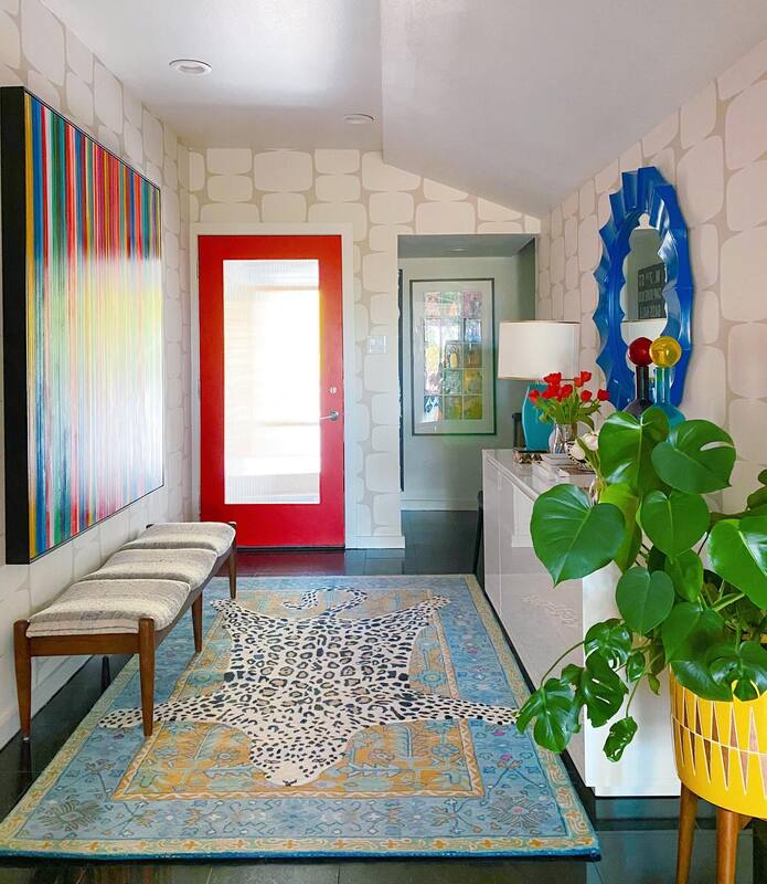
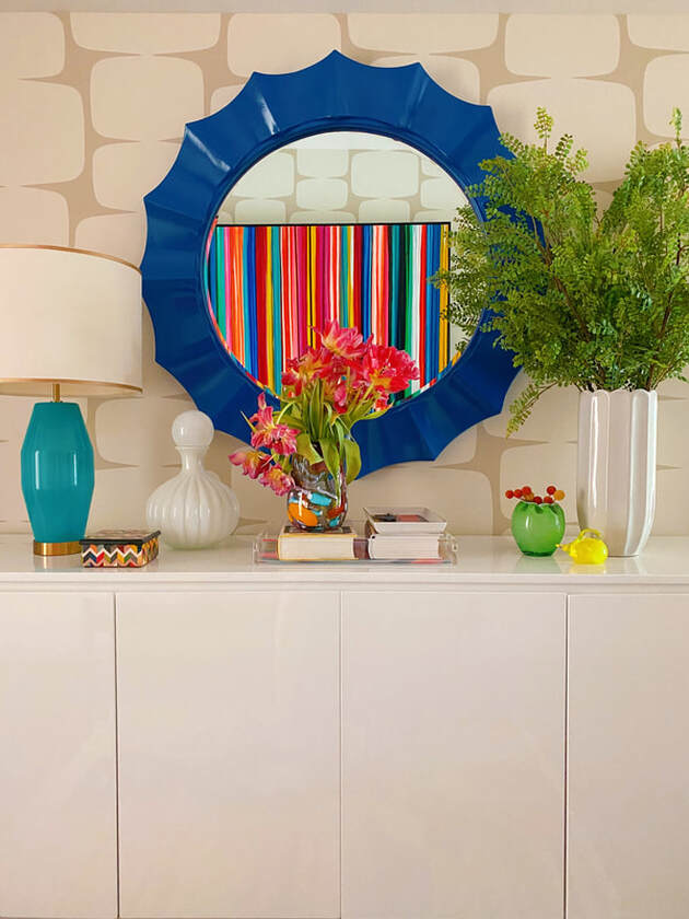
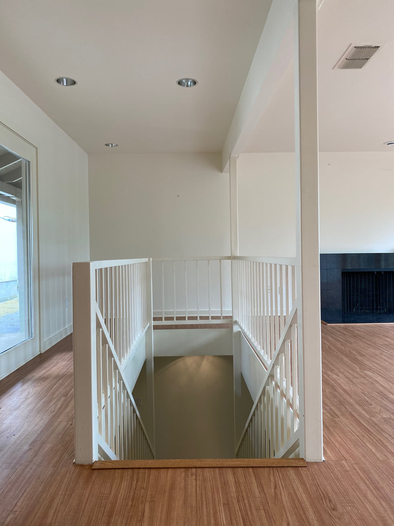
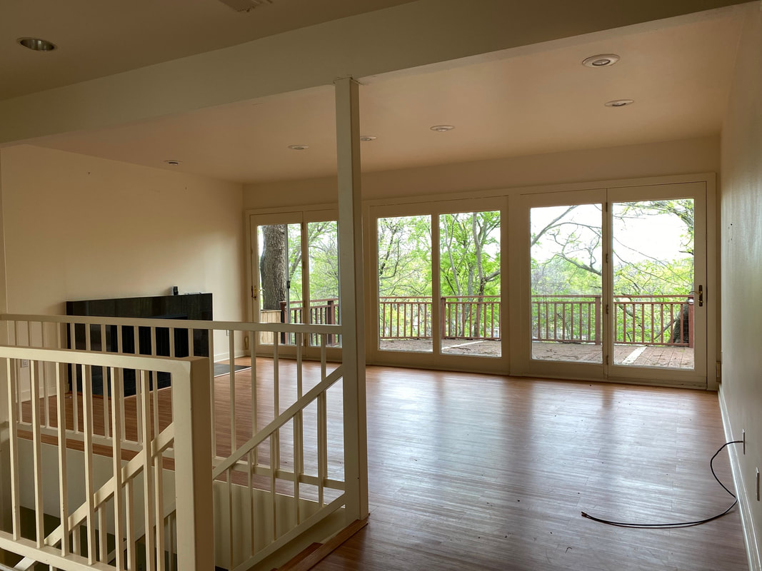
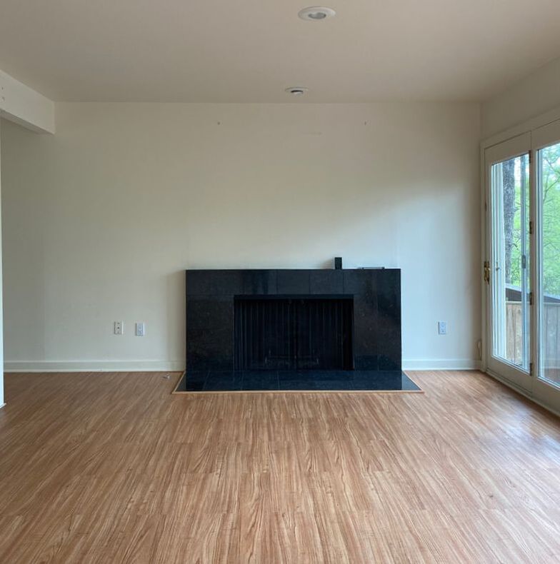
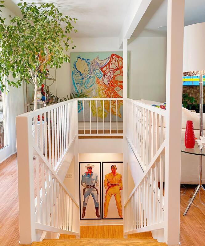
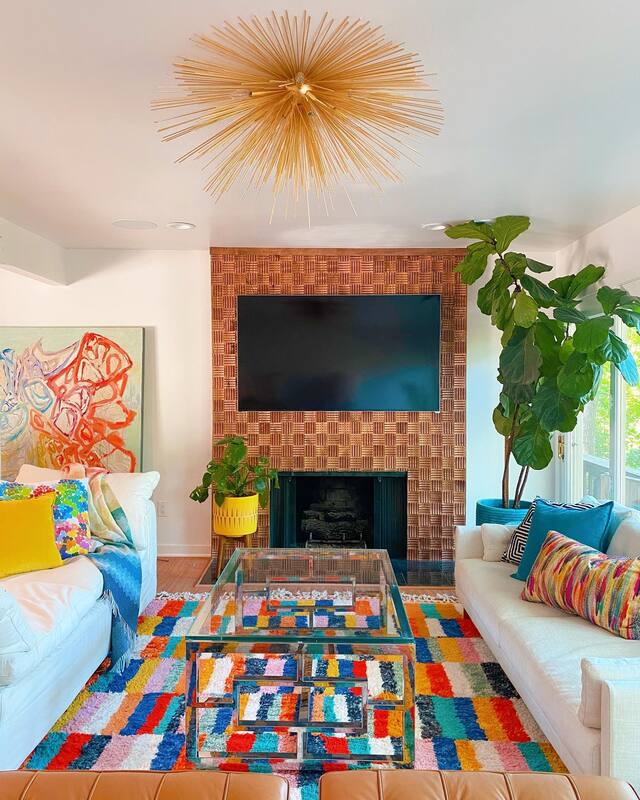
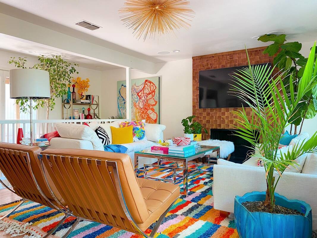
Check out more of our Before & After renovations here. Ready for us to tackle YOUR Before? Contact us for more info. This post contains affiliate links and we are compensated for purchases made via these links. If our Instagram messages are any indication, the renovation of Shauna's new MCM house has caught the attention of a good number of our followers. It's crazy that everything she did was accomplished in less than two weeks, but then, we know how it can be when you have a goal to achieve. There's so much really to share we're going to cover it all in several posts. Also, it'll give you all a reason to keep coming back to get all the details. We know a little bit about how this blogging thing works. :-) So, Part 1 will be the living room and entry way. Enjoy. Entry Before We kept the original marble floor in the entry and hardwood floors throughout which made the renovation not quite as long as it could have been. Paint throughout: Snowbound by Sherwin Williams Front door: Scarlet Sun by HGTV Home + Valspar Entry After One of our primary design philosophies is to start with a neutral backdrop and add color with art and accessories. The primary reason being that in the larger rooms of your home, it can be expensive to change out wallpaper, paint and large furniture when your style or design trends change. By keeping the "bones" neutral, it is easier to update accessories without a large investment. In this house, Shauna also wanted to keep the feel of the mid-century architecture as much as possible. In the entryway, she used a wallpaper with a modern design, but neutral coloring. The glossy white sideboard allows colorful accessories and mirror to stand out, and the vintage Moroccan shag rug ties everything together. Wallpaper: Lohko by Scion Sideboard: Wayfair Side chairs: All Modern Bench: Anthropologie Mirror: Wayfair Lamp: West Elm (discontinued, similar here) Artwork: Allison Castillo Designs Rug in first image: Purchased in Morocco, similar here Rug in second image: Anthropologie Living Room Before The first step in renovating the living room was to reface the fireplace. Shauna wanted a statement installation to balance all of the white walls and when she stumbled on this wood tile from Brazil, it added just the right amount of warmth to the room. Sadly, it has been discontinued but we have linked to similar tiles below. All of the furniture already lived in Shauna's old house, she just had to edit down a little because of the smaller space. The newest addition to the Shauna Glenn living space is of course the very controversial rug. Many of you think it is too busy. But we love it and at the end of the day, YOU have to love your home and no one else so don't listen to those people. YOU DO YOU! It is a vintage shag from Morocco purchased from Chairish. And while you can't buy the EXACT rug, we found some amazing vintage rugs on Rugs.com. The art at the top of the stairs is from Beth Gandy and the vintage Lone Ranger and Tonto prints are from Etsy. Stay tuned for a deeper dive in to Shauna's art collection in an upcoming post.
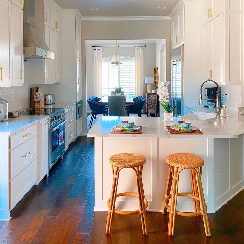
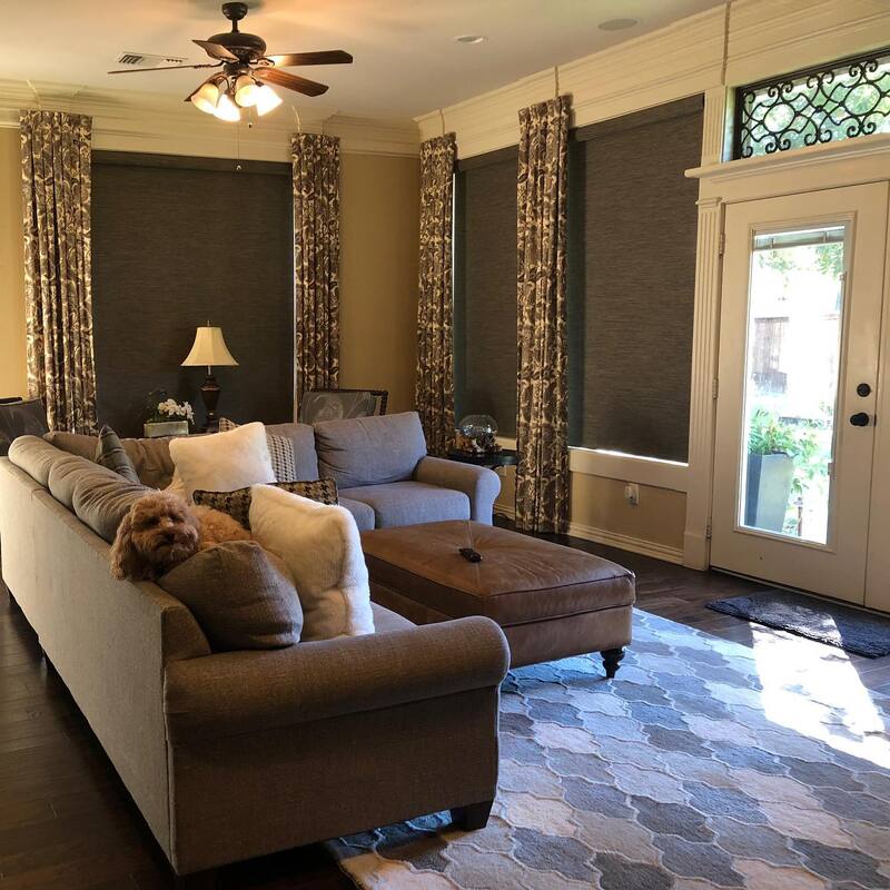
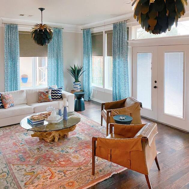
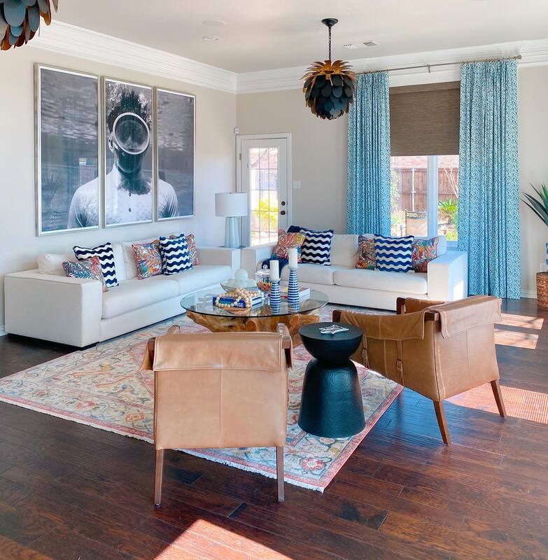
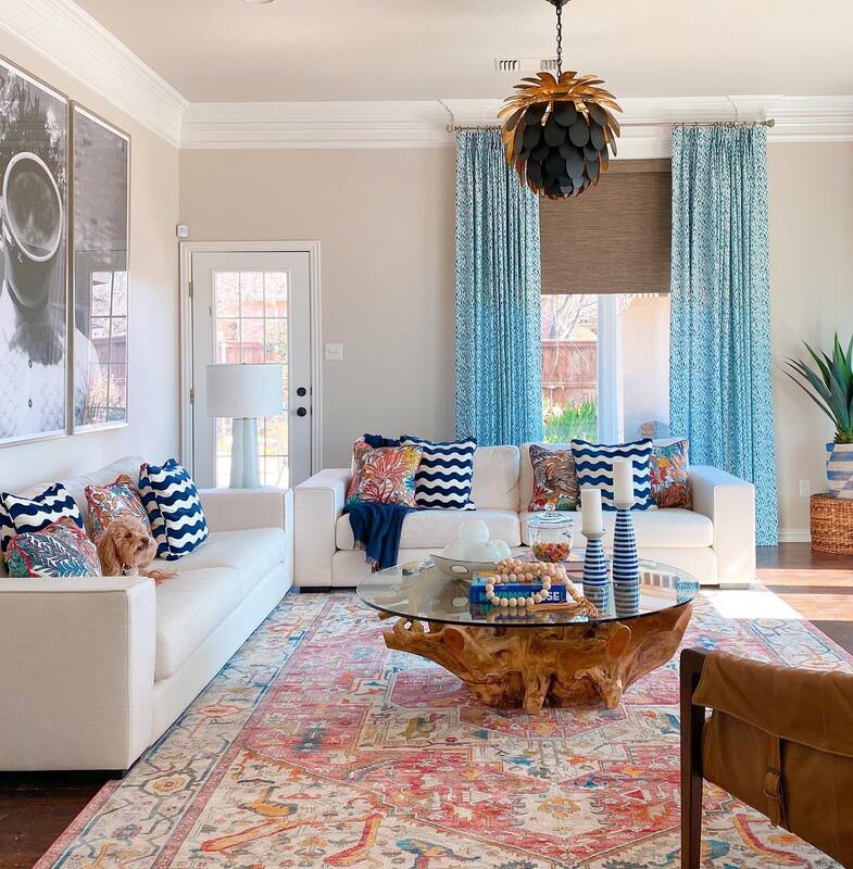
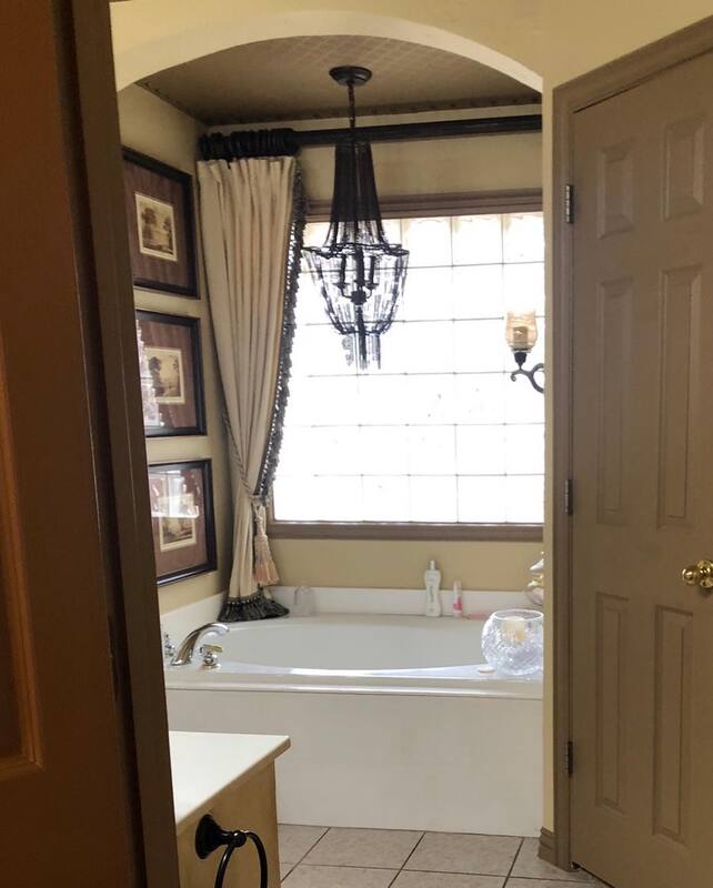
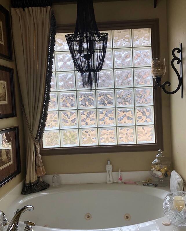
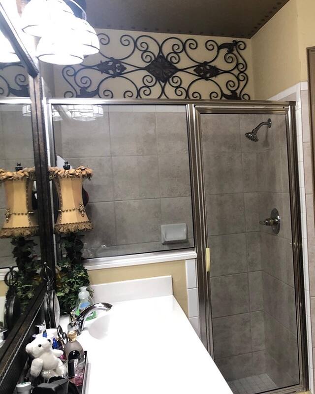
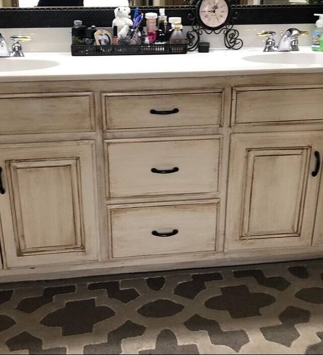
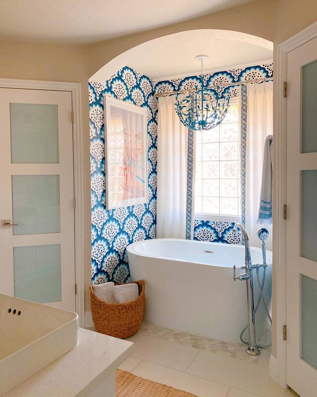
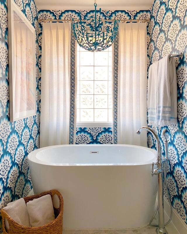
Sofas: Restoration Hardware (similar here) and Jonathan Adler (similar here) Barcelona style chairs: Wayfair Rug: Chairish (similar here) Coffee Table: Wayfair Light fixture: Kelly Wearstler for Visual Comfort Floor lamp: Wayfair Faux fur stool: Pottery Barn (similar here) Velvet Pillows: Anthropologie Print Pillows: Custom made Fireplace Tile: Arco Acustico (discontinued, similar here) More to come! Thank you for following and sharing, we love our community. This post contains affiliate links and we may be compensated for purchases made via these links. You may remember the Lakehouse Project we did back in 2018. It was a brand new build out in Athens, TX for a sweet Mansfield family to use on weekends and holidays, and they hired us to finish out the construction and COMPLETELY furnish the place. Down to the TP in the bathrooms, y'all. Well, the house turned out amazing, and was featured in 360 West Magazine and they were super happy with it. So happy in fact, that they sold it a year later! Sold it! Furnishings and all! We were kinda bummed because, well, we were hoping to negotiate a weekend stay, but when they came back to us and said, "We've sold the lake house, now we can hire you to make our Mansfield home just as amazing as the lake house was", we got over our disappointment over a potential lake weekend real quick. Maybe the lake house was just a test for us and once they saw how it turned out, they were ready to sign on the dotted line to renovate. We're not completely sure, but we don't really care either. This new project has been an amazing transformation and we are so excited to give this sweet family the home of their dreams. First off, the kitchen. It was small and dark and had this odd little baby island smack dab in the middle. We opened up the doorway between the dining room and kitchen to let more of the natural light in to the space and got rid of baby island. The basic footprint stayed the same, but by switching out the bar height counter for a solid counter, there is more space to work and it is more open to the rest of the room. Before: After: So crisp and clean and open! Buh buy baby island, hello gorgeous white! Counter stools: Serena & Lily Just beyond the kitchen is the family room where the family hangs out, watches TV, plays games, etc. It has access to the backyard so in the summer it's full of in and out traffic to the pool. They wanted an entertaining space but still comfortable enough for the whole family. Before: After: I mean, come on?! Right? It's clearly the pup's favorite place to hang out and now, the family will surely never leave this room. The sofas are from Article and yes, they are white, but have removable, washable cushion covers. Still a good idea to keep the Cheetos out of this room though. Club chairs are from Four Hands, and can be found here. Our favorite thing in the room though is the photograph by Leonard Nones, "Man Under Water". It was featured on the cover of GQ Magazine in 1961 and we were so excited to find a home for it here in this room. Rug: Rugs USA Coffee Table: Mitchell Gold Bob Williams Chandelier: Visual Comfort Accent Table: Crate & Barrel Now, you may be thinking that's a heck of a transformation, how could we possibly have more to show you? My friends, we have saved the best for last. Please check out the before of this master bathroom. Why yes, that IS sculpted carpet in front of the vanity! The one thing we did love about this bathroom was the glass blocks in the bathtub alcove. They allow light in but also privacy and are almost impossible to install new these days so definitely worth keeping. NOW, the big reveal! After: Aaahhh! Can you feel it? THIS is what a master bathroom should look and feel like. We ripped out pretty much everything and started from scratch, although the layout was good so none of that changed. Definite highlight is the tub with the chandelier from Stray Dog Designs that we had custom colored to match one of our favorite wallpaper patterns from Hygge & West.
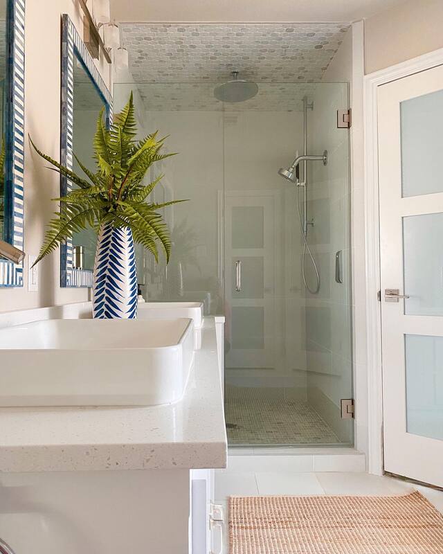
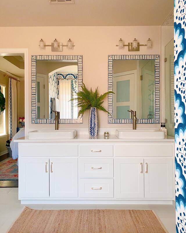
Mirrors: Serena & Lily Jute Rug: Serena & Lily Basket: West Elm Vanity Light: Wayfair Bathtub and hardware: Wayfair Now, on to the next project. Are you next? Contact us to get started on the home of YOUR dreams! |
Categories
All
Archives
October 2023
|

 RSS Feed