|
If you haven't already noticed, we kinda live and die in color. Color trends in home decor tend to:
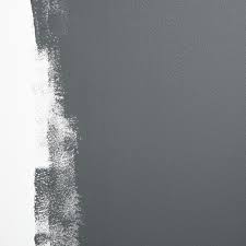
A. be longer living than fashion trends B. lean more towards neutrals C. be cyclical in that they come around again every 30 years or so. Case in point the resurgence of the earthy tones of the 70s. Pantone is THE expert when it comes to color trends and we like to keep an eye on them just to see what may be to come in the next season of home furnishings. Last year's Color of the Year, Veri Peri was so underwhelming to us that we didn't even talk to y'all about it. Kind of a sad color that was trying to be happy, it seemed to match everyone's mood at the time. THIS year, however, we admit we were somewhat surprised at the boldness of Viva Magenta. Girl, you are speaking our language! 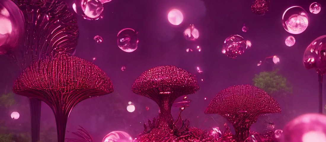
Image courtesy of Pantone
According to the Pantone Institute, "Pantone’s Color of The Year, Viva Magenta 18-750, vibrates with vim and vigor. It is a shade rooted in nature descending from the red family and expressive of a new signal of strength. Viva Magenta is brave and fearless, a pulsating color whose exuberance promotes a joyous and optimistic celebration, writing a new narrative. PANTONE 18-1750 Viva Magenta welcomes anyone and everyone with the same verve for life and rebellious spirit. It is a color that is audacious, full of wit and inclusive of all."
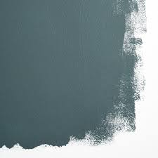
Audacious, full of wit and inclusive of all. I mean, isn't that what we all want to be right now? Can you imagine a velvet couch or sexy wine glasses in this color? Life is too short to live in beige and gray, and we are totally on board with such a bold color choice for 2023. Check out some of our favorite products here and find more on our shop page. 
We can't wait to see how this color evolves in home decor over the year and are very hopeful about the trend towards bolder colors. Maximalist design is surging; colors, textures, layers, patterns all climbing in bed together like one big co-sleeping family. It's an expected swing of the pendulum from the clean, bright, neutrals we've been spoon fed the last decade. Bring on the next iteration of the Roaring 20s!
0 Comments
BY FAR the most common question we get. Which makes us wonder why it's taken SO long to put this out there for you, our peeps. For the most part, we are Sherwin-Williams girls. Probably because they have a store blocks away from our office. But lately, we've been obsessed with the new line of paints from Schumacher, Backdrop. More on that later. Let's start with exterior paint. We tend to stick with white and black because they are both modern and timeless. It's amazing what a coat of white paint will do for a house.  Brick: Snowbound by Sherwin Williams  Trim: Tricorn Black by Sherwin Williams  Tricorn Black by Sherwin Williams Tricorn Black by Sherwin Williams Inside, our two favorite neutrals for walls are Modern Gray and Snowbound. But you all know Shauna won't turn down an opportunity for a bold blue room or a serene aqua ceiling.  Blue Plate by Sherwin-Williams  Alyssum by Sherwin Williams  Raindrop by Sherwin-Williams  Swimming by Sherwin-Williams  Swimming by Sherwin-Williams 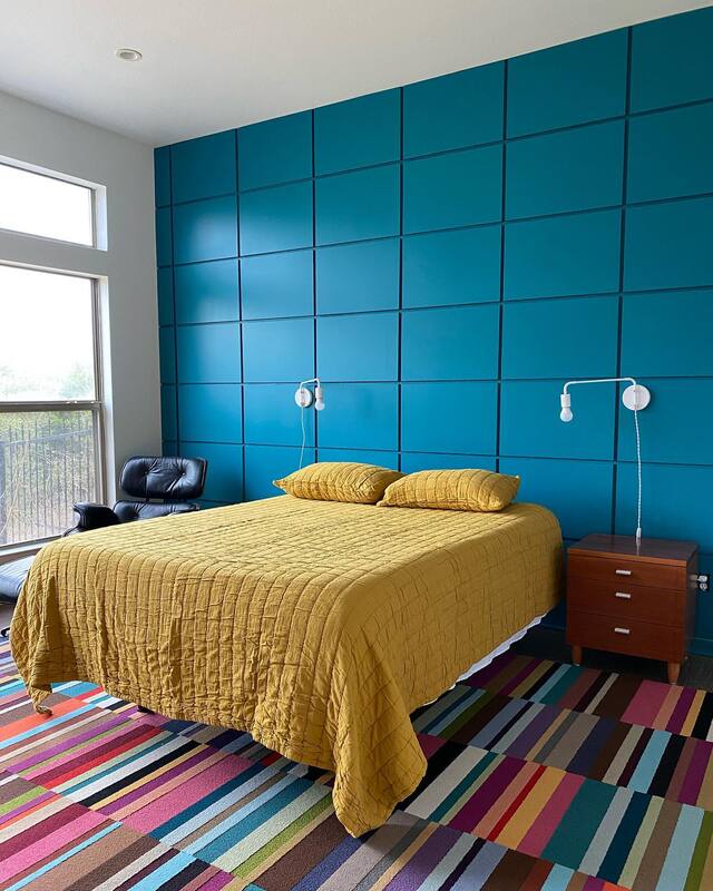 Really Teal by Sherwin Williams  Aviary Blue by Sherwin-Williams  Bathe Blue by Sherwin-Williams We also love to play with color on cabinets, trim and doors. Blue is a neutral, if you haven't guessed that already. But we don't discriminate when it comes to cabinet color; green, teal, black, even pink play in our palette. 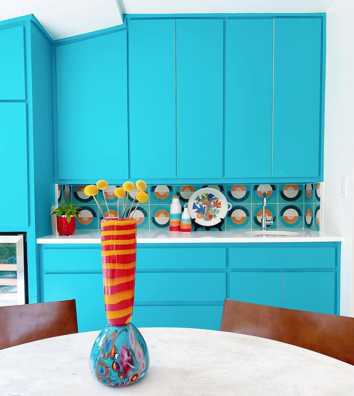 Biscay by Sherwin-Williams 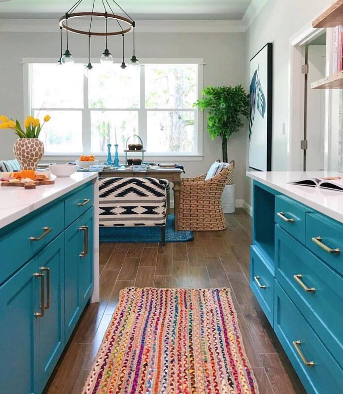 Bunglehouse Blue by Sherwin-Williams  Cherries Jubiliee by Sherwin-Williams  Cherries Jubiliee by Sherwin-Williams 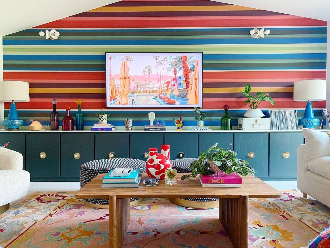 Iron Ore by Sherwin-Williams (cabinets)  Endless Sea by Sherwin-Williams  Irresistible by Sherwin-Williams  Whitetail and Peppercorn by Sherwin-Williams  Starboard by Sherwin-Williams 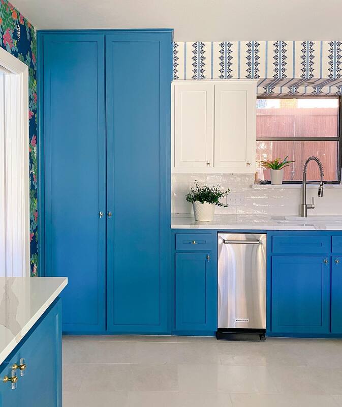 Turkish Tile by Sherwin-Williams Now to our newest obsession, Backdrop. These colors are as scrumptious as their cheeky names and we can't wait to get our hands on them. Projects are in the works so you'll have to check back to see the final results but here's what we've got our eyes on. Last thing to remember. It's just paint! You hate it, there's a thousand other colors to choose from. It's the easiest and most economical way to spruce up a room. Or a piece of furniture. But that's another blog post. :-)
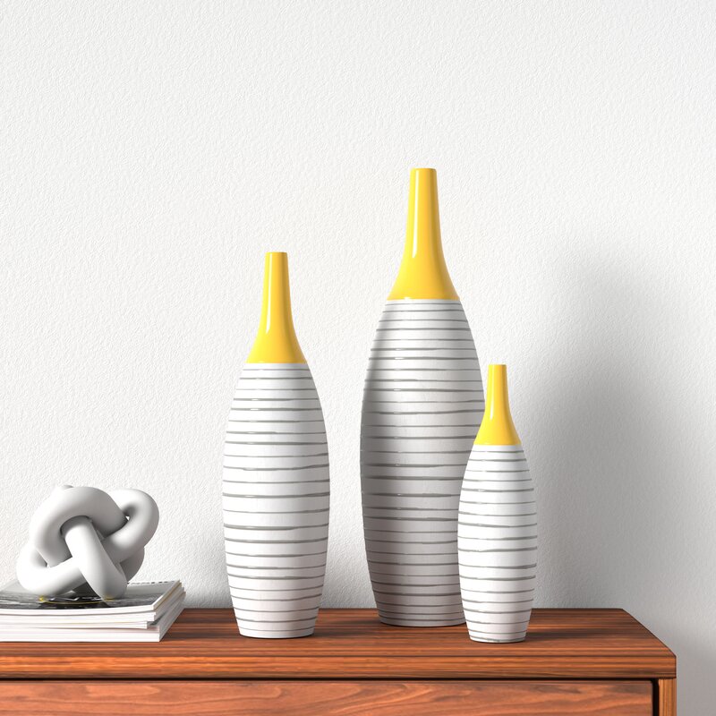
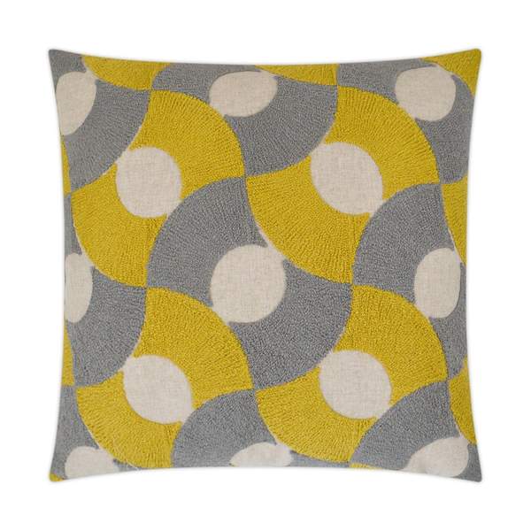
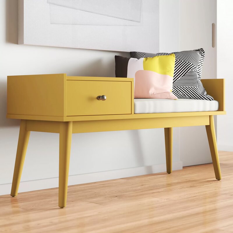
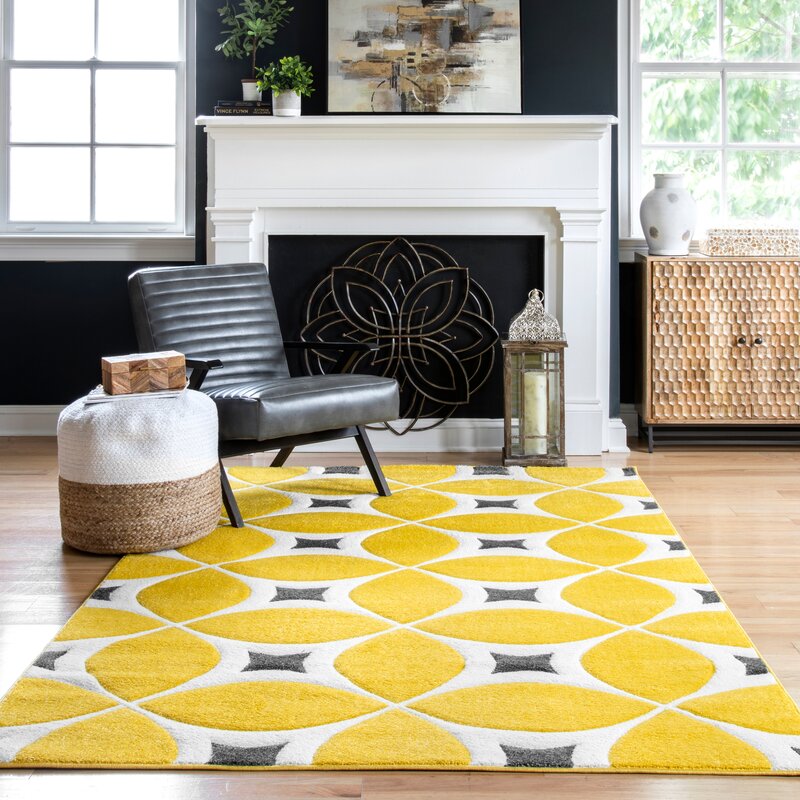
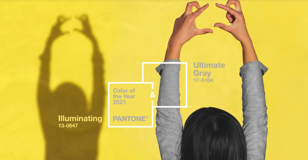 Image credit: Pantone.com If you've been here longer than a hot minute, you'll know that while we follow and comment on color trends, at the end of the day, we're gonna do our own thing. And we encourage our clients and friends to do their own thing too. We don't do "matchy matchy", we believe firmly in the philosophy of "if you love it, it goes", and we get super excited when we can push the limits of color and pattern in a space and it turns out even better than we envisioned. Last year when Pantone announced the Color of the Year for 2020, Classic Blue, we appreciated the choice in that it was made in the attempt to assure us that everything was going to be OK. It was safe, dependable, dare I say, patriotic. Looking back, it appears that the Universe thought that choice was laughable and gave us plenty of reasons to protest such a confident color. Covid Red might have been the better option. For 2021, Pantone decided there would be not one but two Colors of the Year; Ultimate Gray and Illuminating. Maybe they learned their lesson in not putting all the chips on one bet? 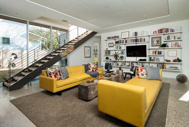 Image Credit: Foursquare Builders According to the Pantone website, these colors are "A marriage of color conveying a message of strength and hopefulness that is both enduring and uplifting." We see you, Ultimate Gray, as the pillar of concrete strength and practicality. We firmly set our design aesthetic on a room with a neutral base that often includes pale gray walls that are both practical and versatile. Gray has quickly surpassed tan and brown as the neutral of choice when buying a sofa or other large furniture item. It instantly gives an element of sophistication to a room. Illuminating immediately has me singing "Sunshine Day" in my head, and maybe that was the intent. We could definitely use some sunshine in our lives right now and seriously when has a yellow pillow or yellow tulips not made you smile? Plus with the popularity of Ochre last fall, a brighter, sunnier yellow is a great transition to spring. 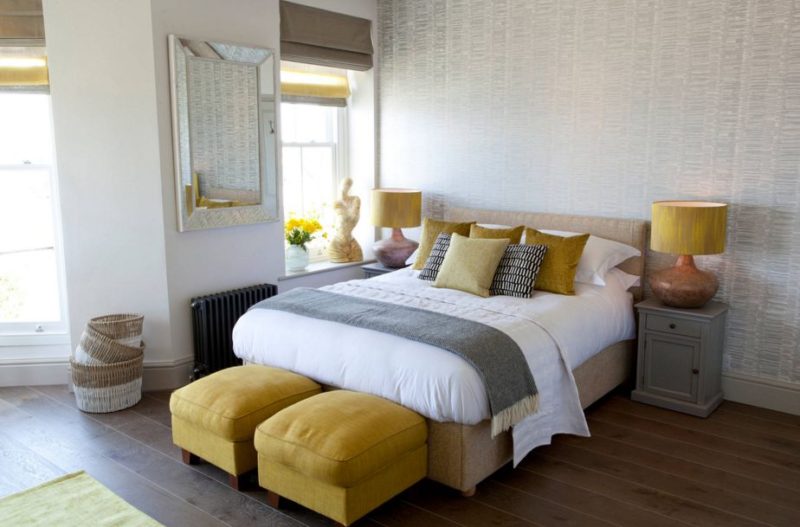 Image Credit: Architecturelab.net Now, is SGD going to ever design a room in gray and yellow? No. BUT, we are fully on board with incorporating elements of this color duo in to a room and have curated an assortment of products to get you up to speed on this trend. Check out our Color of the Year Shop here and some of our top picks below. So tell us, what are your thoughts on these color choices? What would your pick be? If you have some great yellow and gray rooms you'd like to share, we would love to see them!
This post contains affiliate links and we may be compensated for purchases made via these links.  For design geeks like us, the announcement of the Pantone Color of the Year is akin to the Academy Award Nominations. It reflects not only on the direction of design trends, but the overall mood of the world in general. I know, some of you are rolling your eyes at that statement, but bear with me for a minute. Think of the 1970s with the emergence of the hippie, naturalist, conservationist culture. The first Earth Day in 1970 was the birth of the modern evironmental movement. What were the prevailing colors found in almost every home in the 1970s? Earth tones. Every single one of us had kitchen appliances in Avocado Green or Harvest Gold, and the earthy colors permeated throughout the home. Except maybe in the little girls' rooms where pastel Holly Hobbie bedding reigned supreme. 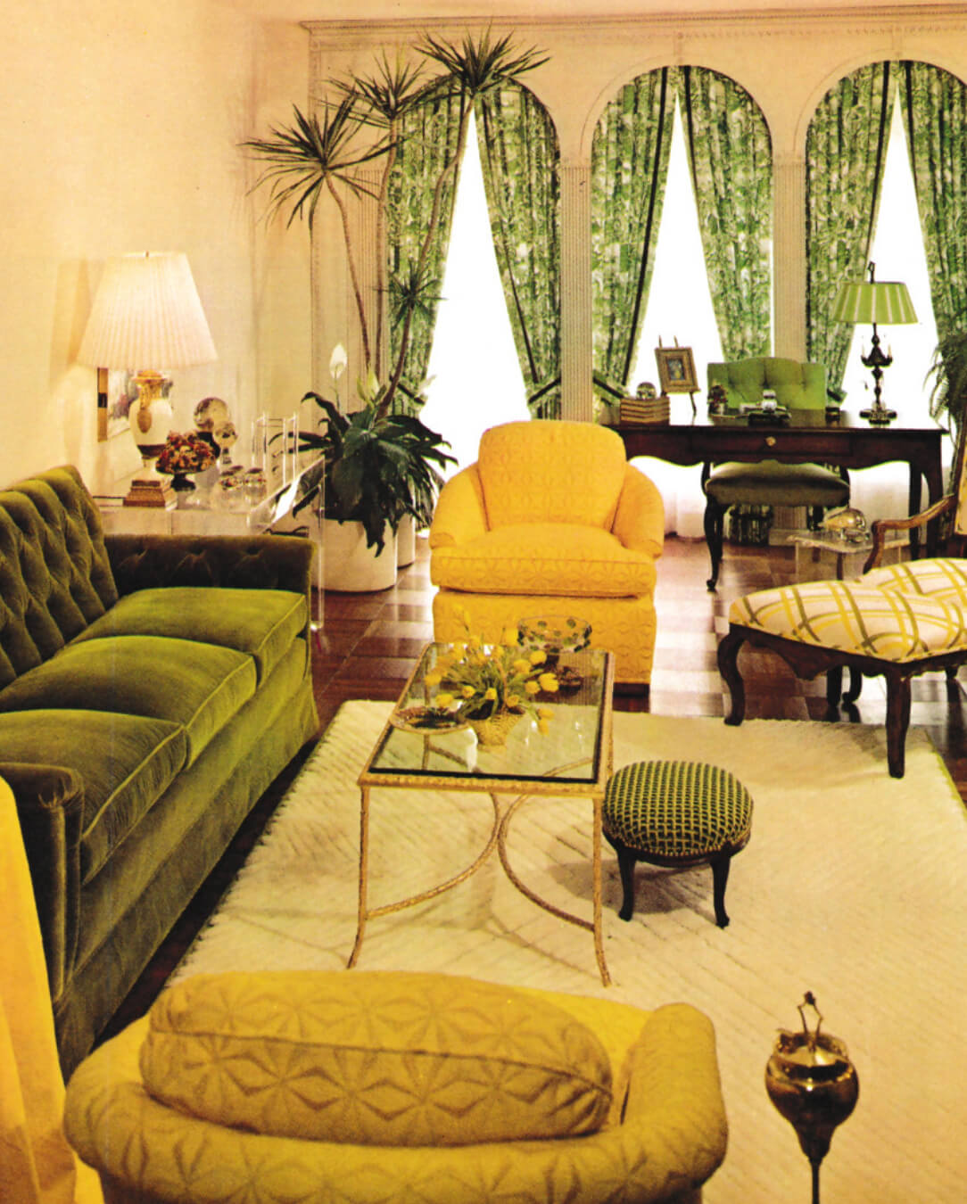 Image: Mindfuldaze The past two Colors of the Year; Ultra Violet in 2018 and Living Coral in 2019 were enigmatic, thoughtful, and expressive. They spoke to visionary thinking and optimistic, joyful pursuits. They were about what is possible in the world. Now, in 2020, the future of our world might not appear to be so optimistic, and therefore, we need a color that assures us that things will be ok. Introducing Classic Blue. 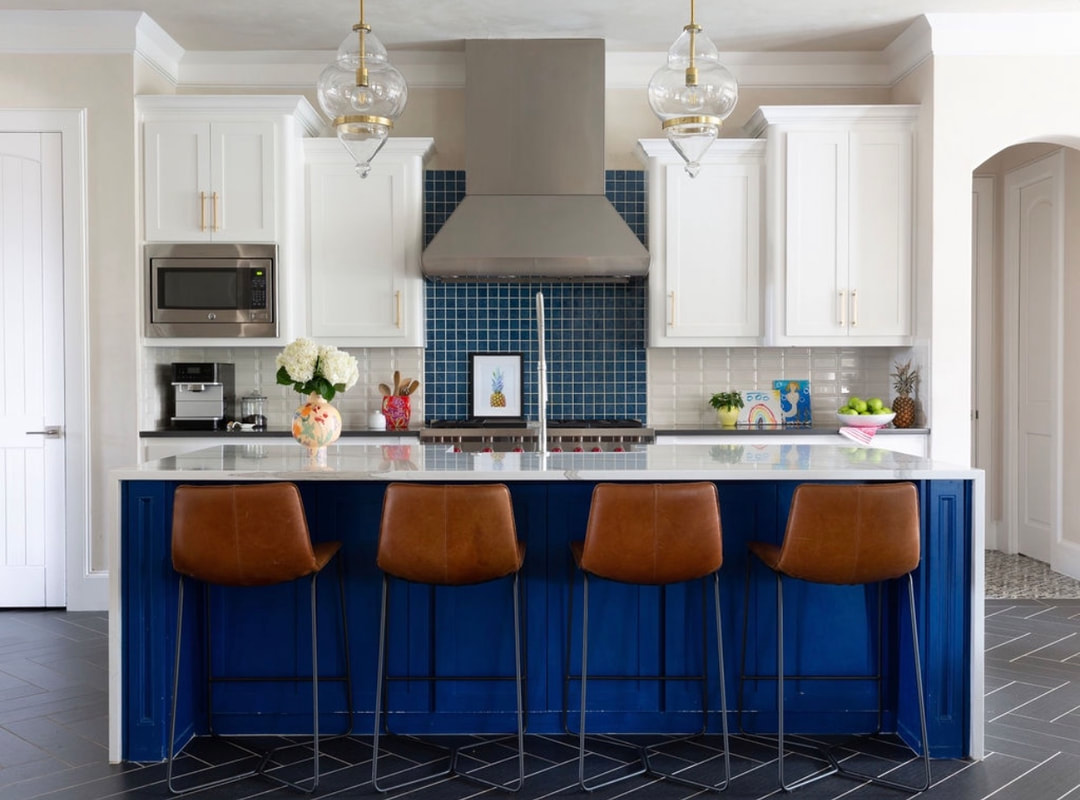 According to the Pantone Color Institute, "We are living in a time that requires trust and faith. It is this kind of constancy and confidence that is expressed in PANTONE 19-4052 Classic Blue, a solid and dependable blue hue we can always rely on." Blue has always been an integral color in the aesthetic of Shauna Glenn Design. It lives outside of the core neutrals of gray, brown, black and white, yet it has a neutral feel all its own. It can be adventurous or conservative and we love this Classic Blue hue because it makes its home somewhere in the middle. For color fans like us, Classic Blue is the perfect color to build on; playing well with coral, teal, chartreuse and pink. A blue chair in the living room, or a blue velvet headboard in the bedroom adds a great pop of color without feeling like you are committing to something super trendy. We love a great blue wallpaper too to brighten up a bathroom. Need some inspiration? Check out some of our favorite projects. 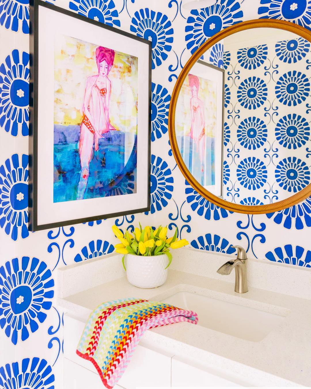 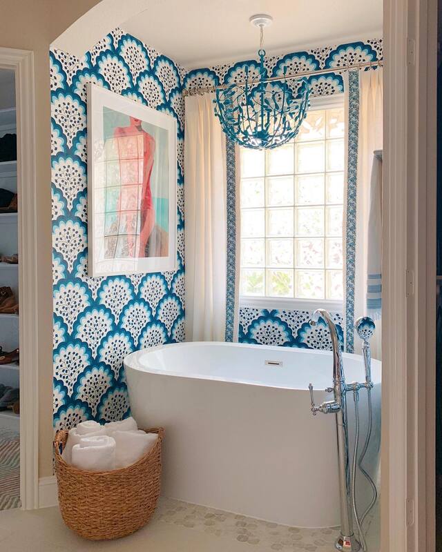 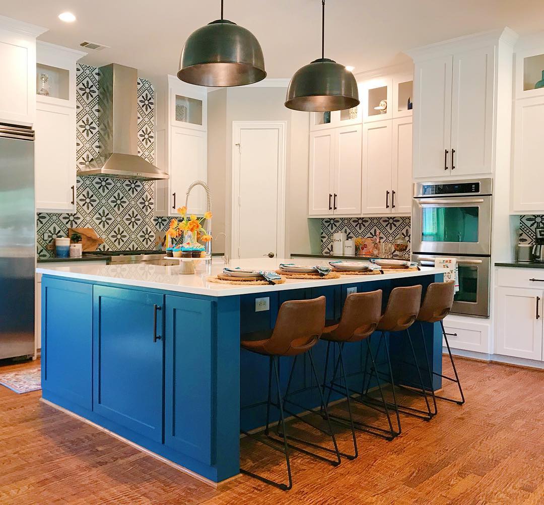 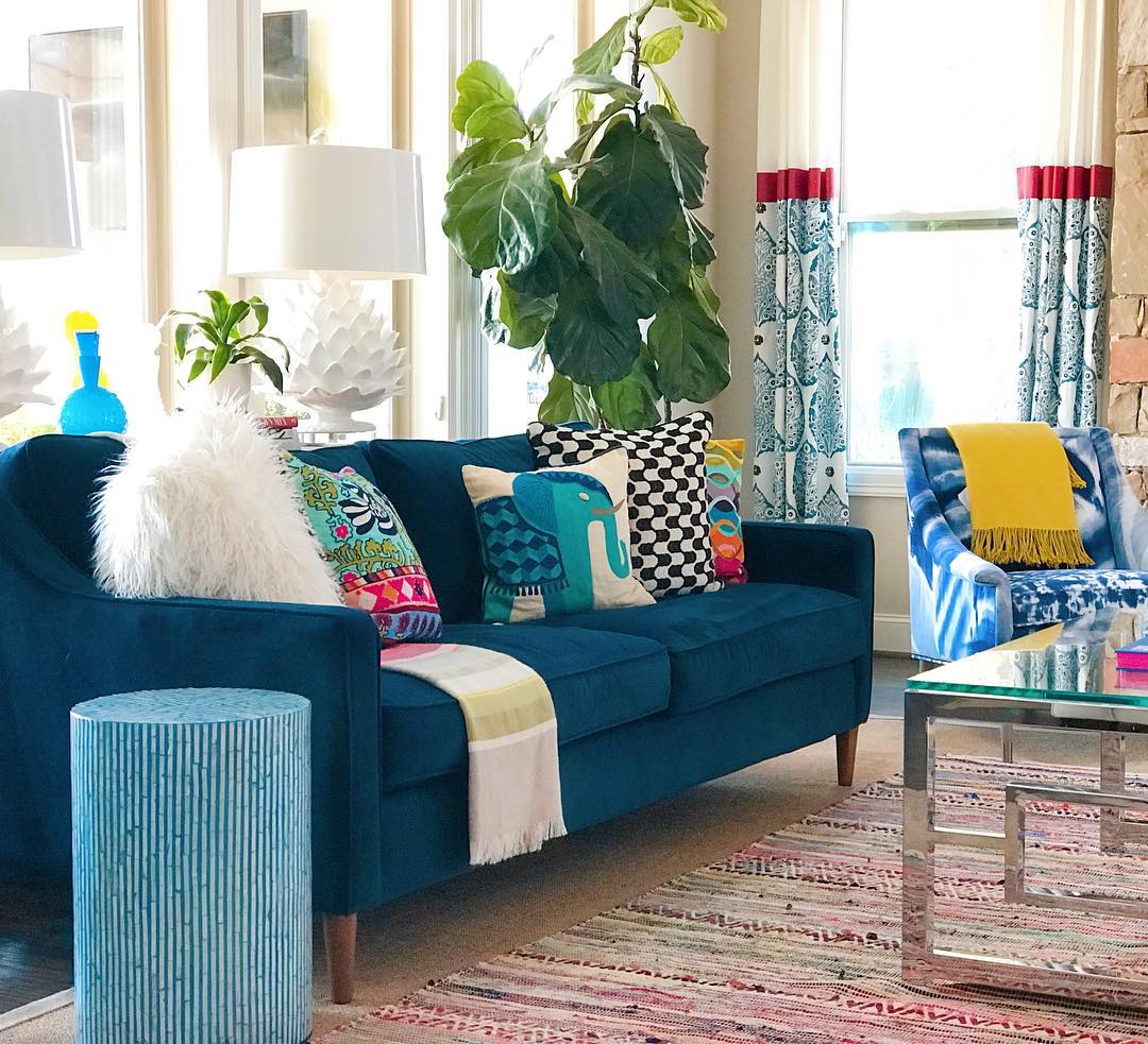   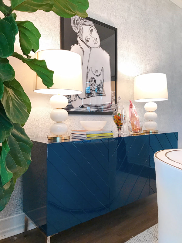 And check out our Feeling Blue shop for more inspo on how to add blue to your space!
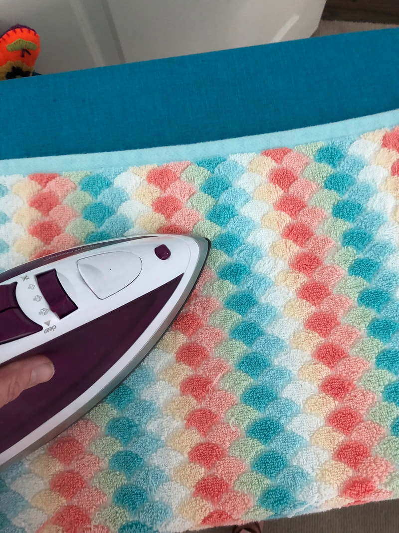
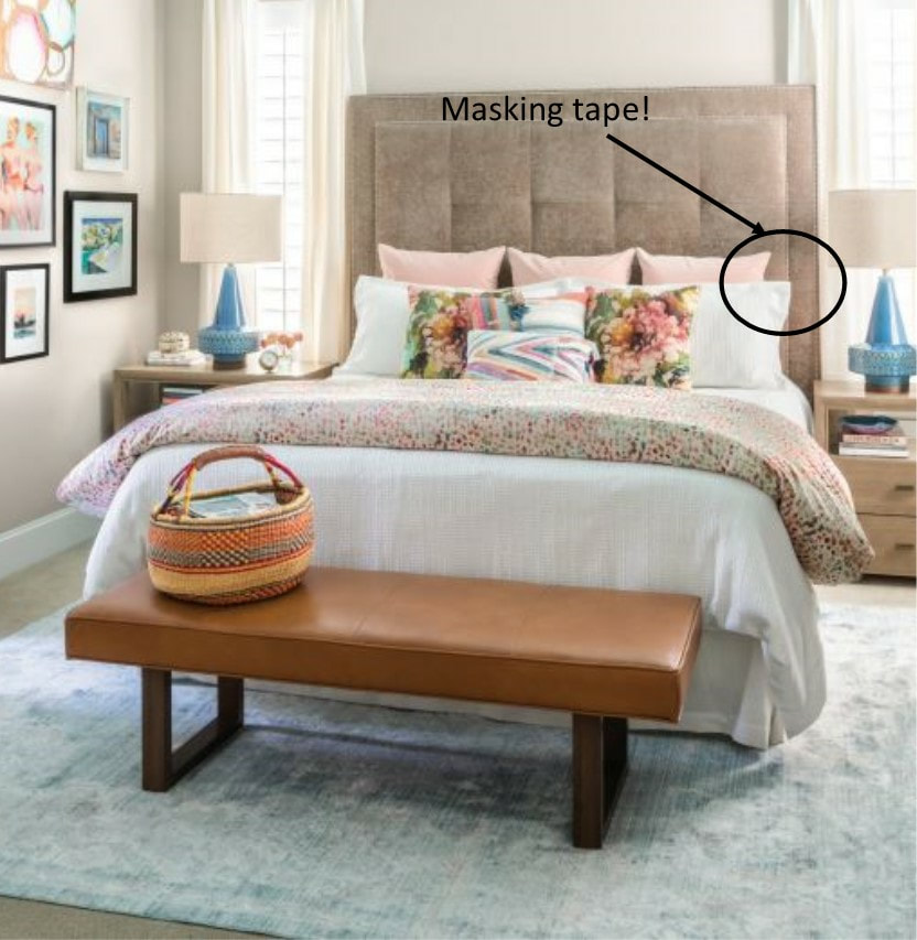
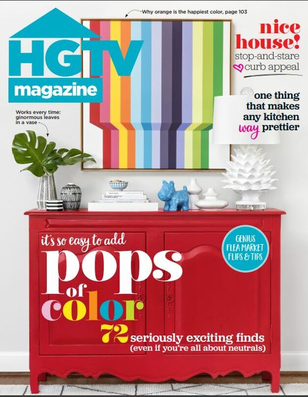 So, if you haven't already heard, Shauna's home was featured in the May 2019 issue of HGTV Magazine. It's also the cover shot, which is amazingly cool. However, the release of the magazine is somewhat bittersweet considering what was happening behind the scenes with Shauna and her family during the week of the photo shoot. Read below for Shauna's story.  When I first heard from HGTV Magazine about possibly featuring my house in their magazine I was blown away, but also knew the reality too. I’ve had interest from magazines in the past, but it seems like it always fell through. After some back and forth with an editor (sending different shots of different rooms using different angles) I received the best email ever. HGTV Magazine wanted to show my home in their house tour section! It. Was. So. Cool. After a few more weeks of hammering out the details the editor emailed me again and said they were also considering putting our house on the cover. SHUT. UP. It was almost too much. Suddenly it felt like everything I’d been trying to do to be taken seriously as a designer (yes, I need to be validated sometimes!) was getting me somewhere. It was a couple of weeks later that I was told yes, we’d also be the cover shot. It was an incredible feeling, I won’t lie. Because the cover is a huge deal, our shoot was pushed back weeks and would go from a two-day shoot to a five-day shoot. I was also informed they would be shipping approximately 80 boxes (!!) of items to be used in the shoot. Soon after, they were right, box after box after box began showing up at our house. On July 30, 2018, a crew of strangers showed up on my front porch (HGTV people, a stylist, a photographer, etc) and thus began one of the most fun weeks of my life. Or so I thought. Right before all of this, my daughter, Presley, gave birth to her third child (Emerson Faye) on July 25th. We were so happy and excited to meet her and have her join our growing family. After a few days something was happening to little Emmy, and no one was sure what it was exactly. She was hospitalized while doctors tried to figure out what was wrong. The photo shoot was happening and I found myself splitting time between being at the hospital and being available for the magazine crew. I wasn’t terribly concerned about Emerson at the time because the doctors couldn’t really find anything wrong with her. I assumed she would get well and be home soon. At the end of the week (Friday) we said goodbye to everyone from the magazine and Emmy was released from the hospital. I could finally exhale after a stressful and exhausting week. Jeff and I were looking forward to a restful weekend. Sunday, August 5, my daughter called to say Emerson stopped breathing and paramedics were on the way. I raced to her house and followed the ambulance to the hospital. After a few hours we were told to gather up our family and friends because Emmy Faye wouldn’t be going home. Her organs were failing and she wasn’t going to survive. It was the worst news I’d ever gotten and it was so unbelievable. The next 24-hours were surreal. We were living out a nightmare. Our family was thrust into a swirling tornado of tragedy. Writing this now takes me back to that moment in time and it still stops my heart, punches me in the gut, and takes my breath away. The magazine is out now. We are in the May issue and as promised, are on the cover and featured in the house tour section. It’s so very exciting, a real pinch me moment. But it’s also bittersweet. Seeing the photos and remembering being there and seeing it unfold while also driving back and forth from the hospital to make sure Emerson was okay, it makes me really sad. I’ve tried to stay upbeat and hold on to the fun memories of that week back in July of last year, but it’s a struggle. I’d gladly give up any career success or checks off my life list (being featured in a national publication is high on that list) to have our sweet Emmy Faye alive and learning to crawl and laugh and know who I am. But I don’t get to choose that. It’s not an option. Instead I’ll try to stay positive and forge ahead. I’ll keep striving to be the best version of me and lead by example. Work hard. Be kind. Bring color into people’s lives. That’s really all I can do. I want to thank everyone at HGTV Magazine for the opportunity and the outpouring of love and support they showed me and my family during that terrible time. And thank you to all of you who have championed me and congratulated me and bought the magazine and sent such kind notes. It means more to me than you’ll ever know. Now, here's some behind the scenes photos that we've been hanging on to for 9 months so we could share them with you now! XO, Shauna So, the 80 boxes of product that were delivered were unpacked and staged in the garage. 80 boxes of vases, platters, lamps, figurines, trays, pretty much anything that could be used to style. A lot of this stuff was rented from two different companies in New York that well, rent out stuff for photo shoots, so it was important for the Assistant Stylist (Kalen) to keep up with what went where, etc. Serious tasks here. Shauna's laundry room became flower shop central with buckets and buckets of flowers to be used for the shoots. Wanna know how to make peonies open? Stick 'em in warm water and in the sun. But not for too long, because then they burn. It's an art. Other fancy jobs of the Assistant Stylist include ironing bedding and towels and trimming the "hair" off of the palm leaves. Bonus styling tip, to make the flanges of the pillow shams stand up so pretty in the photo we used masking tape on the back. So, the cover. Because the cover had to be approved by the Editor back in NYC, there was a lot of back and forth. Take a photo, send it to NY, get comments back, move the vase to the other side, take a photo, send it to NY, we need something tall and green on the left, take a photo....you get the idea. TWO DAYS LATER, the image was approved. Jamie, the HGTV Magazine Home Editor and Matthew, the Stylist were pros, and a lot of fun, and made the process way less painful than it could have been. Also, they were considering changing the color of the chest to aqua in the final cover, so we had to style both ways just in case. Thanks again to everyone from HGTV Magazine for being so amazing. Can't wait to work with y'all again!
This week the team attended the Sherwin-Williams Colormix Color Forecast 2019 presentation at Dallas Market Center to get a sneak peek at what they see as the biggest color trends for 2019. As you might imagine, the color trends for home change a lot more slowly than the color trends for fashion. Remember back in the 70s when those avocado green appliances were around for FOREVER?! (The 70s are back, BTW but hopefully we learned a few lessons on colored appliances the first time around.) Six color stories ranging from cosmic minimalism to bold maximallism and inspired by tech, the Southwest, British libraries, Africa, natural elements and eclectic excess provide a variety of moods and colors for any project. Shapeshifter Inspired by the cosmos and that unique space between tech and spirituality. Clean lines, iridescent finishes and a palette of ethereal blues accented with golden yellow.  Wanderer Modern western palette featuring the dusty colors of the American Southwest. Worn leather, natural woods and tribal patterns. 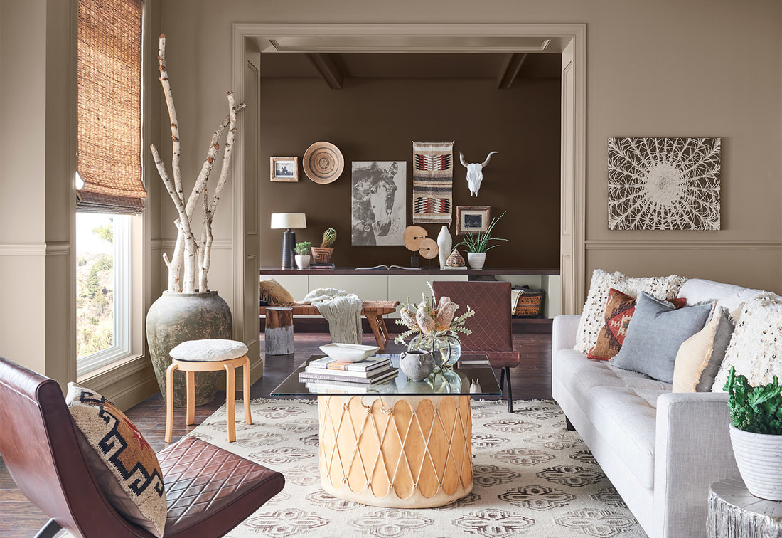 Aficionado Inspired by British libraries and menswear patterns such as plaid and paisley, this palette is a rich, elegant update of the saturated colors of the 50s-70s.  Enthusiast Fully embracing the "more is more" philosophy, this color palette is bold, expressive and excessive. Layered patterns as seen in designs by Gucci and Prada, animal motifs and brocades provide inspiration. 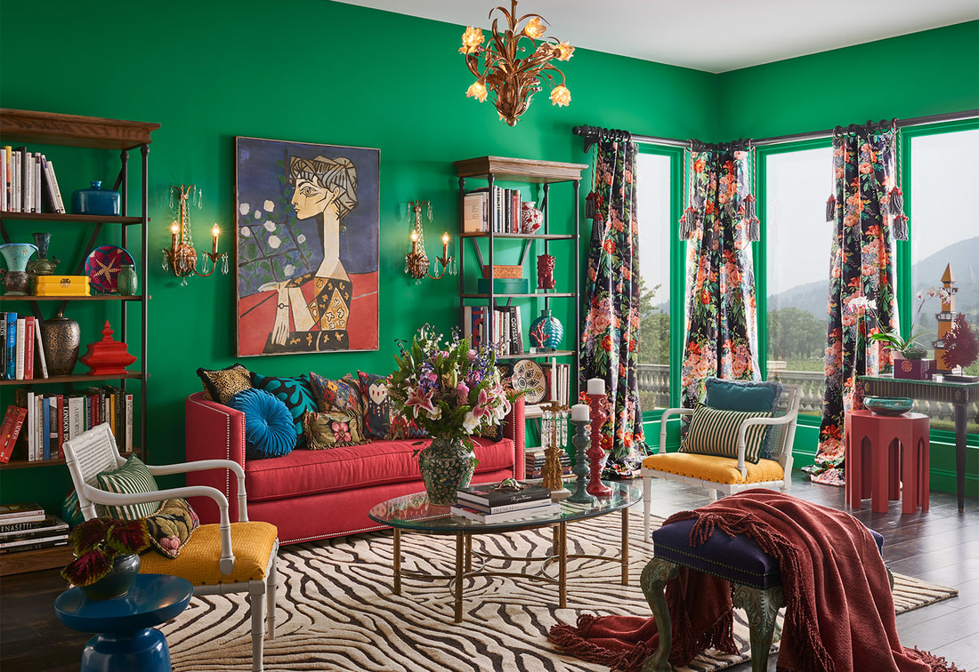 Naturalist The wonder of nature as both botanic and through an Art Nouveau eye provide the inspiration for this ethereal, sophisticated palette.  Raconteur Inspired by African heritage and crafts, this palette tells the story of a culture through color, texture and pattern.  Do you have a favorite? Which one are you? Send us your feedback, we'd love to hear from you!
Want a quick and easy update to your home that doesn't cost a fortune? Consider painting your front door a vibrant, eye-popping color. We love the rich color palettes of fall and have taken inspiration from our favorite paint resource, Sherwin Williams to create four fall front door looks that will make your house the best looking one on the street. Whether your style is modern, boho, or somewhere in between, we've paired our favorite colors with doormats, planters, house numbers and outdoor seating to create a front porch that will make your neighbors green with envy. Pro tip: Switch out the doormat for a 2x3 outdoor rug. Now shut that fancy front door and get outside! 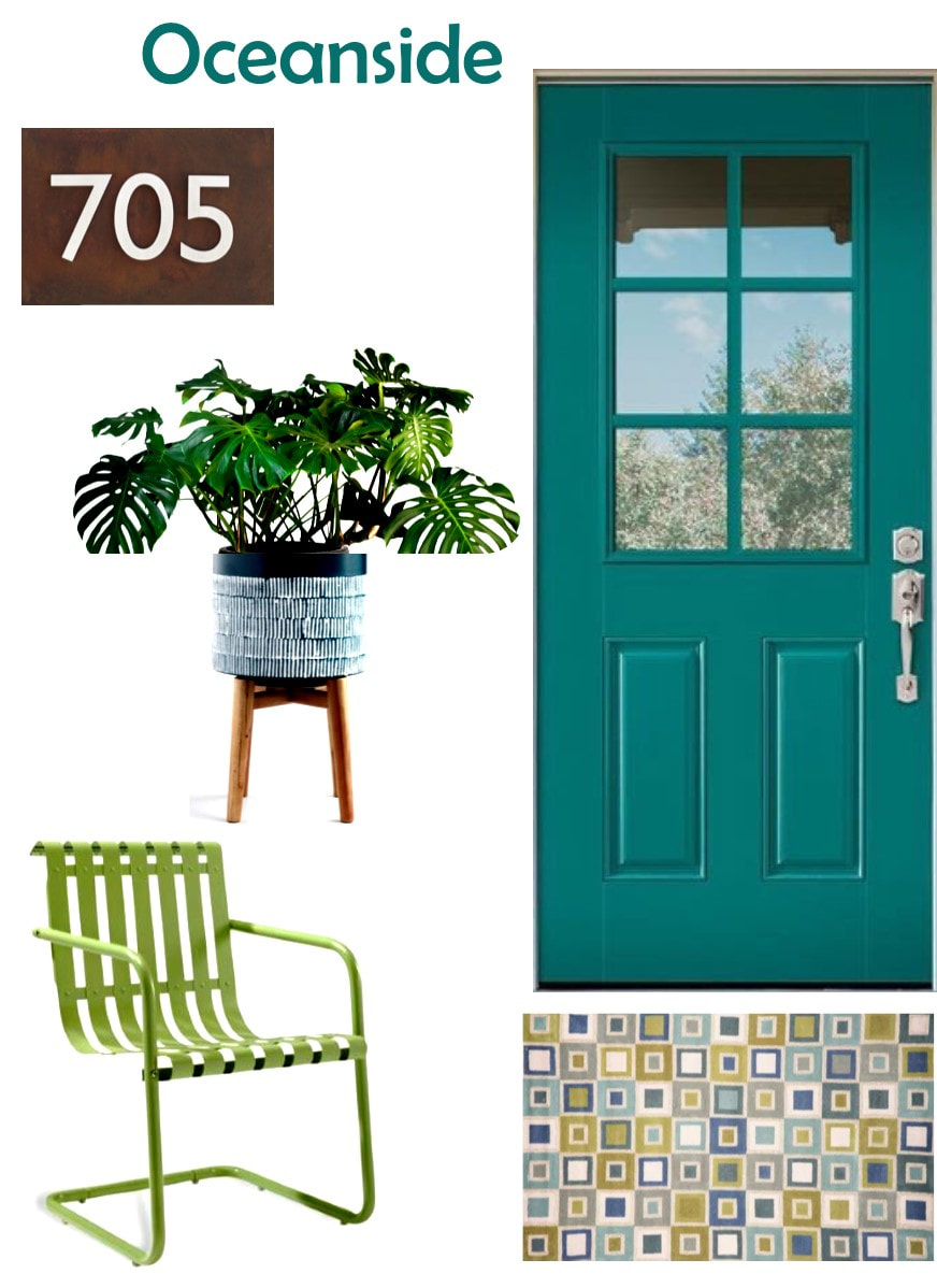 Paint: Oceanside by Sherwin Williams Outdoor Rug: Pier 1 Metal Chair: World Market Planter: World Market House Numbers: Houzz 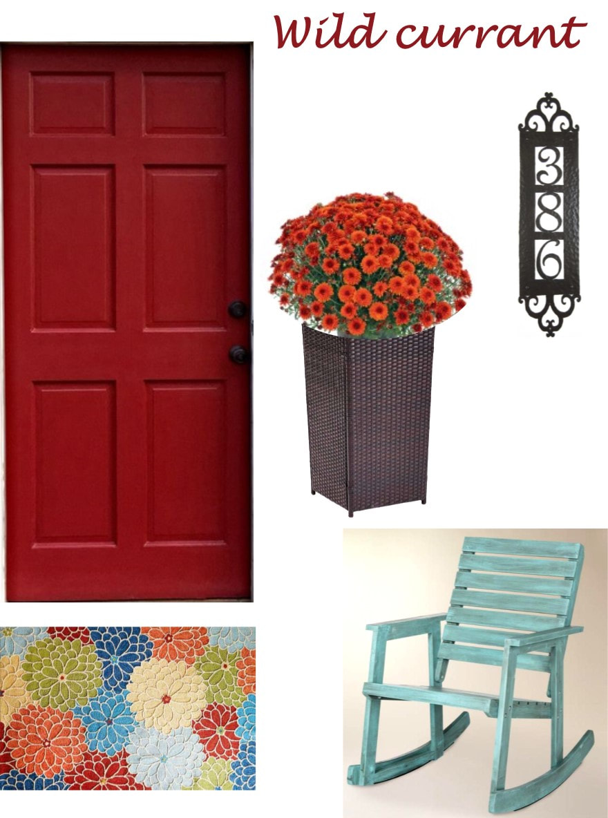 Paint: Wild Currant from Sherwin Williams Outdoor Rug: Pier 1 Rocker: World Market Planter: World Market House Numbers: Houzz 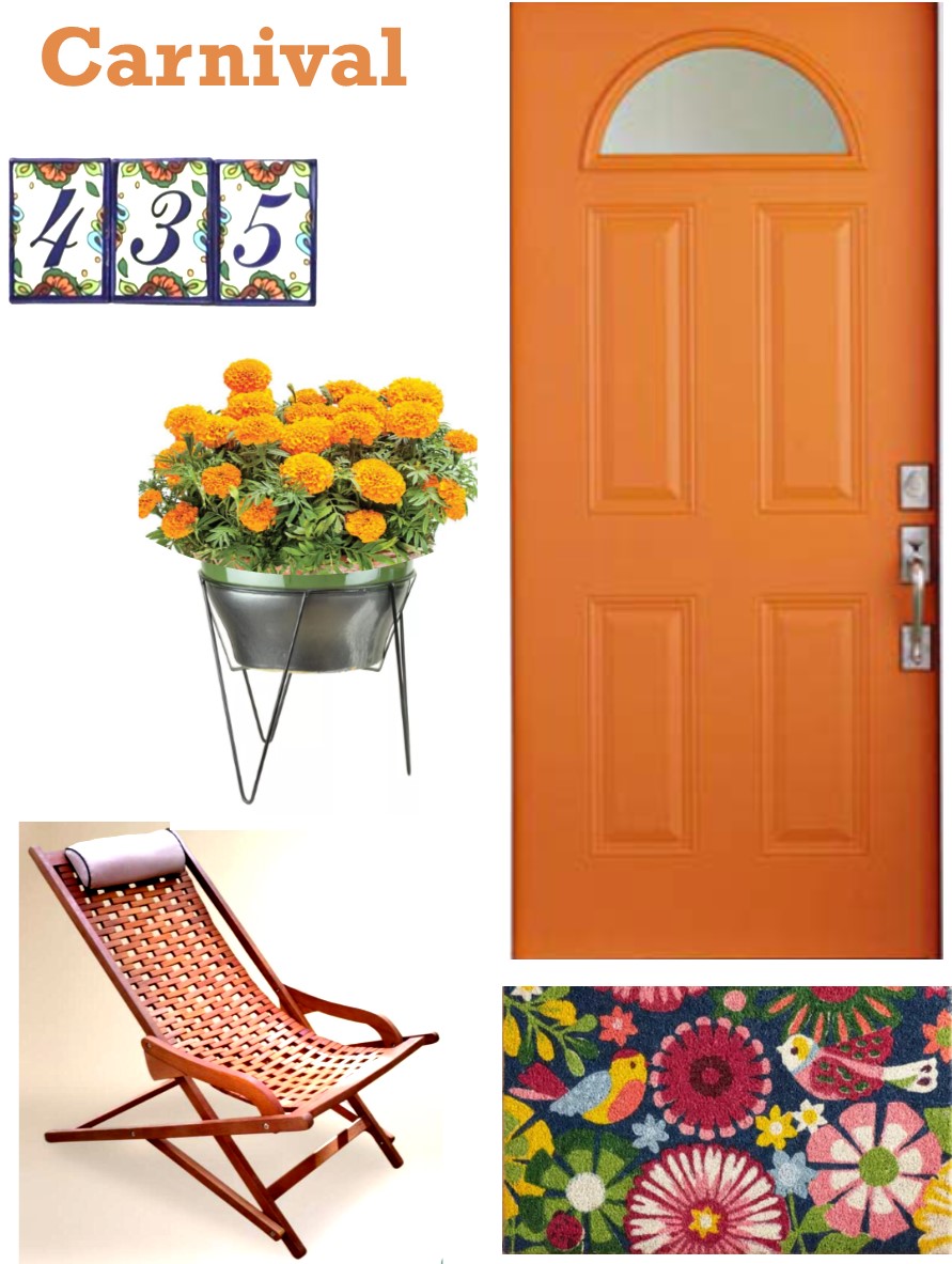 Paint: Carnival by Sherwin Williams Doormat: Pier 1 Outdoor Lounger: World Market Planter: Pier 1 House Numbers: Houzz 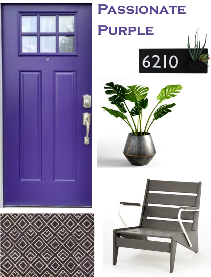 Paint: Passionate Purple by Sherwin Williams
Outdoor Rug: Pier 1 Adirondack Chair: West Elm Planter: World Market House Numbers: Houzz This post contains affiliate links. A few weeks ago we shared with you a little bit of the Lakehouse project we were working on. Well, we were back in Athens yesterday to finish up and OMG, y'all. It. Is. Gorgeous! The clients were such a joy to work with and super thrilled with everything we did. Kinda scary going in to a project where you have free reign to do whatever you want. I mean, we have some wacky ideas sometimes. But, it all came together beautifully. We hope they enjoy many happy family weekends in this amazing home! Living Room 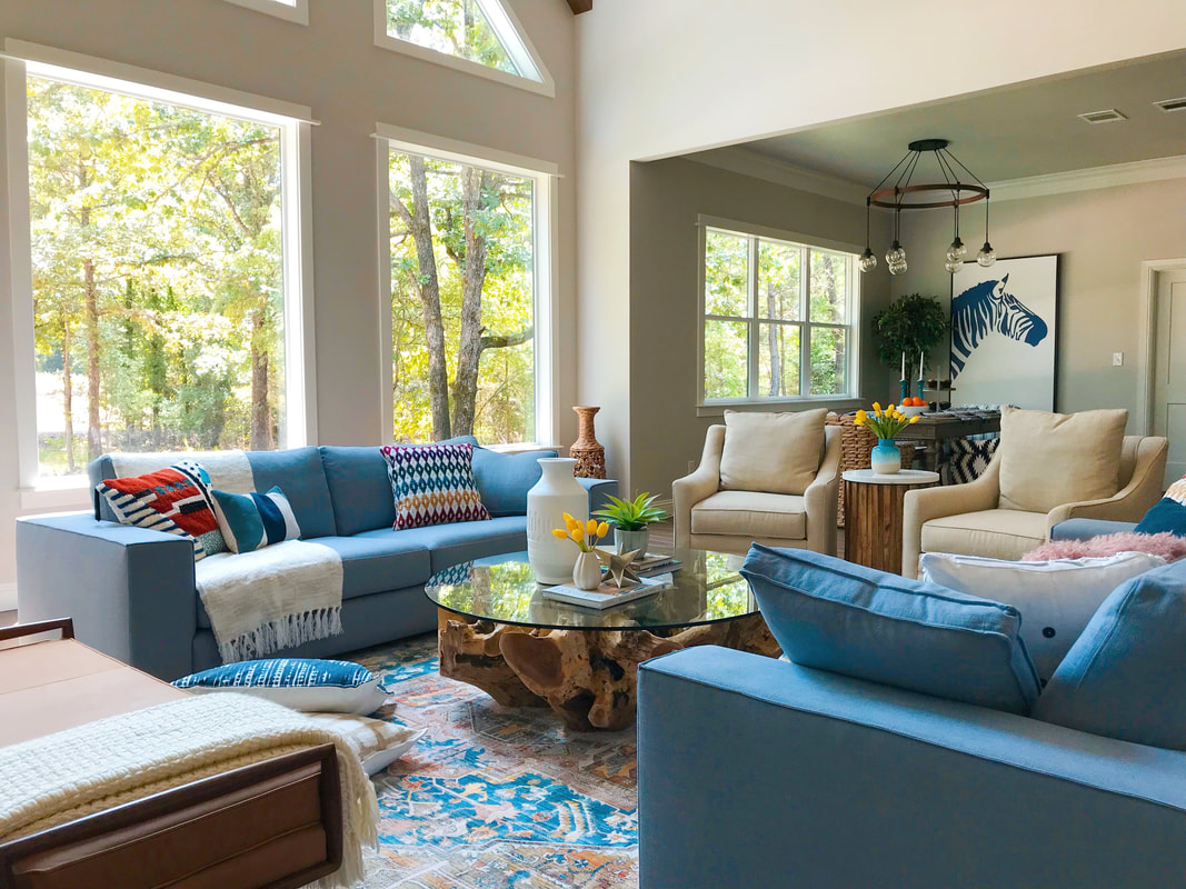 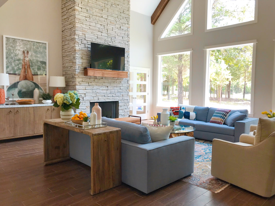 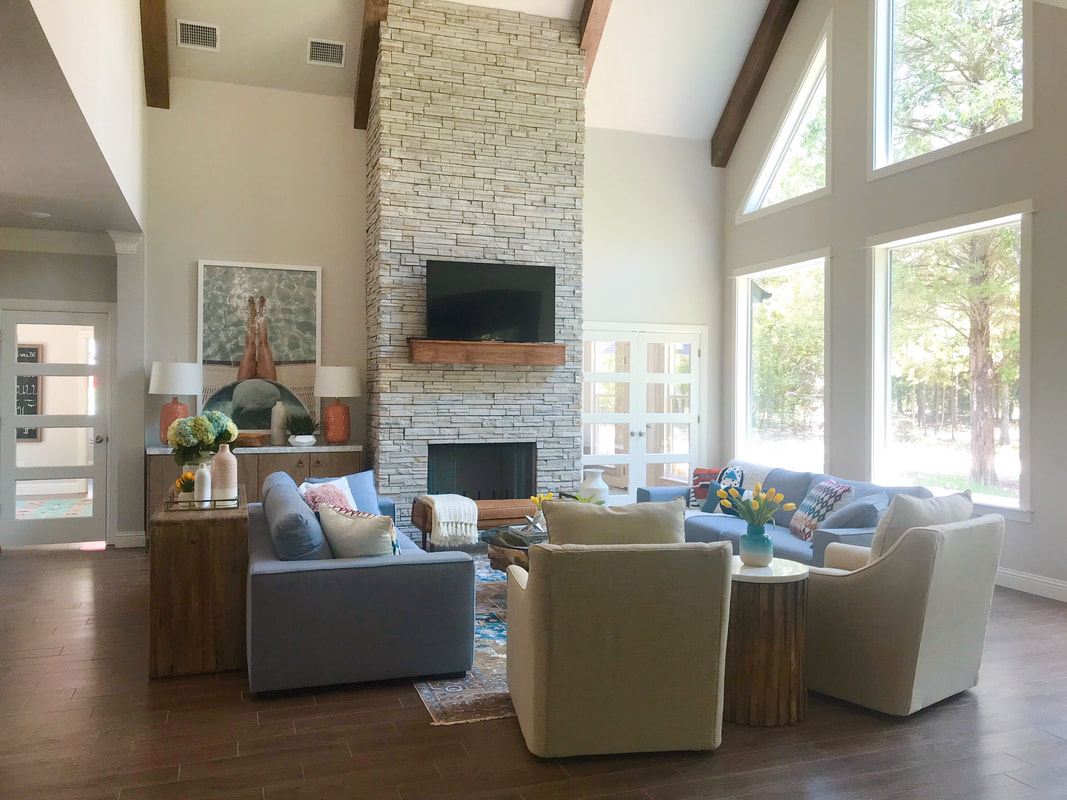 Resources Sofas: Article Swivel chairs: All Modern Console table: Wisteria Coffee table: Mitchell Gold + Bob Williams Sideboard: All Modern Rug: Houzz Master Bedroom 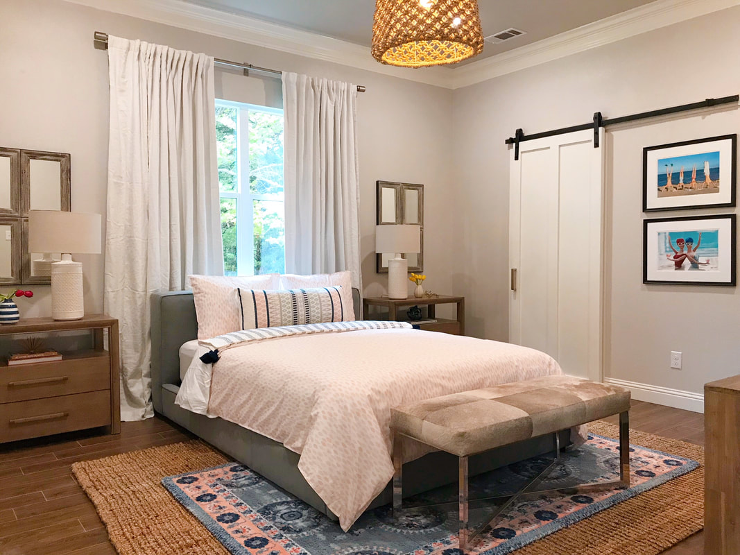 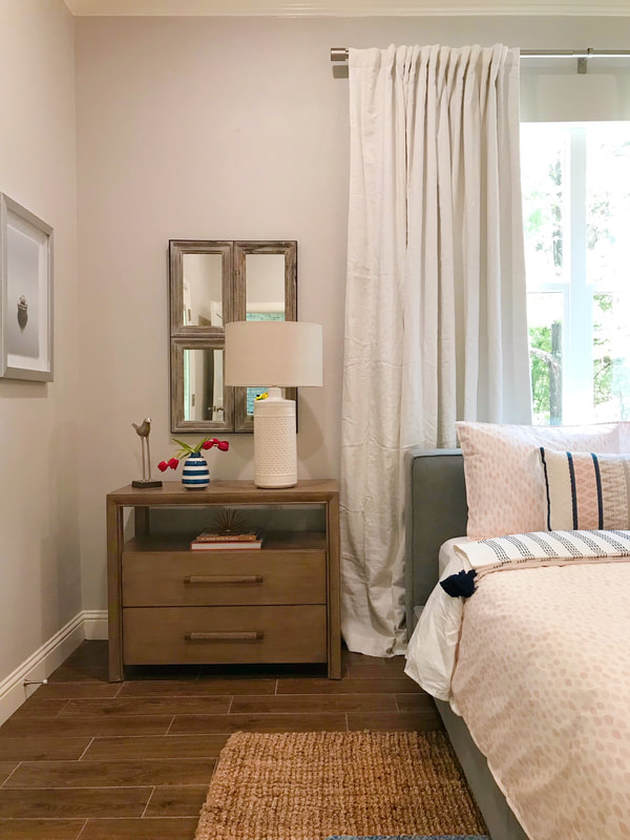 Resources: Bed: West Elm Nightstands: Wayfair Bedding: Rebecca Atwood Lamps: Pottery Barn Print Rug: Anthropologie Jute Rug: Houzz Bench: Wisteria Family Room 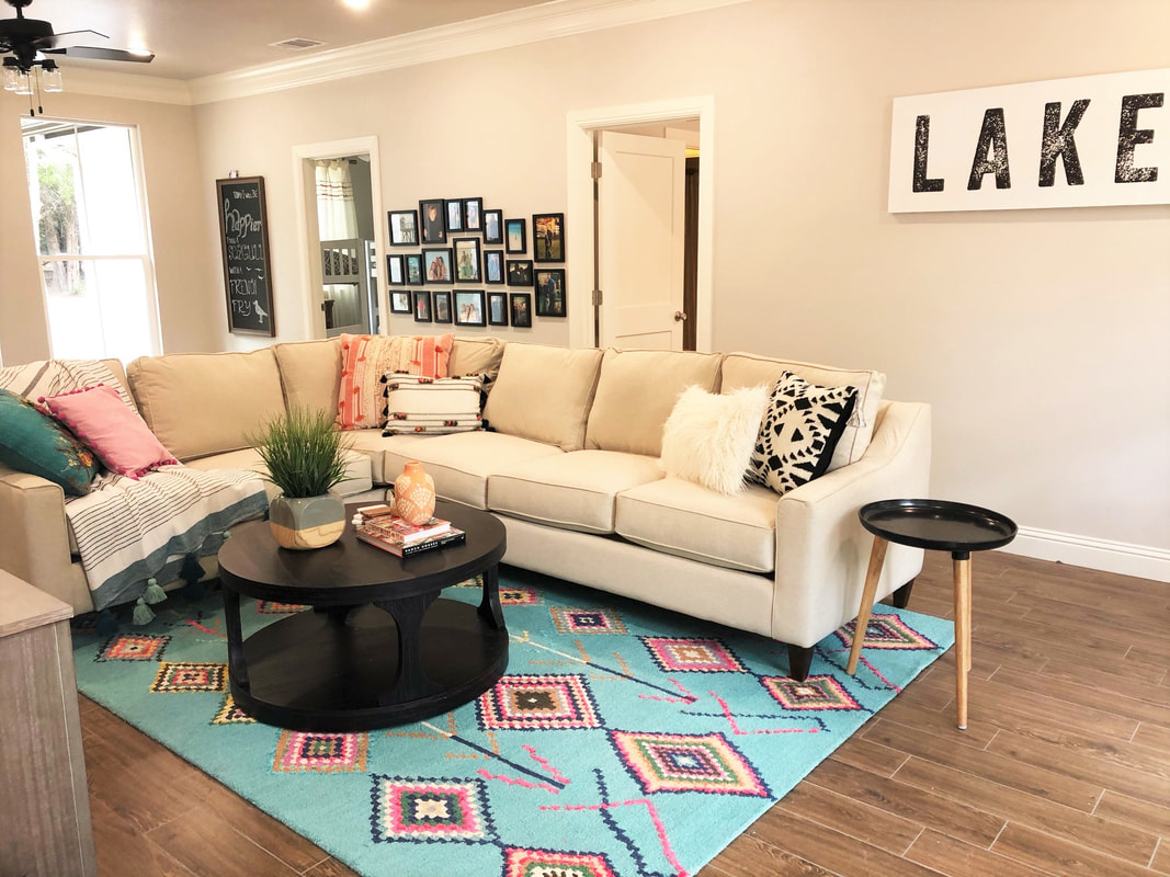 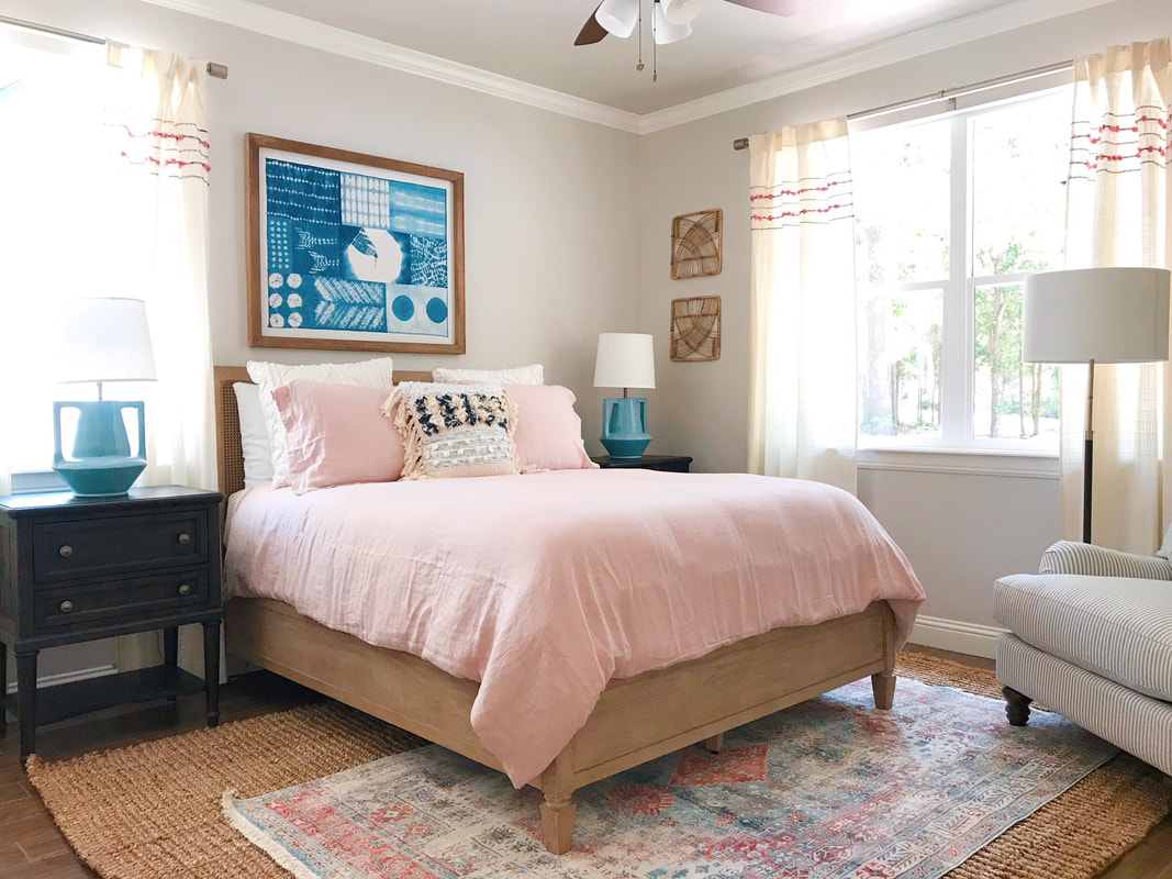 Resources:
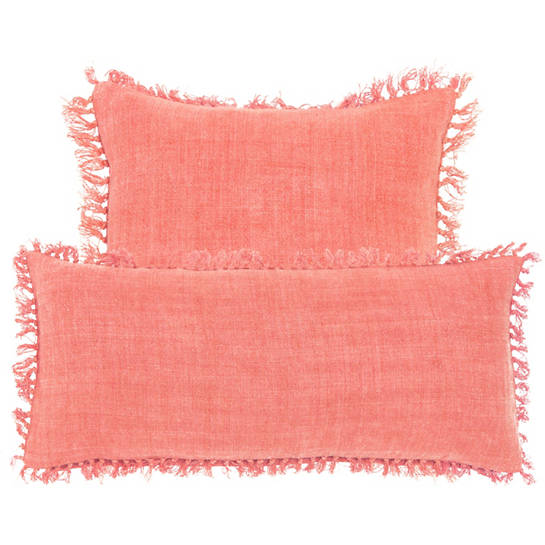
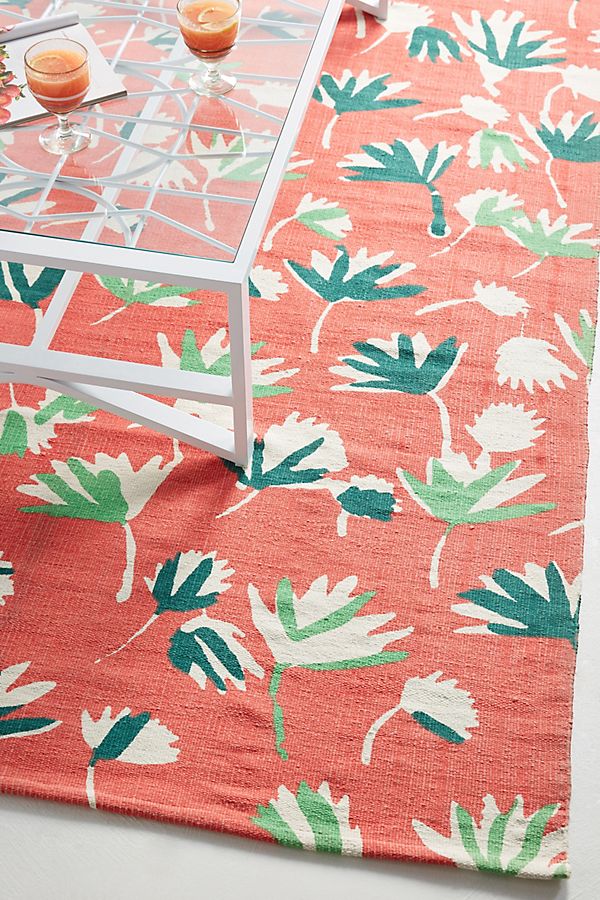
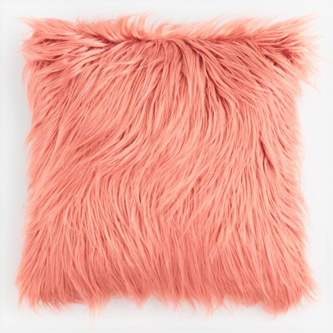
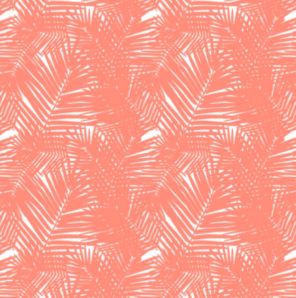
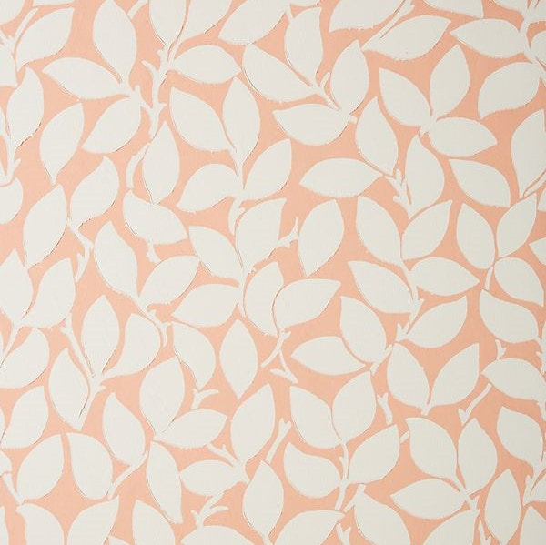
Bed: Pottery Barn Bedding: Pottery Barn Nightstands: Wayfair Table Lamps: Ballard Designs Artwork: Pottery Barn Rugs: Houzz Chair: Birch Lane This post contains affiliate links. A color we seem to be crushing on lately is coral. I think the rug in this Spanish-inspired bedroom may have kicked it off, but now it seems we can't get enough of it. It brings such a warm accent to any room without screaming, "Hey! Look at me!" 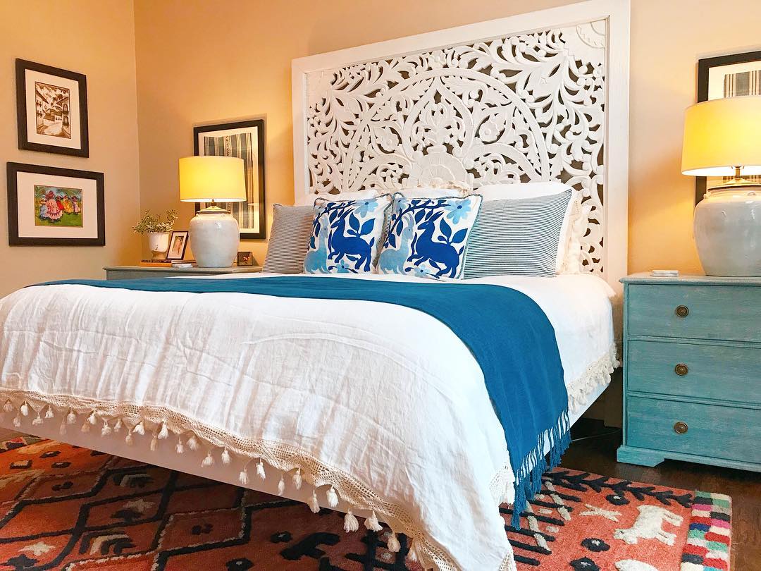 These lamps we used in the Lakehouse project are from Candelabra and just work so perfectly in this space. 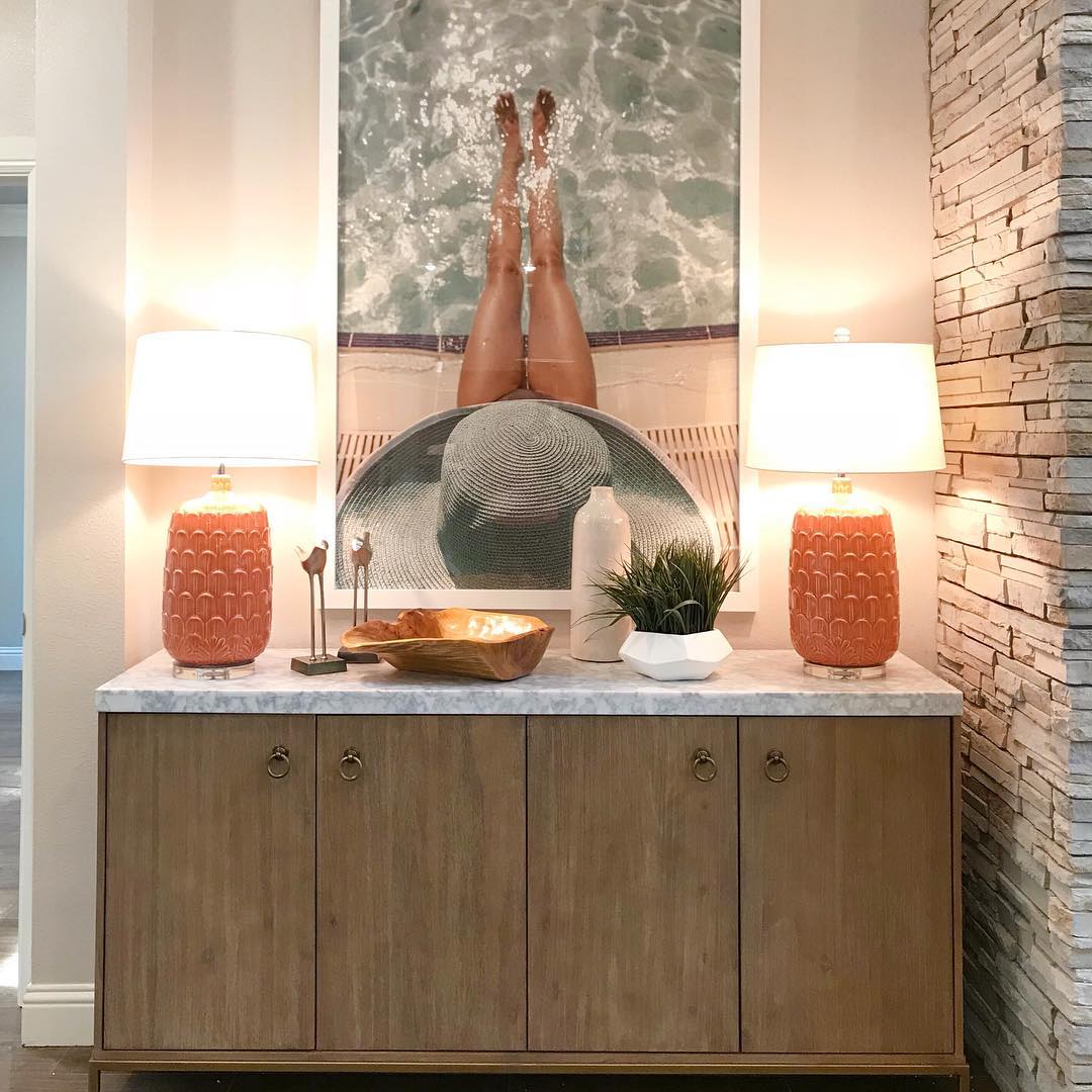 So, naturally when we crush, we crush hard, and our design team was challenged to find their top coral picks to share. Accessories like pillows and lamps are super easy to add as color pops to your room. Pillows are in washed linen from Annie Selke or faux fur from World Market. Ceramic lamp from Wisteria and indoor/outdoor rug from Anthropologie. If you are ready for a bigger commitment, we love these wallpapers for an accent wall or powder room. Jungle leaves from Katie Kime, and Tivoli Floral and New Leaf prints from Anthropologie. As we were digging for coral, we came across this amazing chair and ottoman from Kathy Kuo Home. Can't wait to add these to an upcoming project! 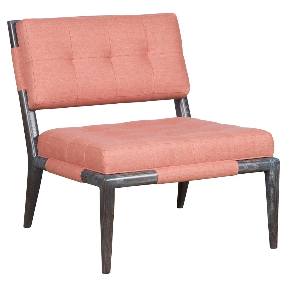 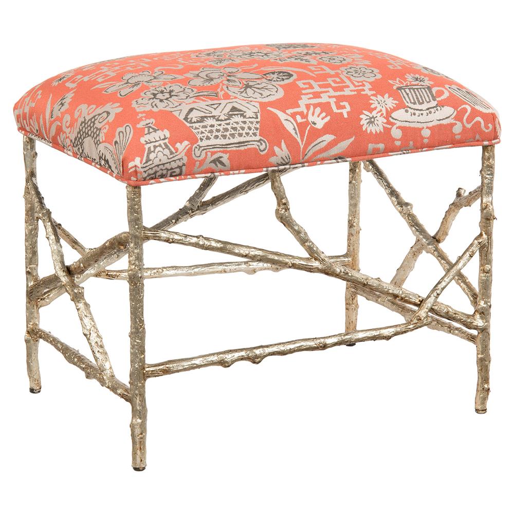 Do you have a love of coral? How have you incorporated it in to your home? Email us and your photos might be used in an upcoming blog!
So, we may have gone a bit overboard on our swatches last week when we visited the Dallas Design District. The whole team scoured showrooms for fabric and wallpaper swatches and then three shopping bags later, we hauled our goodies back to the office. It was a bit like Christmas morning. You all know how much we love color and well, we definitely found some amazing textiles that we can't wait to incorporate in to our clients' homes. Andrew Martin's new Hacienda Collection is inspired by Mexican art and wildlife and just make us so happy. The vibrant patterns and colors of the traditional dress of Oaxacan women provide additional inspiration. 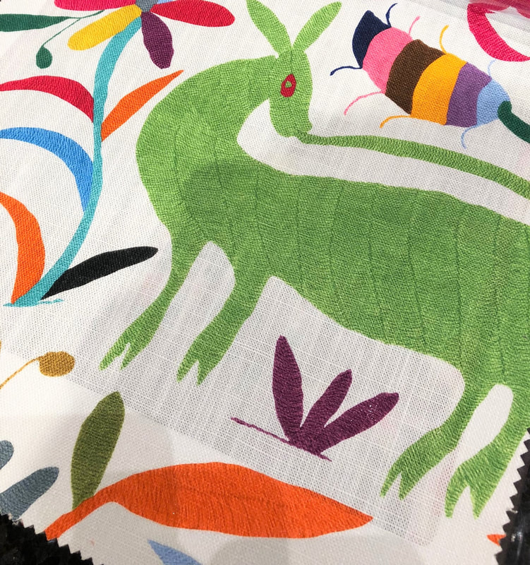  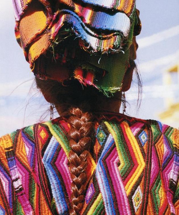 Another line we fell in love with is from John Robshaw and features traditional block printed textiles from India with whimsical motifs of elephants and birds. The indigo dyed collections are gorgeous and we are big fans of the mixing and matching of prints. One of these days we need to take a field trip to India to check out this block printing in person. Who's in? 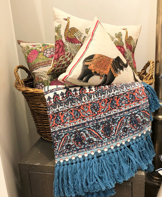 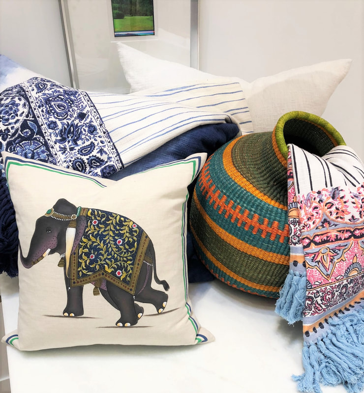 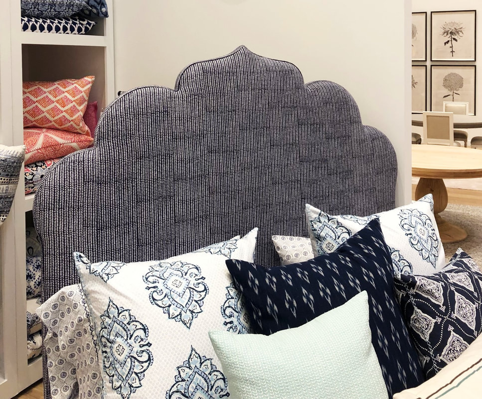 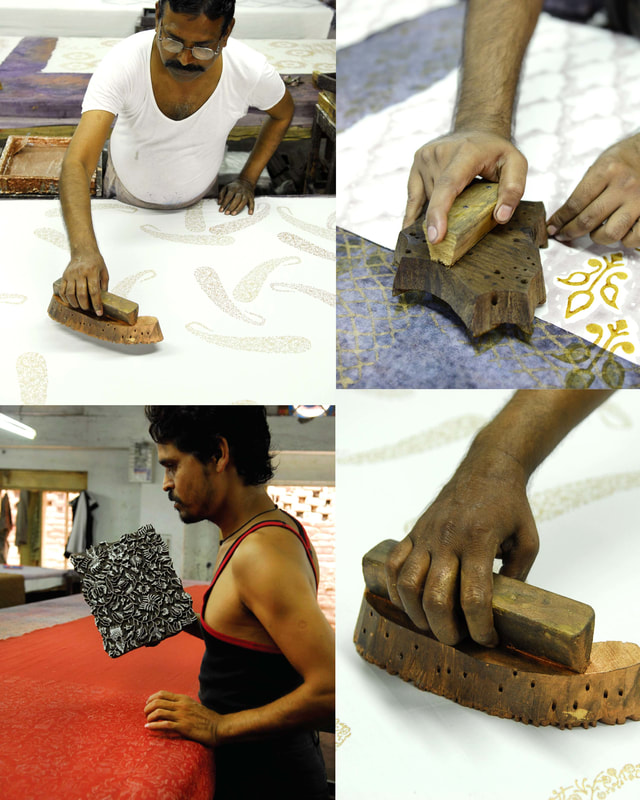 With the addition of our latest treasures, the hoard has grown so much, our basket storage system is about at capacity. Guess it's time to reorganize. 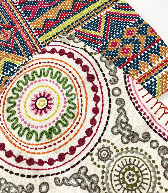 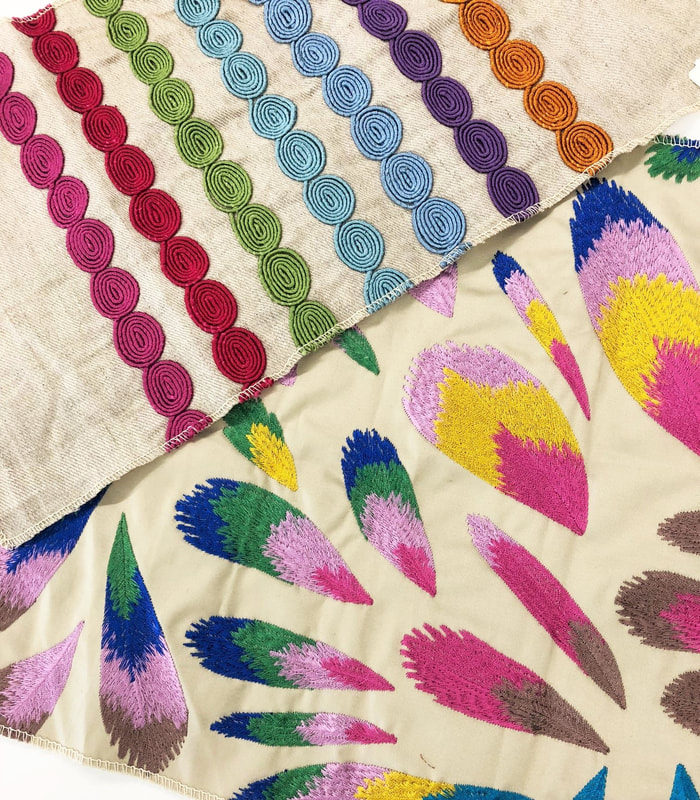 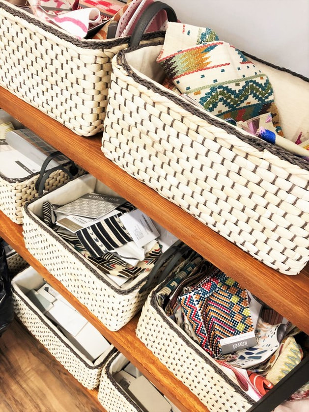 |
Categories
All
Archives
October 2023
|


 RSS Feed