|
If you haven't already noticed, we kinda live and die in color. Color trends in home decor tend to:
A. be longer living than fashion trends B. lean more towards neutrals C. be cyclical in that they come around again every 30 years or so. Case in point the resurgence of the earthy tones of the 70s. Pantone is THE expert when it comes to color trends and we like to keep an eye on them just to see what may be to come in the next season of home furnishings. Last year's Color of the Year, Veri Peri was so underwhelming to us that we didn't even talk to y'all about it. Kind of a sad color that was trying to be happy, it seemed to match everyone's mood at the time. THIS year, however, we admit we were somewhat surprised at the boldness of Viva Magenta. Girl, you are speaking our language!
According to the Pantone Institute, "Pantone’s Color of The Year, Viva Magenta 18-750, vibrates with vim and vigor. It is a shade rooted in nature descending from the red family and expressive of a new signal of strength. Viva Magenta is brave and fearless, a pulsating color whose exuberance promotes a joyous and optimistic celebration, writing a new narrative. PANTONE 18-1750 Viva Magenta welcomes anyone and everyone with the same verve for life and rebellious spirit. It is a color that is audacious, full of wit and inclusive of all."
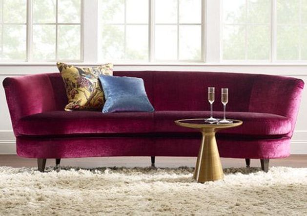
Audacious, full of wit and inclusive of all. I mean, isn't that what we all want to be right now? Can you imagine a velvet couch or sexy wine glasses in this color? Life is too short to live in beige and gray, and we are totally on board with such a bold color choice for 2023. Check out some of our favorite products here and find more on our shop page. 
We can't wait to see how this color evolves in home decor over the year and are very hopeful about the trend towards bolder colors. Maximalist design is surging; colors, textures, layers, patterns all climbing in bed together like one big co-sleeping family. It's an expected swing of the pendulum from the clean, bright, neutrals we've been spoon fed the last decade. Bring on the next iteration of the Roaring 20s!
0 Comments
It may surprise you to know that SGD tends to not pay a ton of attention to color and home decor trends. It's more of a "that's interesting to know but I'm still going to use turquoise" kind of design philosophy. But, as with the Pantone Color of the Year and previous trend posts, we like to let y'all know that we ARE on top of things and that we are there for you as a resource.
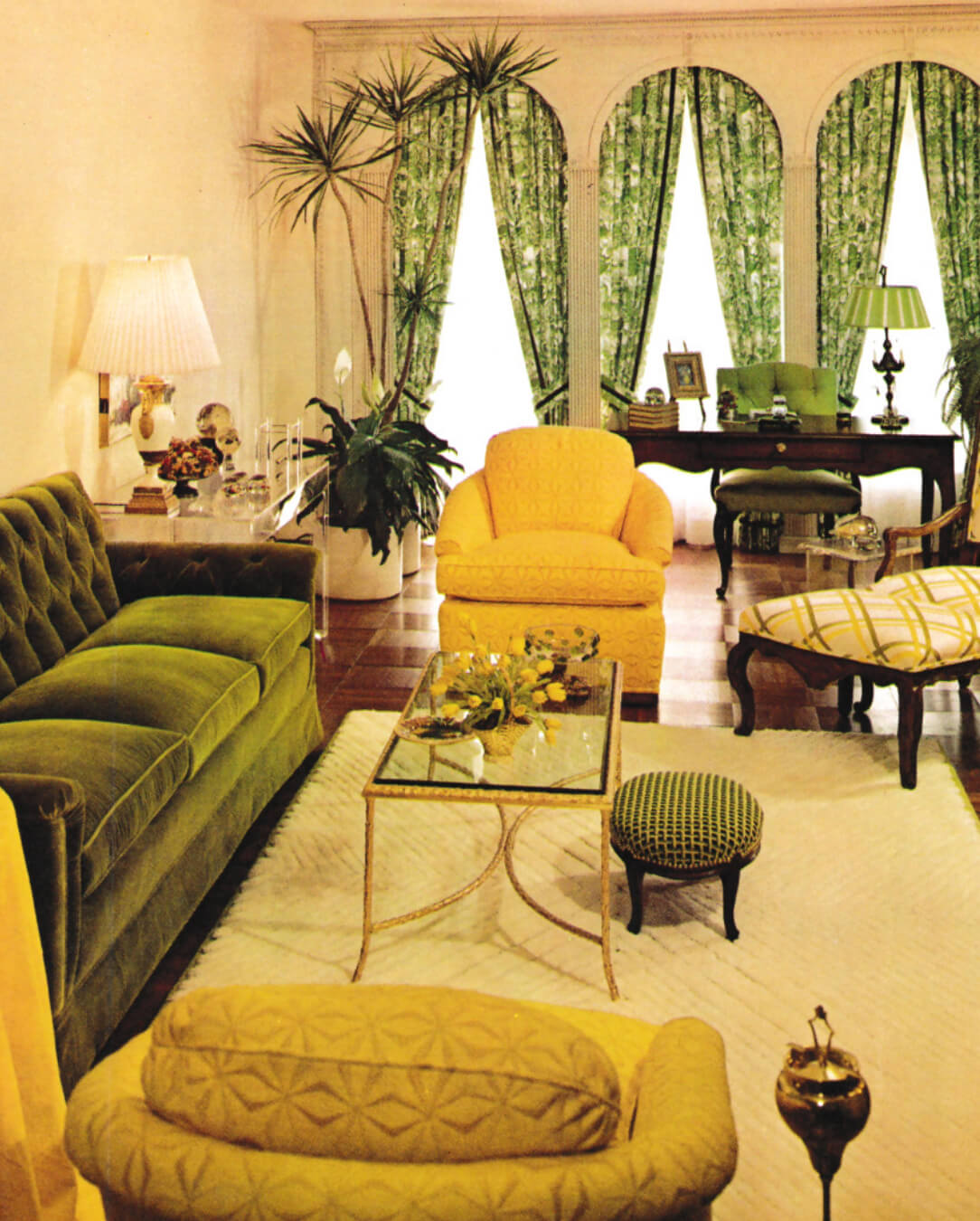
Last fall, Ochre was the color on the rise and friends, might as well embrace it because it's not going anywhere. This is not your mama's Harvest Gold from 1974. This is rich and earthy and spicy and you'll be surprised as to how it pairs with other colors. Ochre has also lead the way for a resurgence in the earth tones that were so popular in the 1970s. Olive and Terracotta are combined with ivory and charcoal gray for an updated, sophisticated palette. Throw in some Teal for a little coolness and you've got the recipe for warm and cozy surroundings that will last you all winter. Grab your pumpkin spice and settle in.
OCHRE 
OLIVE

TERRACOTTA

TEAL

Check out our Shop section for more of our fabulous finds!
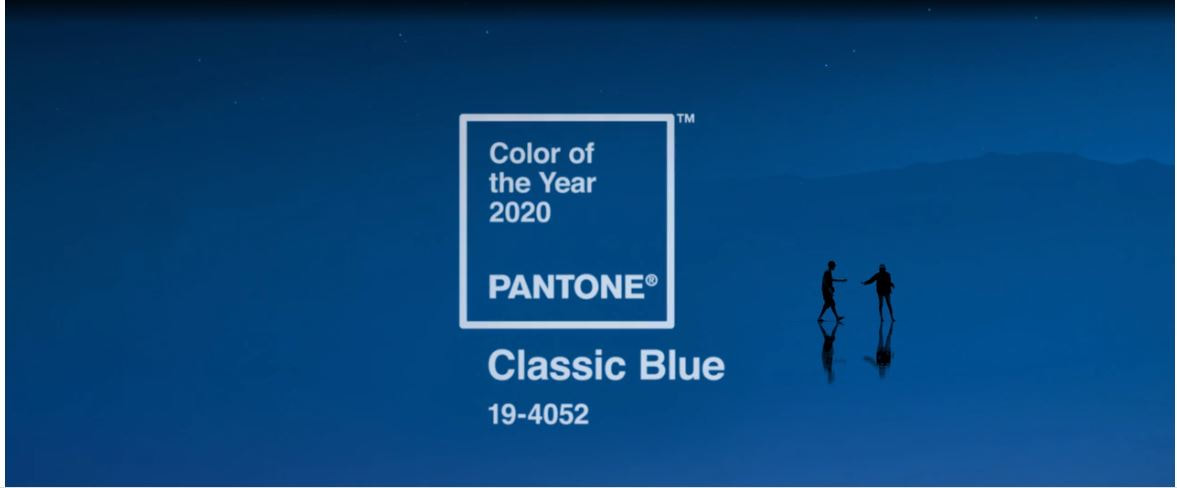
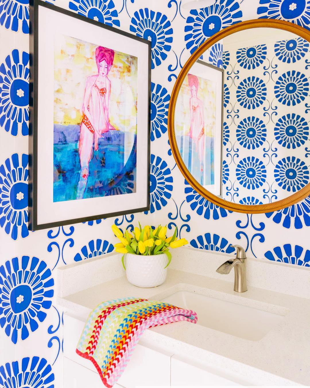
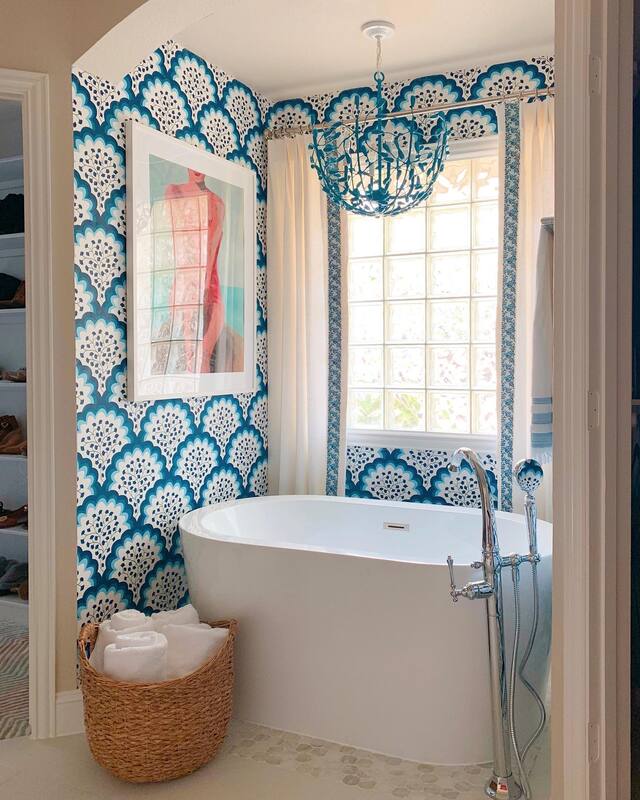
This post contains affiliate links and we may be compensated for purchases made via these links. For design geeks like us, the announcement of the Pantone Color of the Year is akin to the Academy Award Nominations. It reflects not only on the direction of design trends, but the overall mood of the world in general. I know, some of you are rolling your eyes at that statement, but bear with me for a minute. Think of the 1970s with the emergence of the hippie, naturalist, conservationist culture. The first Earth Day in 1970 was the birth of the modern evironmental movement. What were the prevailing colors found in almost every home in the 1970s? Earth tones. Every single one of us had kitchen appliances in Avocado Green or Harvest Gold, and the earthy colors permeated throughout the home. Except maybe in the little girls' rooms where pastel Holly Hobbie bedding reigned supreme. The past two Colors of the Year; Ultra Violet in 2018 and Living Coral in 2019 were enigmatic, thoughtful, and expressive. They spoke to visionary thinking and optimistic, joyful pursuits. They were about what is possible in the world. Now, in 2020, the future of our world might not appear to be so optimistic, and therefore, we need a color that assures us that things will be ok. Introducing Classic Blue. According to the Pantone Color Institute, "We are living in a time that requires trust and faith. It is this kind of constancy and confidence that is expressed in PANTONE 19-4052 Classic Blue, a solid and dependable blue hue we can always rely on." Blue has always been an integral color in the aesthetic of Shauna Glenn Design. It lives outside of the core neutrals of gray, brown, black and white, yet it has a neutral feel all its own. It can be adventurous or conservative and we love this Classic Blue hue because it makes its home somewhere in the middle. For color fans like us, Classic Blue is the perfect color to build on; playing well with coral, teal, chartreuse and pink. A blue chair in the living room, or a blue velvet headboard in the bedroom adds a great pop of color without feeling like you are committing to something super trendy. We love a great blue wallpaper too to brighten up a bathroom. Need some inspiration? Check out some of our favorite projects. And check out our Feeling Blue shop for more inspo on how to add blue to your space!
As if furniture and decor from Anthropologie was not already at the top of our "Most Coveted List", their fall collection has us all ready to max out our credit cards and go to town. Warm ochre and nubby textures have us feeling uber hygge and ready to nest in with a cuppa tea and a good book. Florals are not just for spring in rich colors and dark backgrounds. Add a dose of whimsy with an animal motif or two in everything from mugs to lamps. And the 70s boho vibe is alive and well with rattan and cane making a big decor statement. Check out more of our favorite fall trends here. OCHRE--Move over pumpkin, this earthy, rich hue pairs with everything from blush to navy to your favorite spicy hues. TEXTURES--Nubby textiles, ribbed glass, textured ceramics and embossed metals are tactile elements that add that one extra detail to make these pieces extra special. FLORALS--Not just for spring, the florals of fall include rich jewel tones as well as delicate inlay and glass floral motifs. ANIMALS--Leopards, snakes and birds, oh my! The animal kingdom is invading home decor in both decorative and functional ways. RATTAN & CANE--Natural elements that bring a boho vibe to any room, rattan and cane details are a light and airy contrast to heavy fall velvets and saturated colors. Shop the Anthropologie Decorating Event for 20% off furniture, decor and bedding. PLUS, for a limited time, save an extra 50% off sale items!
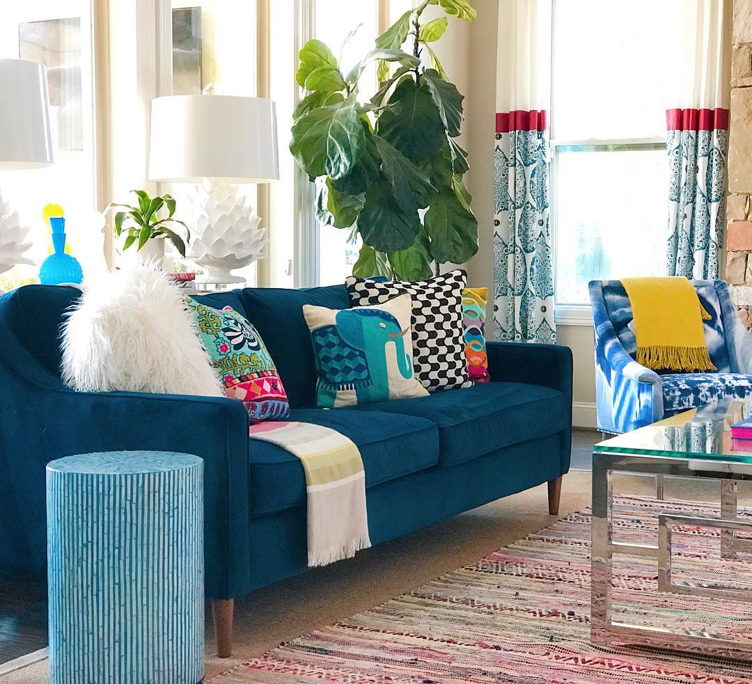
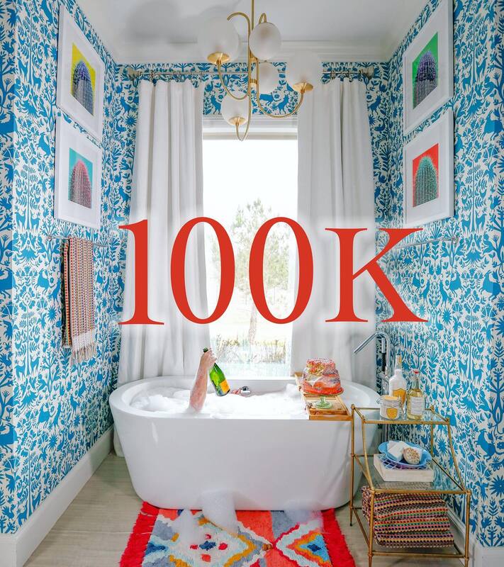
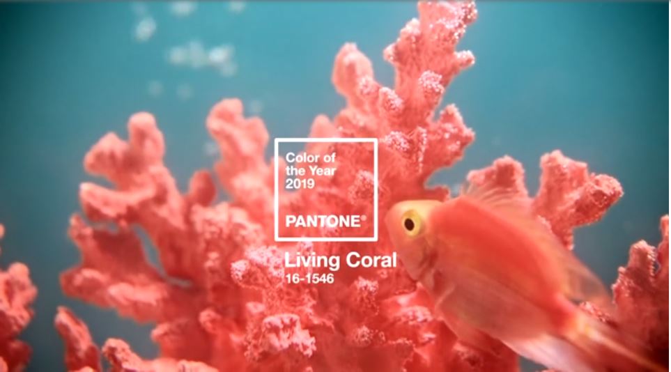
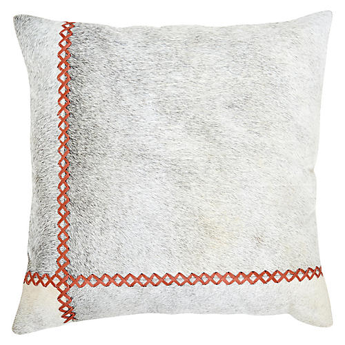
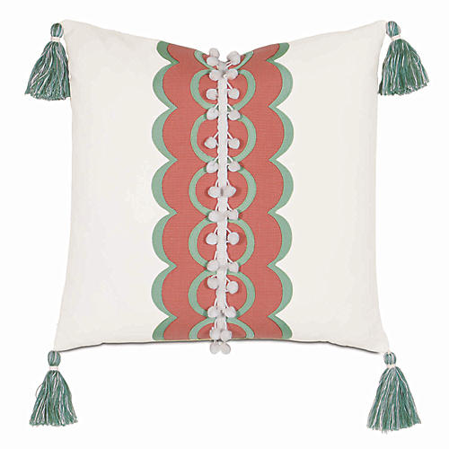
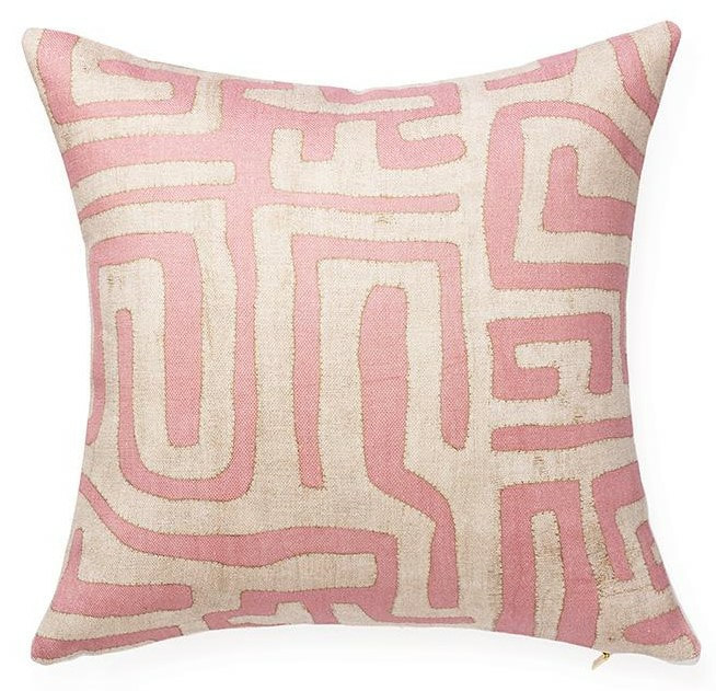
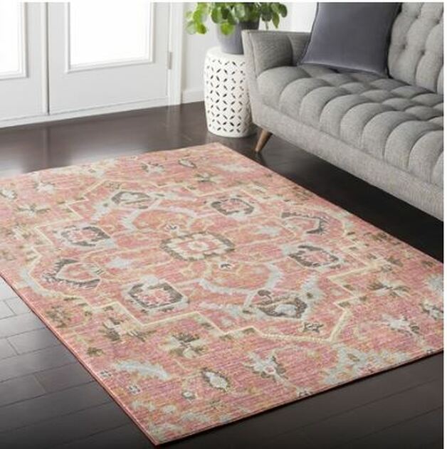
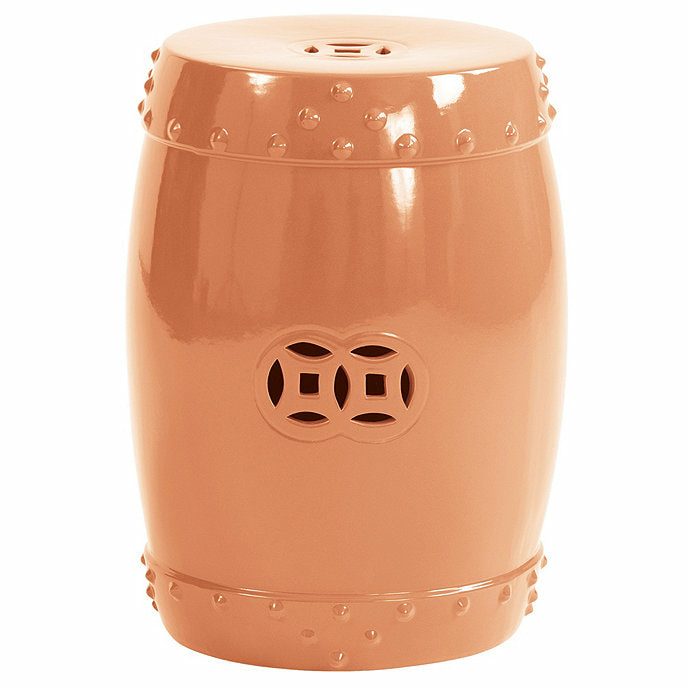
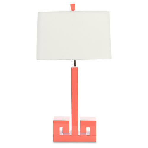
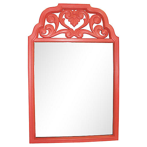
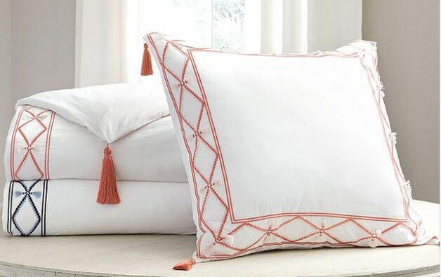
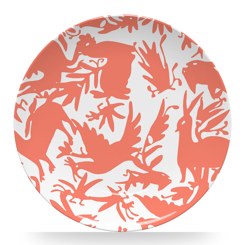
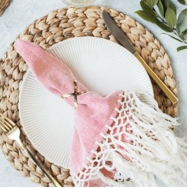
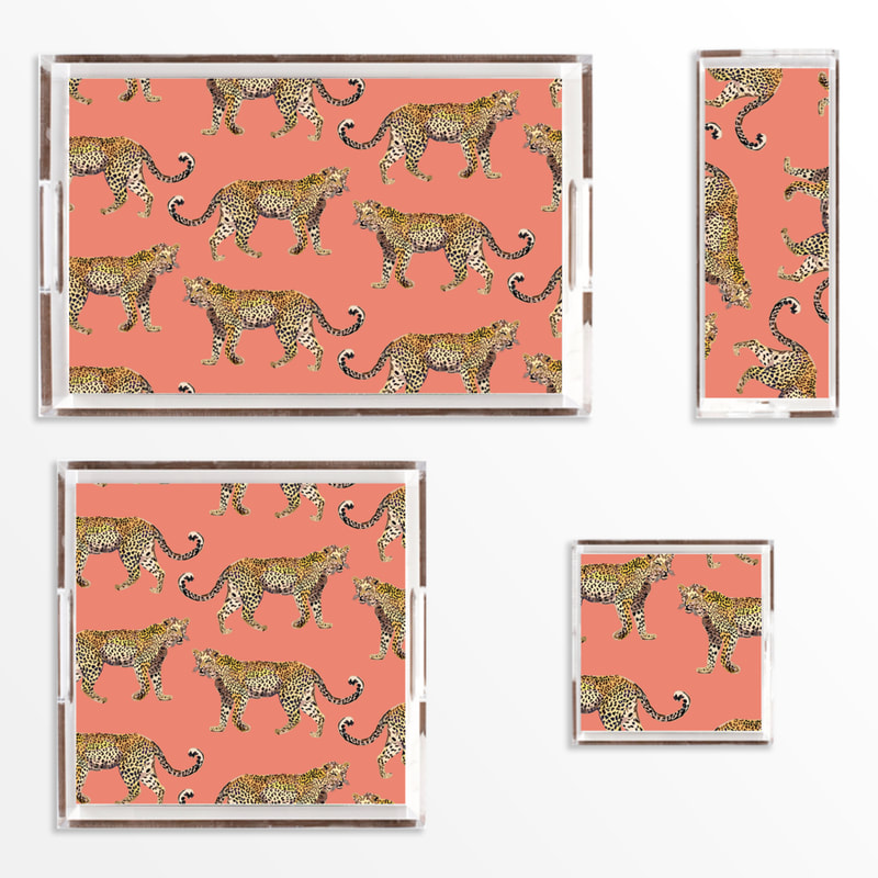
This post contains affiliate links and we are compensated for purchases made via these links. To be honest, it was a group effort, so let's all celebrate! Champagne and cake for everyone! Last week, we hit an Instagram Milestone, 100,000 followers. I swear it felt like the last 300 took us FOREVER to reach. But, we made it and celebrated with lunch from Dutch's Hamburgers and then promtly all went home to take a nap. Speaking of Instagram, one of the things we love about it now is the ability to follow hashtags. If you are looking for design inspiration (other than from us, of course), these are some of our favorites. 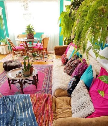 #jungalowstyle--Created by blogger and designer Justina Blakeney, the Jungalow brand is boho chic meets bold color and a touch of jungle fever. If you have a love of plants, this was made for you. 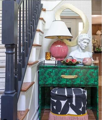 #finditstyleit--Treasures can be found anywhere; flea markets, grandma's house, your closet. Get great inspo on how to style these found treasures in new and different ways. 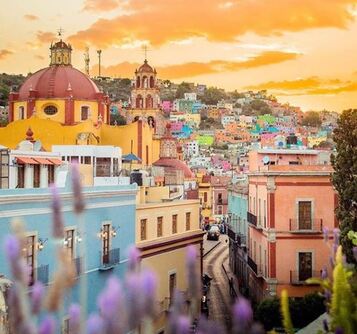 #ihavethisthingwithcolor-- This is pretty self explanatory. Posts include not only home but fashion, travel, food, anything and everything colorful! 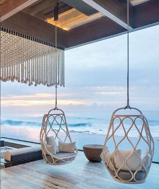 #bohoismyjam-- Lots of macrame, natural elements, and plants in addition to pattern mixing and global textiles. A complete boho smorgasbord. 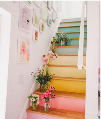 #houseenvy-- A great combo of interiors, architecture, exteriors, finishings, design and decor. Plus some innovative upcycling and repurposing ideas. 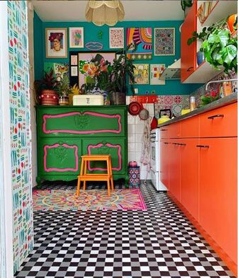 #eclectichome-- Lots of British design inspo with this hashtag. A combination of flea market finds, global textiles and bold pattern mixing. 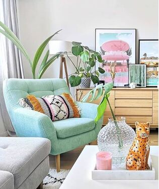 #myinteriorstyle-- More curated, styled photos that focus on design vignettes, before and after images, and weirdly a bunch of photos of dogs. When we did a trend story on the color coral last year, we were not anticipating being so ahead of the design curve in our love affair with this color. Recently, Pantone announced it's Color of the Year for 2019 as Living Coral and we are a little bit giddy with the potential of new and fabulous products for our clients. "PANTONE 16-1546 Living Coral emits the desired, familiar, and energizing aspects of color found in nature. In its glorious, yet unfortunately more elusive, display beneath the sea, this vivifying and effervescent color mesmerizes the eye and mind. Lying at the center of our naturally vivid and chromatic ecosystem, PANTONE Living Coral is evocative of how coral reefs provide shelter to a diverse kaleidoscope of color." --Pantone.com So, naturally, this led us to check out some of our favorite resources to see what new and exciting coral pieces they have to offer. Enjoy! Pillows are one of the easiest ways to update a space. We love this hair on hide pillow with the coral accent stitching. Coral and aqua have always played well together. This pillow is made to go outdoors but use it anywhere! The Kuba cloth pillow is a traditional African fabric that is one of our favorites from St. Frank. It's no secret that we love colorful rugs. The Anamura Rug from Lulu & Georgia is the perfect balance to a neutral sofa. Coral accents add a pop of color anywhere in your home. Tuck two of these garden stools under a console table for extra seating that can be pulled out anytime. This modern lamp from One Kings Lane is sleek and bold with its stylized Greek Key designed base. And we love this chinoiserie style mirror for a powder bath! The Ariana Bedding from Ballard has detailed embroidery and finished off with tassel ends on duvet cover and pillow shams. Jump off from the coral or navy base with a plethora of colorful accent pillows. Jazz up plain white dinnerware with these amazing tabletop pieces. We love Otomi patterns and well, in coral just makes us swoon. These plates are from Katie Kime and I need them now. Macrame fringe adds a boho vibe to the Darcy coral napkins from Lulu & Georgia. Lucite trays with a leopards on a coral background come in a variety of sizes and can be used in your living space or bedroom. Also from Katie Kime. Roar!
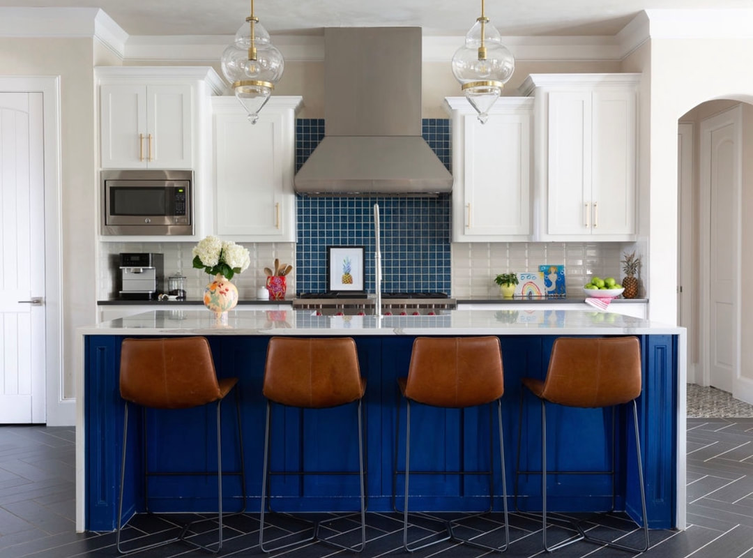
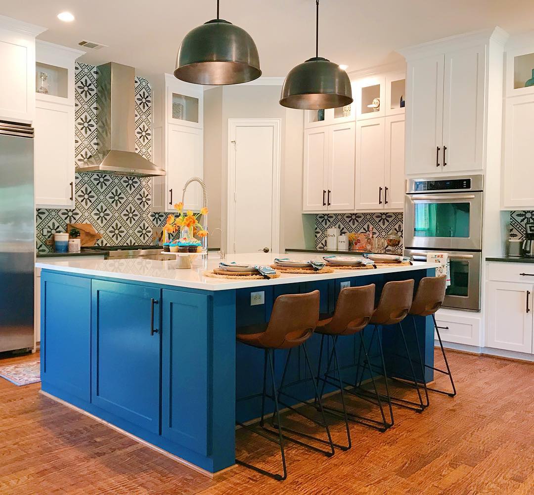
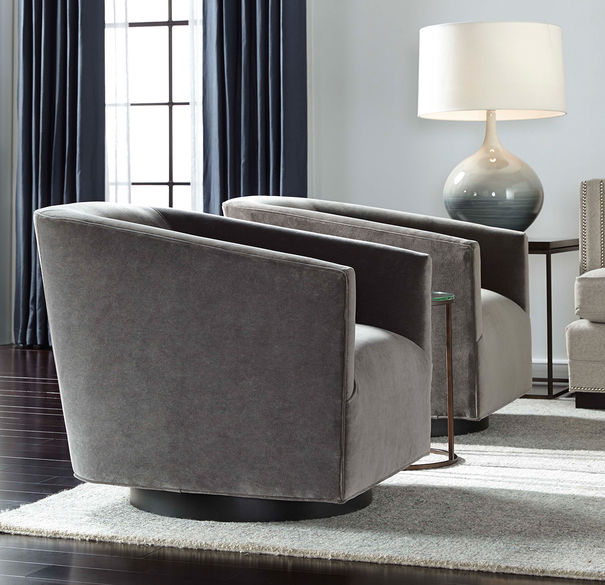
This post contains affiliate links. New year, new you. Isn't that what we always hear? And as we wrap up 2018, some of our clients are already getting a jump start on their newness with all kinds of projects. Good thing, we like it busy with a side of chaotic. For those of you mulling the idea of updating your home in 2019, we pulled together some of the top home decor and design trends that we are gravitating towards. Some of them (minimalism) (?!!) just aren't our style, so we'll smile graciously and wave to the all white lacquered room as we pass by. Hopefully this will give you some inspiration for getting your own project started. Or just call us. We'll always make room for one more! Bathrooms Two of our favorite bathroom trends are floor to ceiling wall tile and matte black hardware. For greater visual interest, we picked two different tile patterns from Ann Sacks. Ceramic tile flooring that is made to resemble wood is also a top trend for the bathroom. Stick with light colors for an open, airy feel. While we love the matte black fixtures, it's always fun to mix up the metals as with these brass accents in the light fixtures, mirror and hardware. And don't be afraid to have some fun by incorporating a bold wallpaper, especially in a powder room. Kitchens OK, so we have thing for blue in the kitchen. Seems as though we are not alone in that as blue cabinetry is one of the top kitchen trends for 2019. Along with patterned tile backsplashes and waterfall countertops, today's kitchens are anything but plain Jane. And the same wood textured tile we loved so much in the bathroom is also the perfect flooring for your kitchen. How cool is it in black? Living Spaces Turns out that another big decorating trend for 2019 is pattern mixing. Hello, have we met? Glad to see you've joined the fun! It's no secret that we love pattern and texture, and we will mix anything we love with anything else. Don't be shy! Go for it! In other trend news, statement light fixtures have moved beyond just the dining room. I know we all love our ceiling fans but give these beauties a try. On the more elegant side, curved barrel style chairs and Art Deco style curved sofas are an upcoming trend. Combine with brass accents and you have a chic space to serve those retro cocktails.
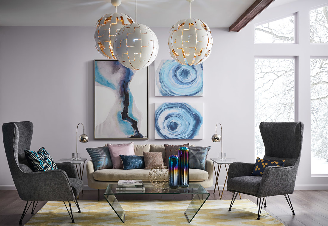
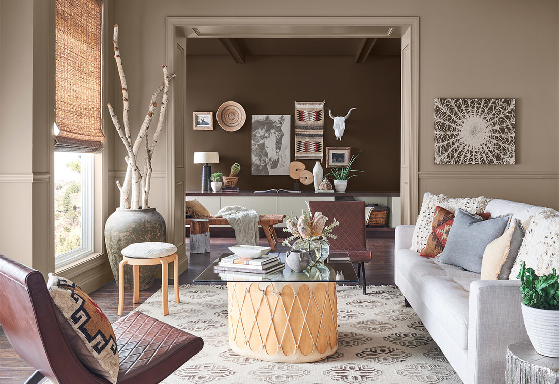
Need help with an upcoming project? Contact us here, or email. We'd love to give you a fresh start for 2019! This week the team attended the Sherwin-Williams Colormix Color Forecast 2019 presentation at Dallas Market Center to get a sneak peek at what they see as the biggest color trends for 2019. As you might imagine, the color trends for home change a lot more slowly than the color trends for fashion. Remember back in the 70s when those avocado green appliances were around for FOREVER?! (The 70s are back, BTW but hopefully we learned a few lessons on colored appliances the first time around.) Six color stories ranging from cosmic minimalism to bold maximallism and inspired by tech, the Southwest, British libraries, Africa, natural elements and eclectic excess provide a variety of moods and colors for any project. Shapeshifter Inspired by the cosmos and that unique space between tech and spirituality. Clean lines, iridescent finishes and a palette of ethereal blues accented with golden yellow. Wanderer Modern western palette featuring the dusty colors of the American Southwest. Worn leather, natural woods and tribal patterns. Aficionado Inspired by British libraries and menswear patterns such as plaid and paisley, this palette is a rich, elegant update of the saturated colors of the 50s-70s. Enthusiast Fully embracing the "more is more" philosophy, this color palette is bold, expressive and excessive. Layered patterns as seen in designs by Gucci and Prada, animal motifs and brocades provide inspiration. Naturalist The wonder of nature as both botanic and through an Art Nouveau eye provide the inspiration for this ethereal, sophisticated palette. Raconteur Inspired by African heritage and crafts, this palette tells the story of a culture through color, texture and pattern. Do you have a favorite? Which one are you? Send us your feedback, we'd love to hear from you!
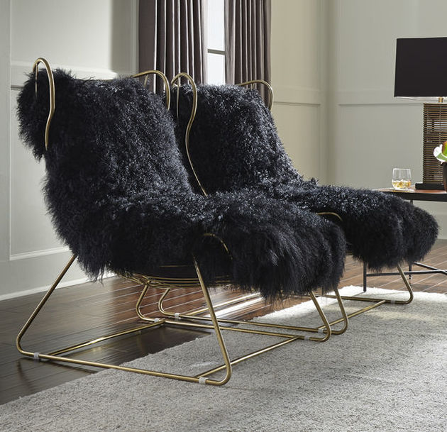
We recently received a Fall 2018 Preview catalog from Mitchell Gold + Bob Williams and let me say, we've already got several pages dog-eared. With a collection named "Modern Bohemian" (excuse me, have we met?) inspired by free-spirited, unconventional looks, it is right up our alley. Saturated luxe velvets, textured neutrals, bold patterns and warm metallics all give us the warmth of fall with just a hint of a vintage vibe. Here are some of our favorites. To see these and more in person, check out the Fall 2018 Preview Party at Mitchell Gold + Bob Williams Fort Worth tonight, 8/16/18 from 5-8. Plus enter to win a Bellini Media Console!
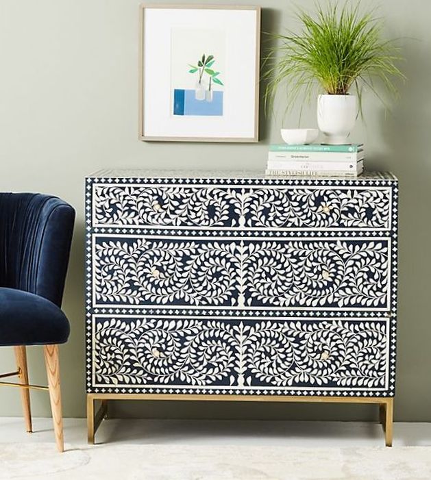
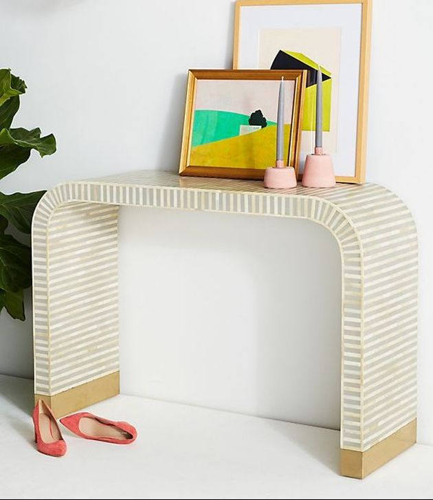
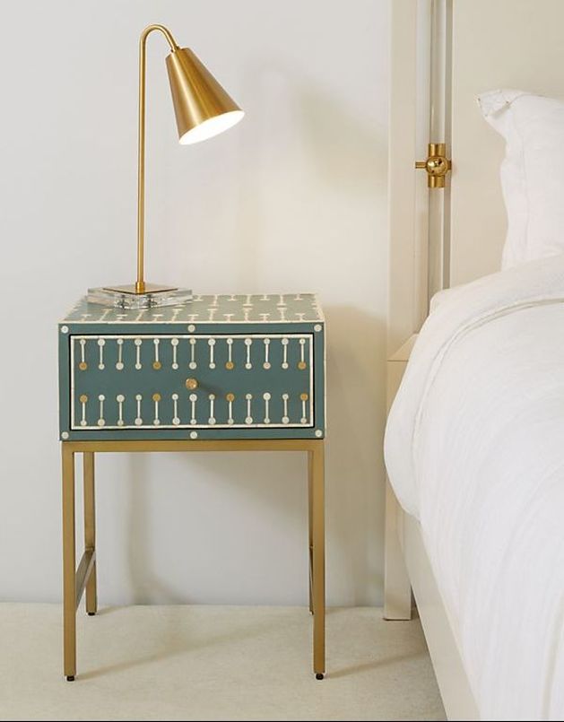
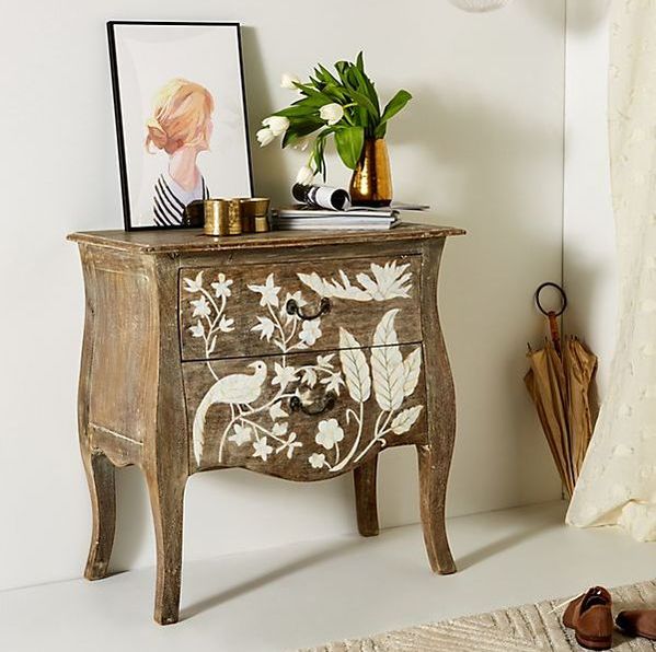
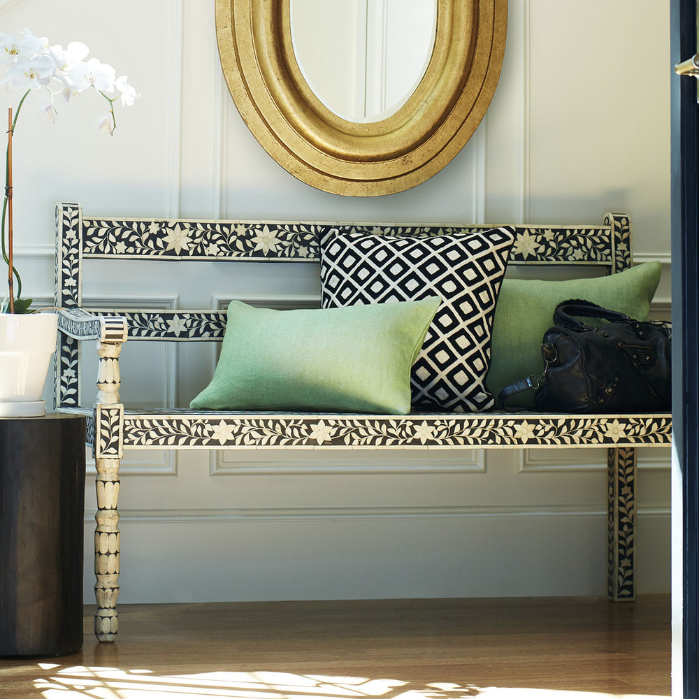
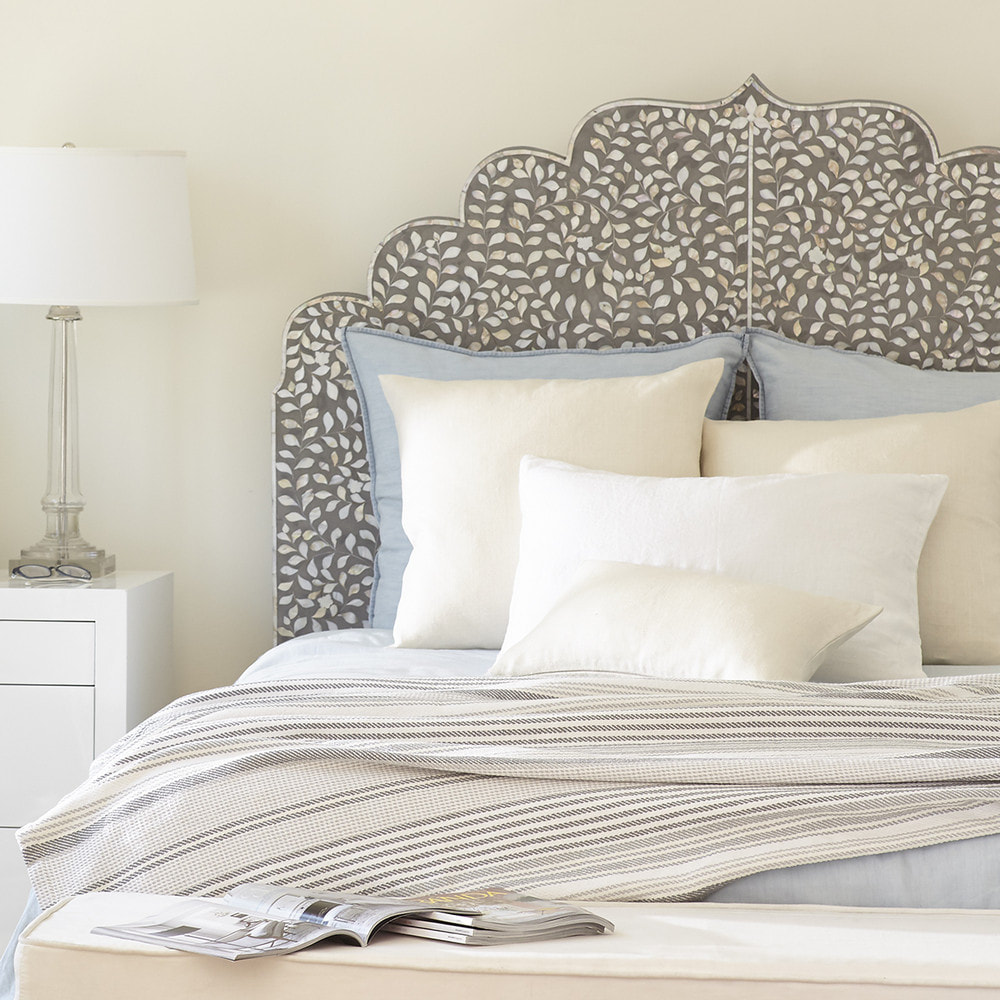
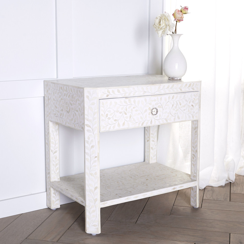
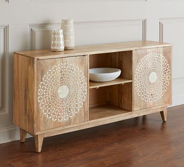
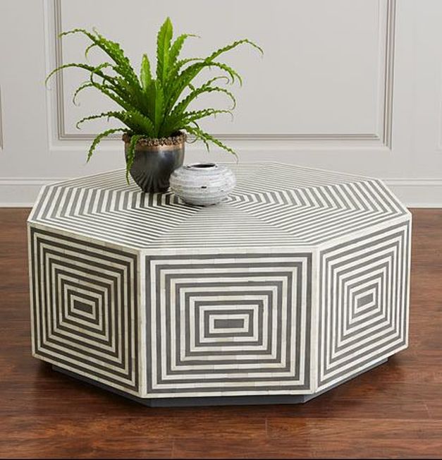
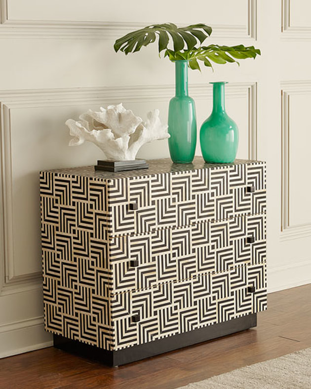
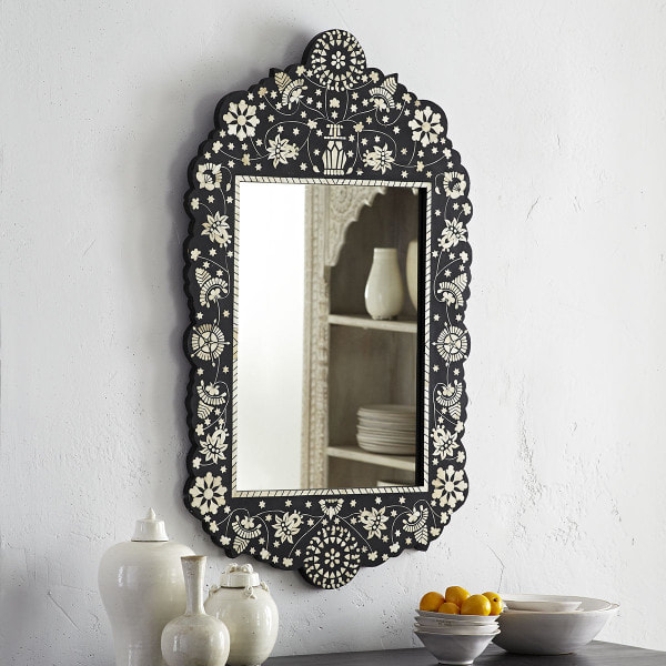
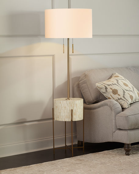
This post contains affiliate links. For hundreds of years bone has been used as an accent to furniture to add a luminous, pearly finish. From traditional Islamic or Indian motifs to more geometric Art Deco designs, the art of bone inlay adds a luxurious quality to your home decor without being too over the top. Of course, we kinda love over the top, so our favorite pieces range from subtle tonal florals to bold colors and designs.
|
Categories
All
Archives
October 2023
|

 RSS Feed