|
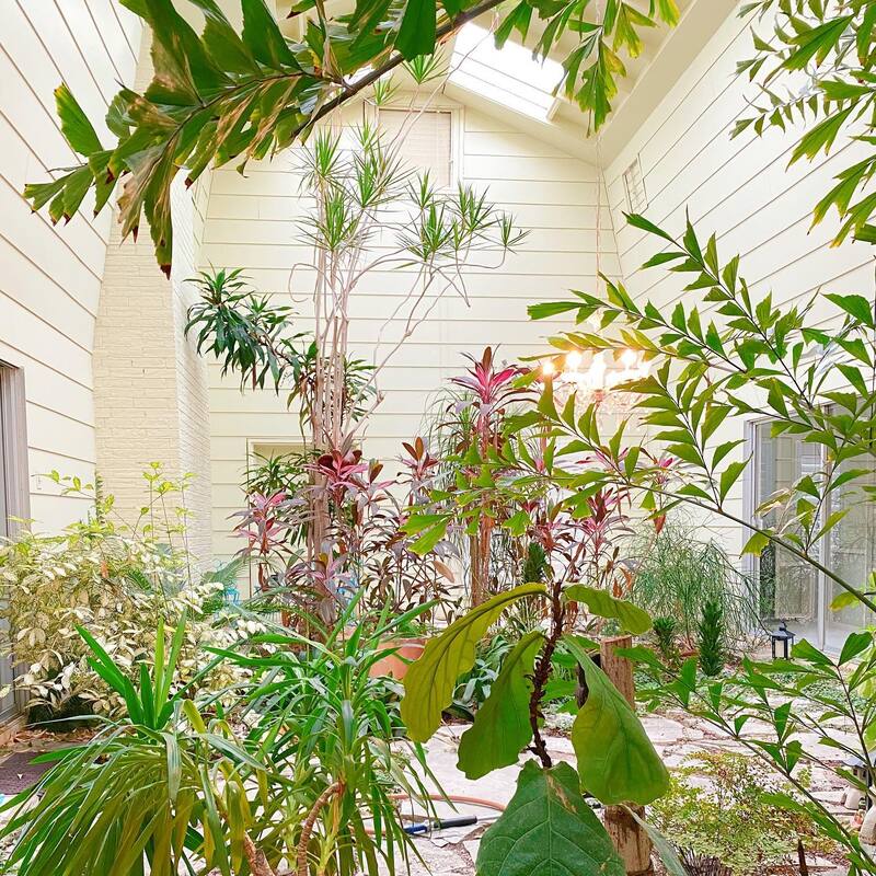
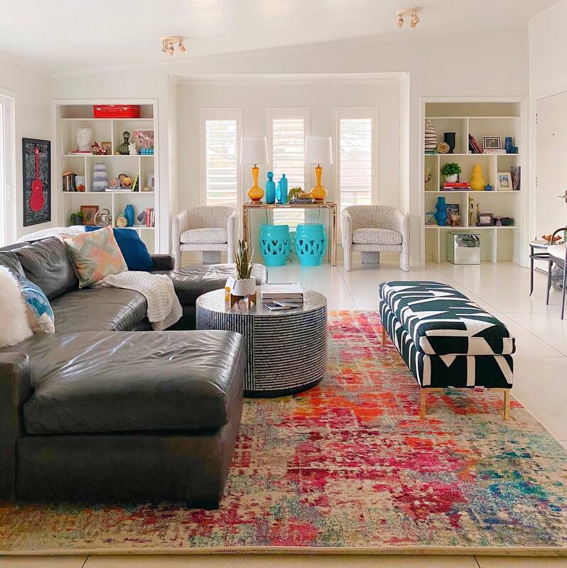
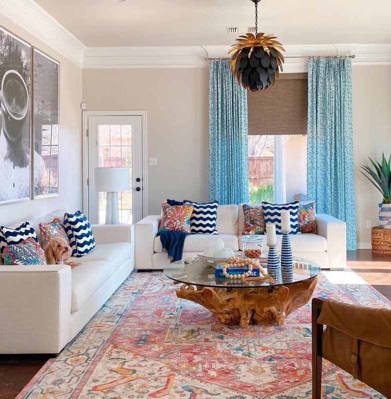
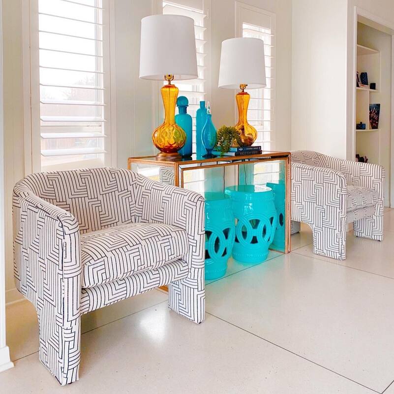
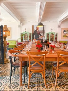
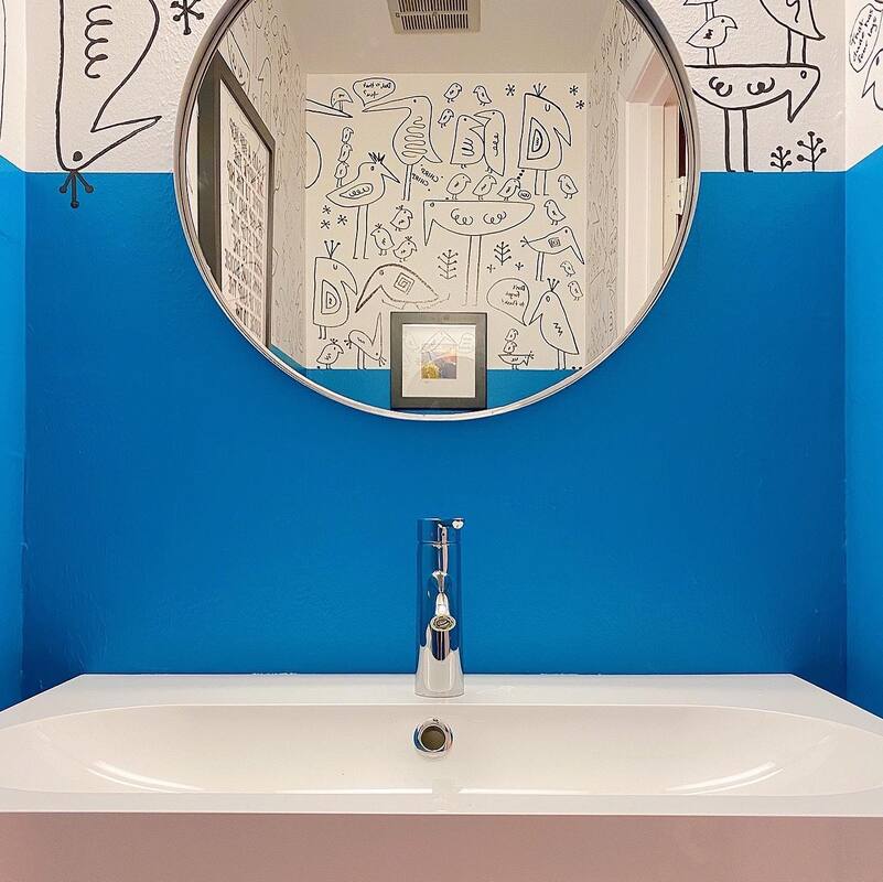
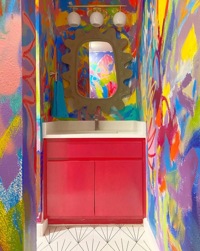
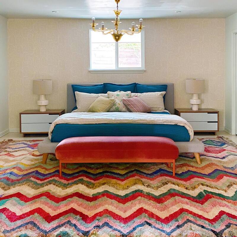
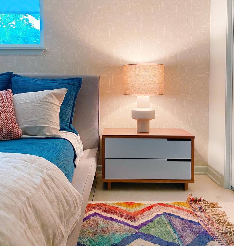
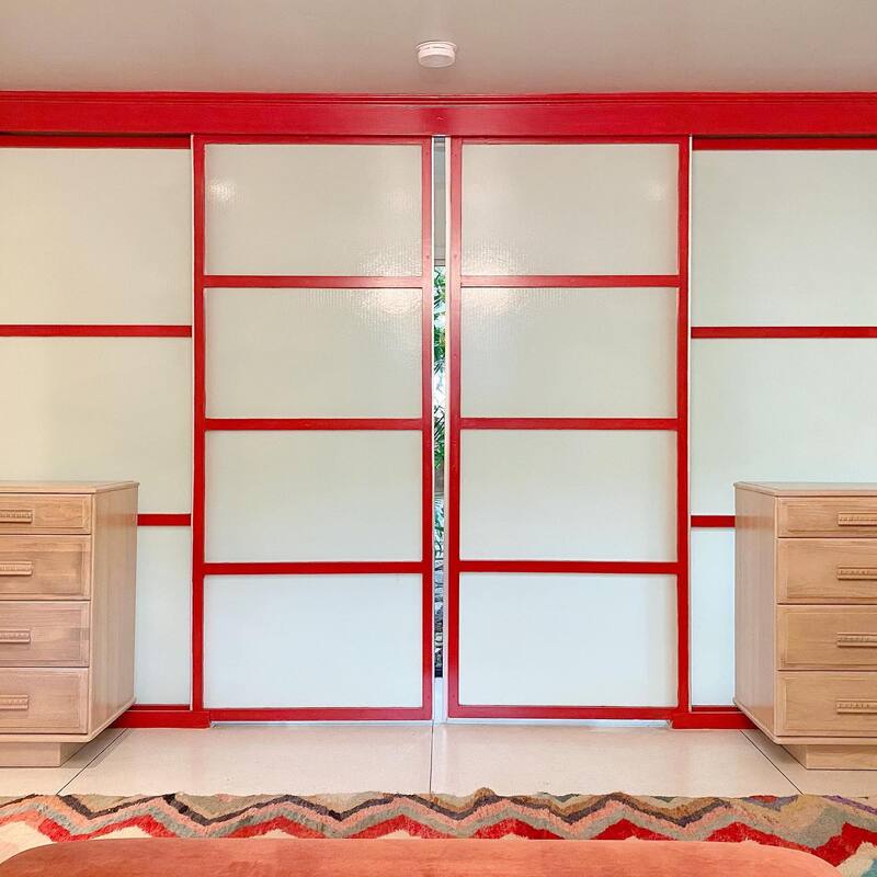
So, here's the way our most favorite projects go: Client: Hi Shauna! I want you to come do my living room. SGD: Great! Yes, we'd love to, when can we meet? Client: Here's my dilemma, I love your work, do your magic. SGD: Here's what we want to do, OK with you? Client: Perfect, when can you start? SGD: Ready to install, you are going to love it Client: I can't wait, when can I see? **BIG REVEAL** SGD: What do you think? Do you love it? Client: OMG! This is amazing, I love it so much! Thank you! 3 MONTHS LATER Client: OK, I've saved up some more money, can you come do our bedroom? We LOVE when this happens. And such was the case when a close friend of Shauna's bought an AMAZING MCM home in the Ridglea Hills neighborhood of Fort Worth. One of those homes you drive by and say, "this is what MCM is all about". Definitely the coolest house on the block. And what really got the team excited was A. The original terrazzo floors and B. The atrium in the middle of the house. Our first project was the living/dining room. A wide open space that gave us plenty of flexibility for furniture layout, we anchored the leather sectional with a great rug to create the main sitting area. The niche area between the bookshelves was a perfect place to add a console table and accent chairs that can be pulled in for additional seating. Vintage lamps were updated with new shades to keep with the mid-century aesthetic. Resources: Leather sectional: Client's own, similar here Rug: RugsUSA Coffee Table: Home Goods, similar here Bench: Custom, similar here Accent Chairs: Anthropologie Console Table: Client's own, similar here Garden Stools: Wayfair Lamps: Vintage, similar here To define a dining space, we hung two pendants under the dining table situated against the wall. Then added chairs from West Elm to the existing table and bench. Artwork from Captain Casual hangs behind the bench, and a bar cart in the corner houses vintage glassware. Resources: Dining table: Client's, similar here Dining chairs: West Elm Pendants: Wayfair Art: Captain Casual In the powder bath, Shauna was inspired by some graffiti art wallpaper that she fell in love with and hand drew on the walls with a paint pen. The walls were given a painted wainscoting in a bold blue to provide contrast. Yes it took forever (7 hours!), and yes, she had hand cramps for days. But, the client loved it and she'd do it again in a heartbeat. Resources: Wall Paint: Blue Mosque by Sherwin Williams Art: Society 6 Mirror: Client's, similar here. Hand Towel: Client's, similar here. Our most recent project in the home was the master bedroom. The West Elm Platform bed was new so we worked with that and added new bedding, a wallpapered feature wall, this amazing vintage Moroccan rug and new bedside tables. The client also had some vintage chests that we incorporated in to the room for more storage. Lastly, the shoji style sliding doors were painted on the inside with a hot cherry red. You can see a glimpse of the atrium across the hall from the bedroom, what an amazing view to wake up to!
Resources: Bed: West Elm Bedside tables: Blu Dot at All Modern Lamp: West Elm Bench: Blu Dot Rug: Chairish, similar here and here Bedding: Annie Selke Wallpaper: Scion from Style Library Chandelier: Original to home Paint color: Cherries Jubilee from Sherwin Williams Apparently, the patio is next, so stay tuned! This post contains affiliate links and we may be compensated for purchases made via these links.
0 Comments
It may surprise you to know that SGD tends to not pay a ton of attention to color and home decor trends. It's more of a "that's interesting to know but I'm still going to use turquoise" kind of design philosophy. But, as with the Pantone Color of the Year and previous trend posts, we like to let y'all know that we ARE on top of things and that we are there for you as a resource.
Last fall, Ochre was the color on the rise and friends, might as well embrace it because it's not going anywhere. This is not your mama's Harvest Gold from 1974. This is rich and earthy and spicy and you'll be surprised as to how it pairs with other colors. Ochre has also lead the way for a resurgence in the earth tones that were so popular in the 1970s. Olive and Terracotta are combined with ivory and charcoal gray for an updated, sophisticated palette. Throw in some Teal for a little coolness and you've got the recipe for warm and cozy surroundings that will last you all winter. Grab your pumpkin spice and settle in.
OCHRE 
OLIVE

TERRACOTTA

TEAL

Check out our Shop section for more of our fabulous finds!
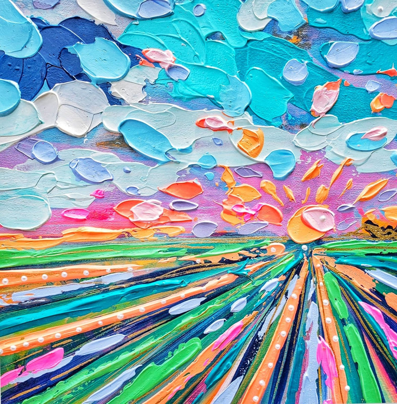
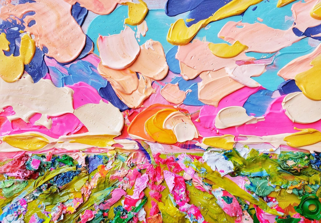
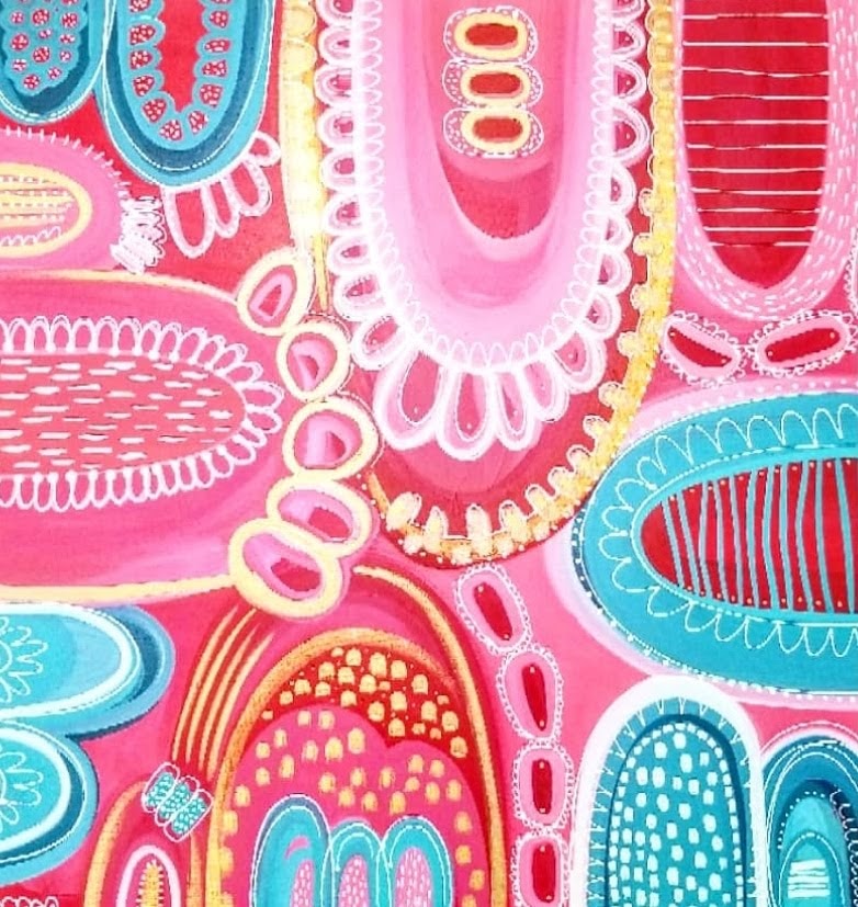
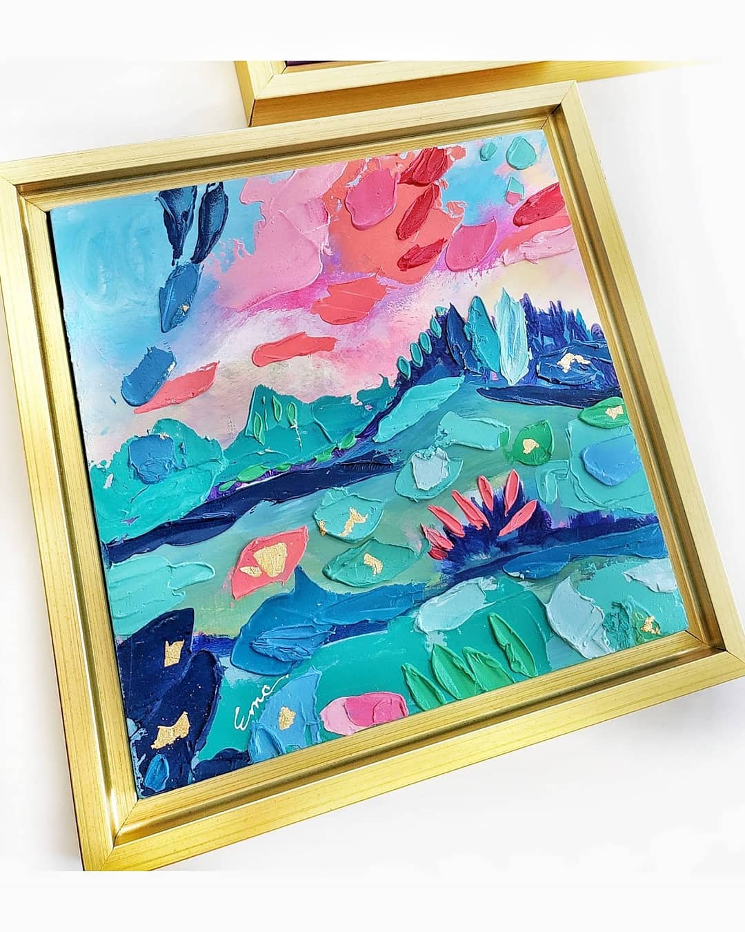
This post contains affiliate links and we may be compensated for purchases made via these links. We went to the Instagram "way back" machine to find out exactly when SGD and Esther McCord became acquainted with one another. Turns out it was July 2018 when she started following us and Shauna fell in love with her art. So much in fact, she commissioned a large 36x36 canvas, which was bigger than anything Esther had done in the past. The piece was amazing, of course, and Esther wrote to us later to thank Shauna for pushing her to "go big". And while we did fall in love with Esther's art, we fell in love with Esther's heart as well. Shortly after Shauna commissioned the piece, her granddaughter passed away at the age of 12 days. She heard from many of her friends and followers on social media with words of sympathy and comfort, but Esther's messages stood out. Every other day or so, there was a prayer, a quote of scripture, a word of encouragement. We knew then that Esther was someone special and are forever grateful for her beautiful, giving heart. SGD: Can you briefly walk us through your story? How did you get started and how did you get to where you are today? EM: In 2013 I left my teaching career to join the full time, volunteer ministry. I then found myself with extra time on my hands and decided it was time to start sharing my art with the world. I was nervous and scared! I remember thinking, "What if no one likes my work?" (Some don't) "What if people are mean and jealous?" (Some are) BUT I did this for ME and to share my joy with YOU! I was no longer able to share my joy of art with teaching children, so now I had to share my joy by creating and sharing with YOU! Instagram was a great platform for this. I've met and connected with wonderful creative people on Instagram and have found several amazing collectors! And to this day, those of you that love my work and continue to support me, far outweigh my doubts and the meanies! THANK YOU! My paintings are living in JUST ABOUT all 50 states and even one in New Zealand! Moral of the story? Continue reading to find out... SGD: Has it been a smooth road? If not, what were some of the struggles along the way? EM: FEAR and DOUBT, were big obstacles that I had to overcome. Getting out of my own way was the biggest obstacle. Once I figured out WHY I was sharing my work with the world and was consistent, I learned that the little negative voice in your head can be overcome by the positive one! This world 🌎 needs color and positivity and I'm happy to share what I can contribute! SGD: What are you most proud of and what sets you apart from other artist? EM: I can honestly say that I am most proud of not giving up! Everyday, I find something positive to share with my friends and collectors. And as an artist I firmly believe in producing art that will remind you to stay positive and never give up! My work has been described as uplifting and inspiring. My artworks are more than mere objects, an experience will be provided by establishing meaningful connections with collectors. SGD: What advice would you give to someone at the start of his or her career? EM: •Be humble. • Get out of your own way. • Learn from others. • Then give them credit for helping you. • Know your worth. •MOST IMPORTANTLY commend and encourage everyone you meet! Always look for the good. My favorite motto: Be Nice or Leave. SGD: What artists do YOU admire and why? EM: David Hockney, Andy Warhol, Maud Lewis, these artists all have something in common and that's their love for bold and beautiful color! Each of these artists took pride in their work and worked hard at succeeding in their art careers. SGD: If you weren’t an artist, what would you be? EM: A psychologist. Contact Info: Esther McCord
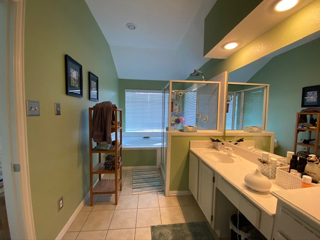
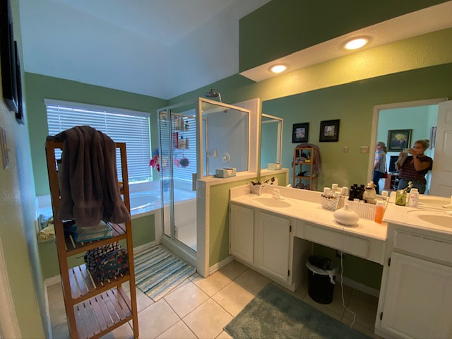
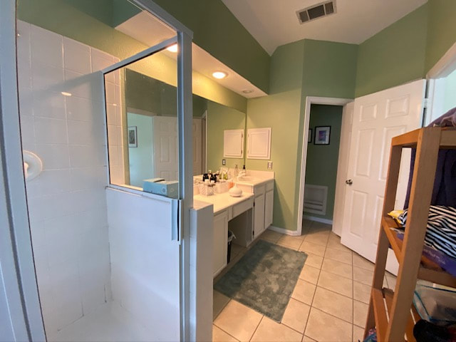
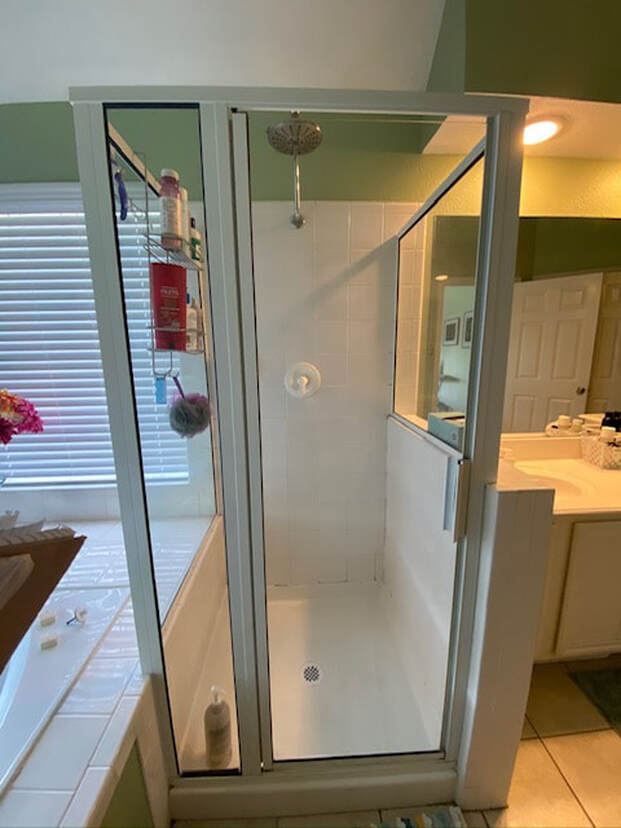
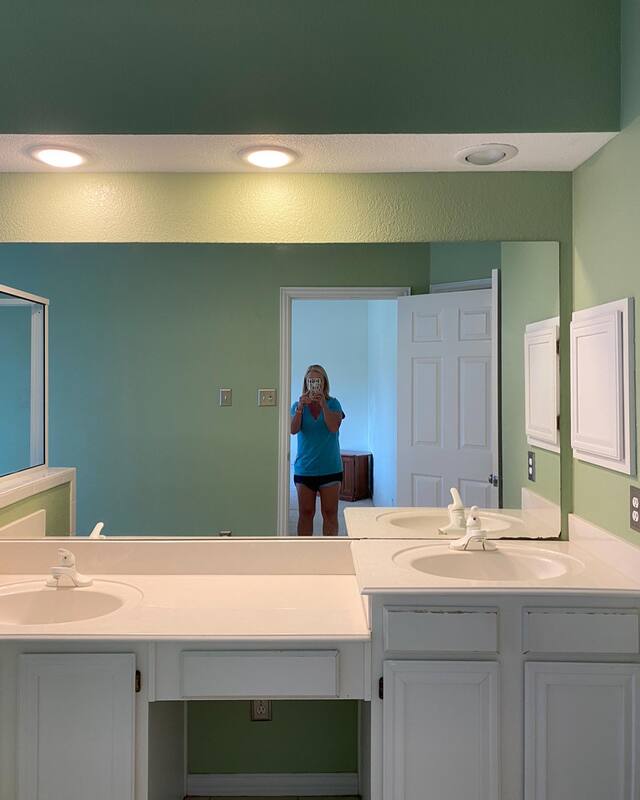
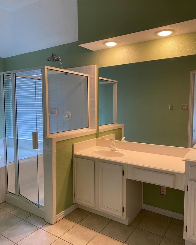
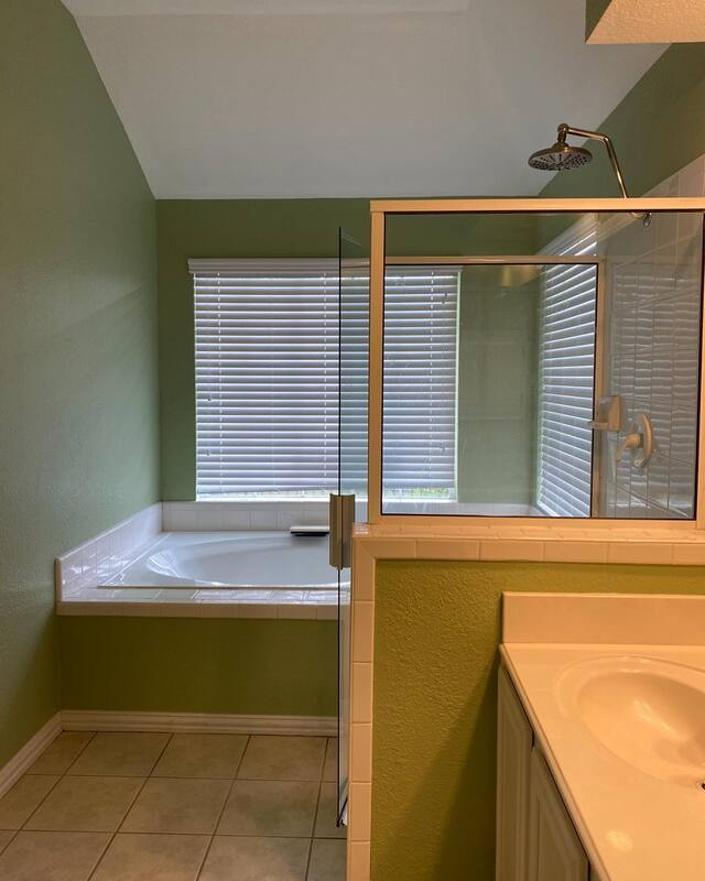
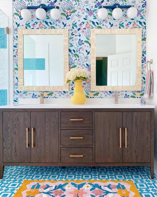
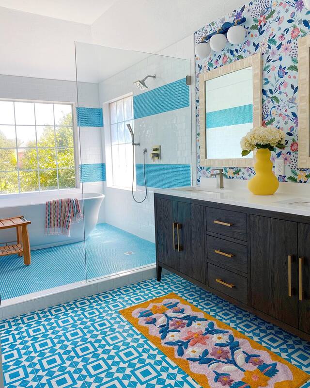
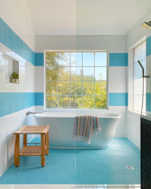
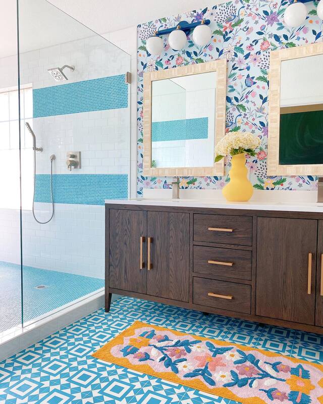
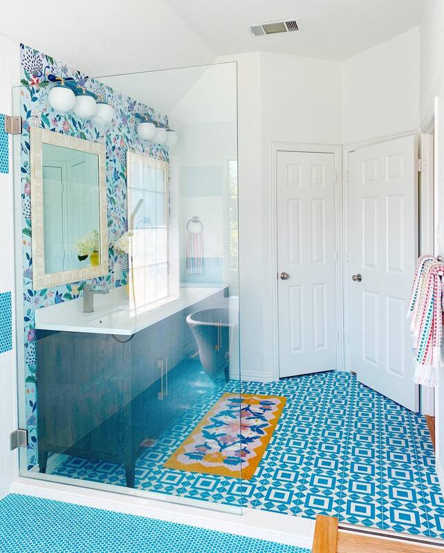
Check out more of our Artist Spotlight series here. We always cross our fingers that a renovation turns out as amazing in person as our initial vision and storyboard. AND that our client loves it as much as we do. Well, this latest bathroom project was a super duper success and I think all of us were blown away by the end result. The original footprint of the bathroom was a great size to begin with, so we were able to work with the original plumbing layout and had plenty of space to work with to create an elegant, fresh, happy room. Bathroom Before We love idea of a wet room, where the tub and shower are together behind a wall of glass, and this layout provided us the perfect opportunity to create one. The existing vanity needed to be updated for more storage as well as to remove features she didn't use (chair nook and multi-level sinks). We also removed the dated soffit containing the vanity light for an immediate refresh. Bathroom After Now, we assume that when people hire us to renovate bathrooms that they know that what we are going to propose is color and pattern. While we can and have done serene and elegant; bright, bold and happy is totally our jam.
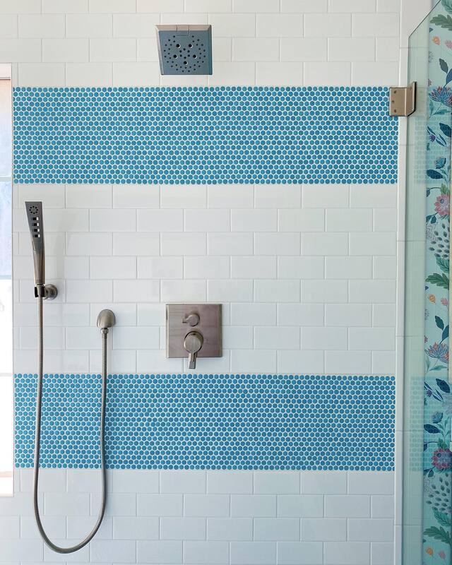
It might seem out of place to put a dark wood cabinet in this bathroom, but with so much blue and white, it needed a darker color to anchor the room. We also brought in natural elements in the bone inlay mirrors and teak stool in the shower, and like to include these elements in every design. Kind of like a visual sorbet to cleanse the palette! Because the wet room space was so big, we chose an economical white subway tile and aqua mosaic tile to match the floor. Mosaic tile is perfect for the shower floor as the grout lines provide a non-slip surface. By replacing the built in tub with a vessel tub, we gained a ton of room for the shower. Seriously, you could have a party in here. Lastly, the wallpaper from Anthropologie gives the space that feminine touch to balance all the geometric designs and dark wood vanity. I guess we passed the test because we are already hard at work on a plan for the client's guest bath. She's already told us though that it can't be as fabulous as this one. We'll try to contain ourselves. Resources: Vanity: Restoration Hardware Floor tile: Zia Tile Shower tile: Subway and mosaic both from Wayfair Bathtub: All Modern Shower fixtures: Wayfair Wallpaper: Anthropologie Mirrors: Serena & Lily Vanity light: Dutton Brown Teak shower stool: Frontgate Towels: Target Rug: Urban Outfitters Vase: Home Goods, similar here. So, are you ready to get started on YOUR bathroom reno? Contact us for more info! This post contains affiliate links and we are compensated for purchases made via these links. |
Categories
All
Archives
October 2023
|



 RSS Feed